ASF® | A Branding Identity Design Built on Trust and Continuity
ASF® is built around a clear belief: financial development should be accessible, responsible, and based on partnership. Their work connects individuals and institutions through programs designed to create long-term impact. As the organization grew, they realized that the way they looked did not fully reflect the way they worked. Their branding and identity needed to communicate trust, continuity, and structure in a way that felt clear and human.
Client
ASF®
Industry
Finance
Year
2025
Services
Branding
Challenge
Financial organizations often walk a fine line. They have to look stable and secure. At the same time, they shouldn’t feel distant or overly corporate.
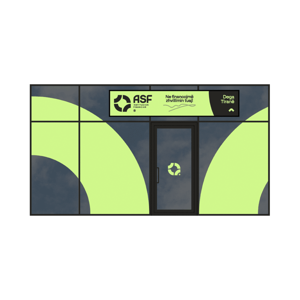
ASF® needed branding that balanced both sides. The identity had to show partnership, since clients and institutions operate as equal contributors. It also had to support multiple programs under one consistent design system.
Everything needed to work together. Reports. Campaigns. Presentations. Digital platforms. The visual framework had to stay flexible, but consistent.
The real challenge was clarity. How do you make something structured still feel human?
Solution
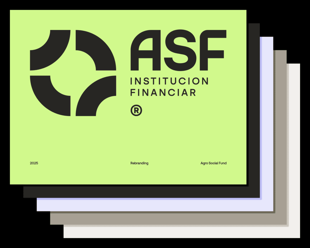
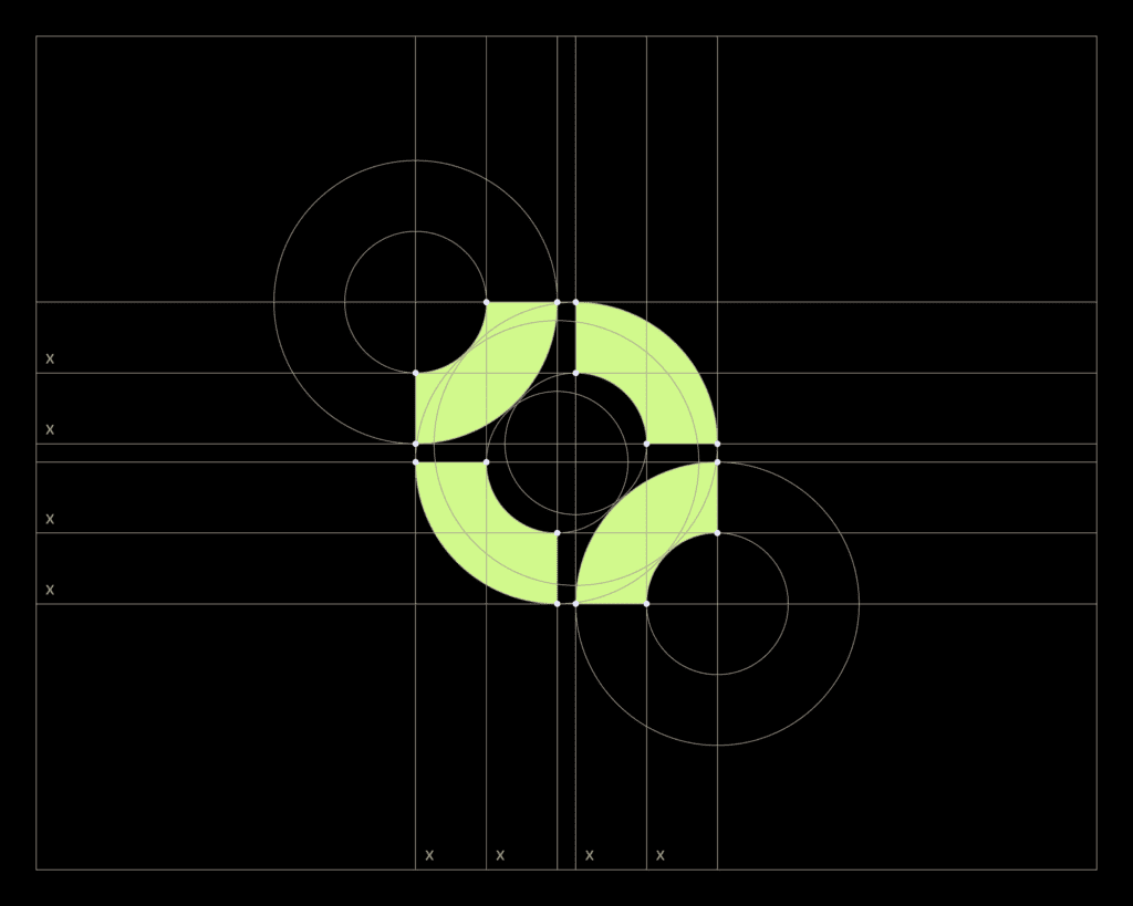
The answer was structure.
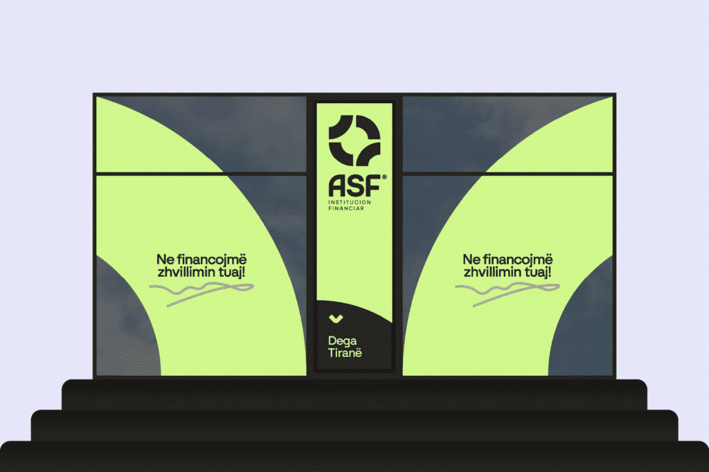
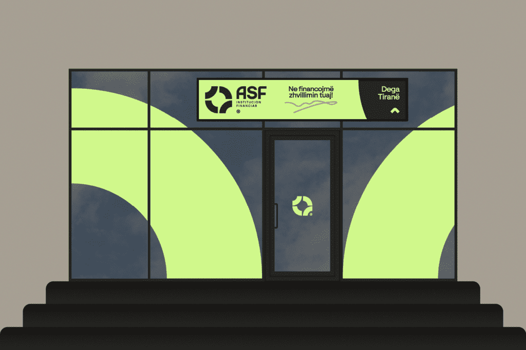
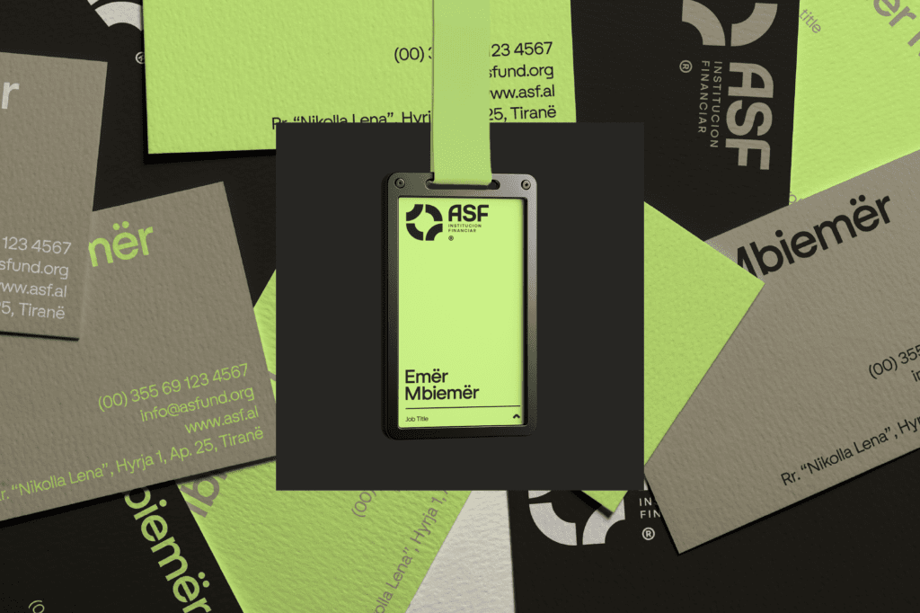
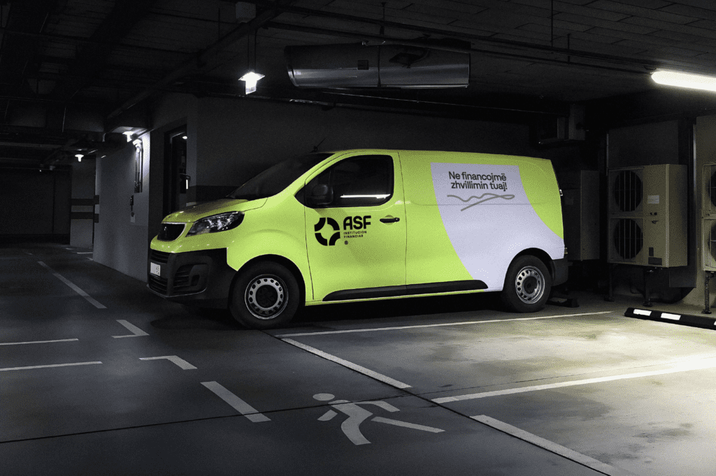
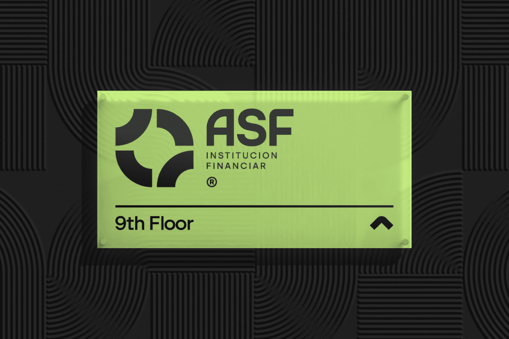
We built the identity around a circular system. The shape represents continuity and shared responsibility. It suggests movement from challenge to outcome without being overly symbolic.
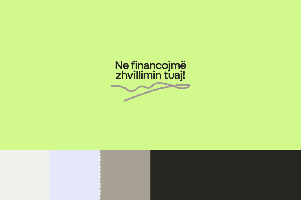
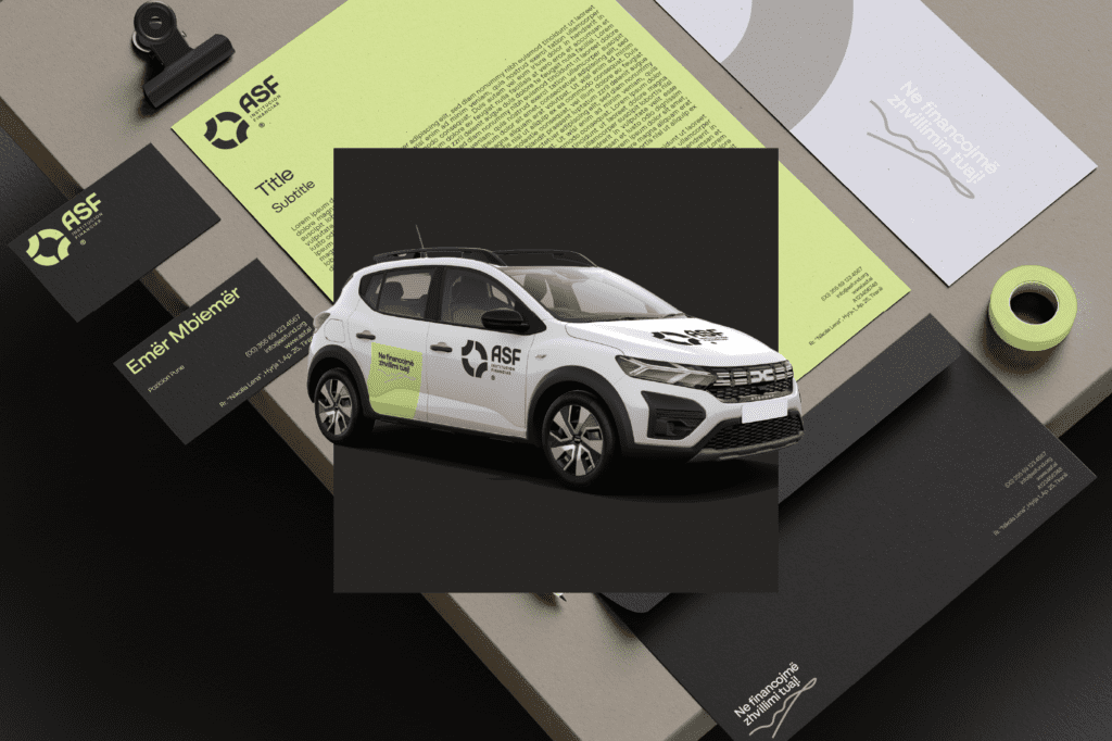
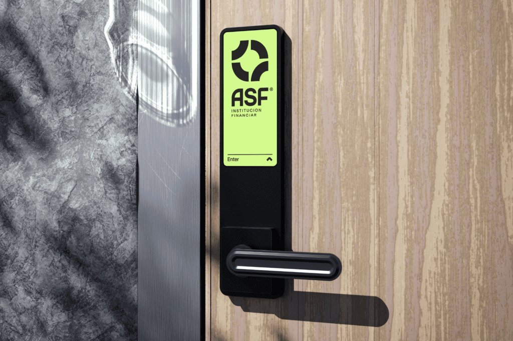
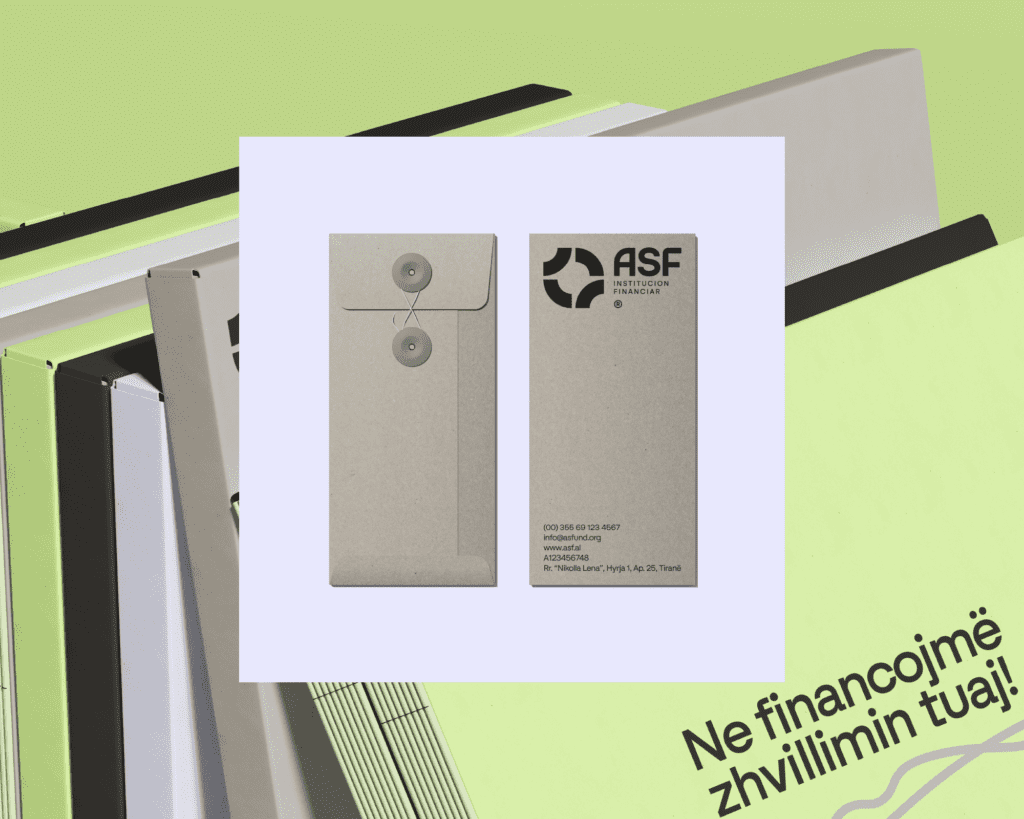
The system is modular. It scales across documents, campaigns, and digital touchpoints while staying consistent. A restrained color palette supports clarity and transparency. Typography is clean and easy to read. Imagery supports the message instead of distracting from it.
The result is a branding and identity system that feels steady, adaptable, and built for long-term trust.