Diamond® Lasagne | Modern Take on Italian Packaging Design
Diamond approached us with the simple goal of refreshing the way their fresh lasagne shows up on shelf. The product was strong. The quality was there. But the packaging needed to match that level and compete confidently in a busy food category. This wasn’t about decoration. It was about presence.
Client
Diamond®
Industry
Food & Beverage
Year
2025
Services
Packaging
Challenge
With the pasta aisle being as crowded as it is, and with many brands relying on the same visual shortcuts (flags, rustic textures, and predictable Italian cues). Diamond needed something different.
The challenge was to create a packaging identity that felt modern, direct, and strong at first glance.
As we began shaping the concept, a few key questions guided the process:
How do you respect tradition without looking dated? How do you make fresh pasta feel premium, yet approachable? How do you stand out in a supermarket environment where attention lasts only seconds?
Solution
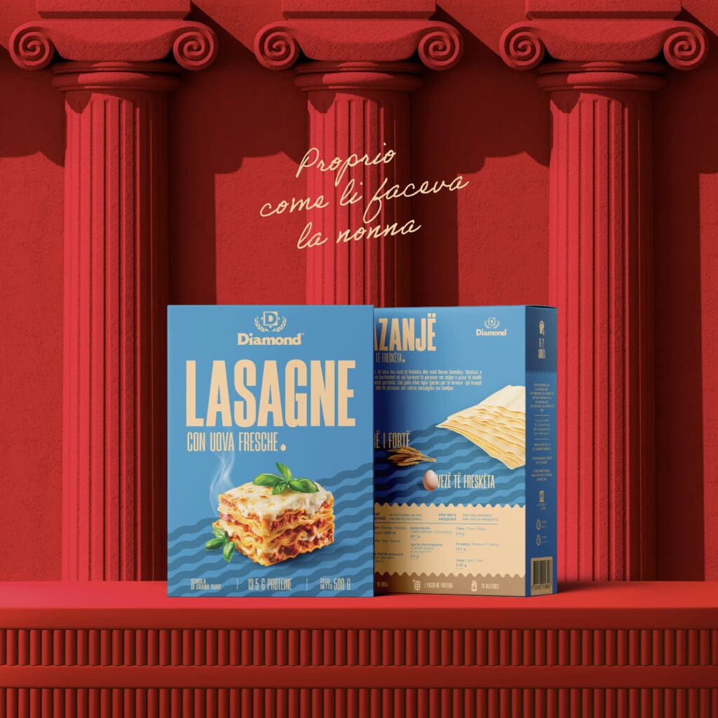
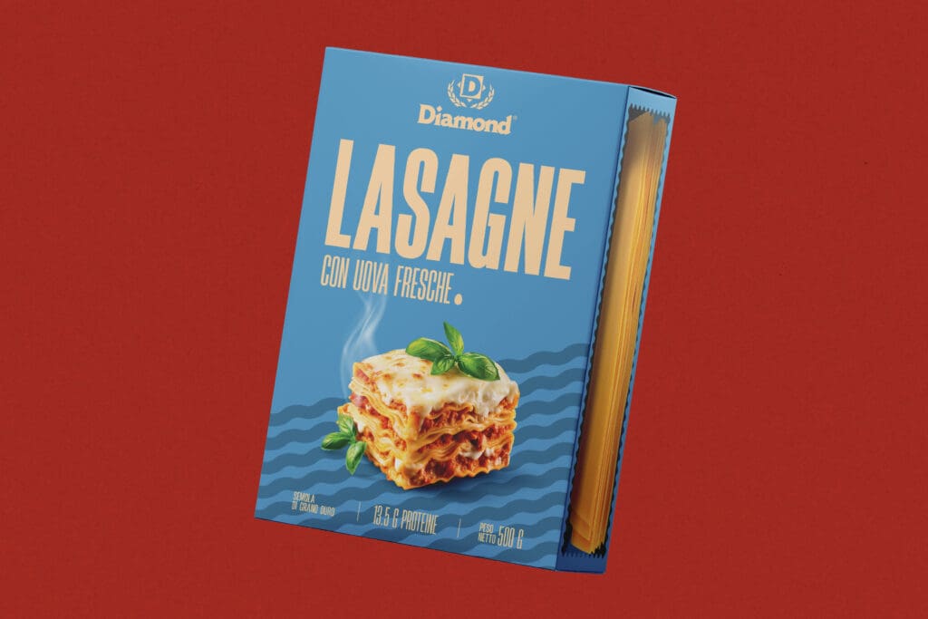
We started with structure.
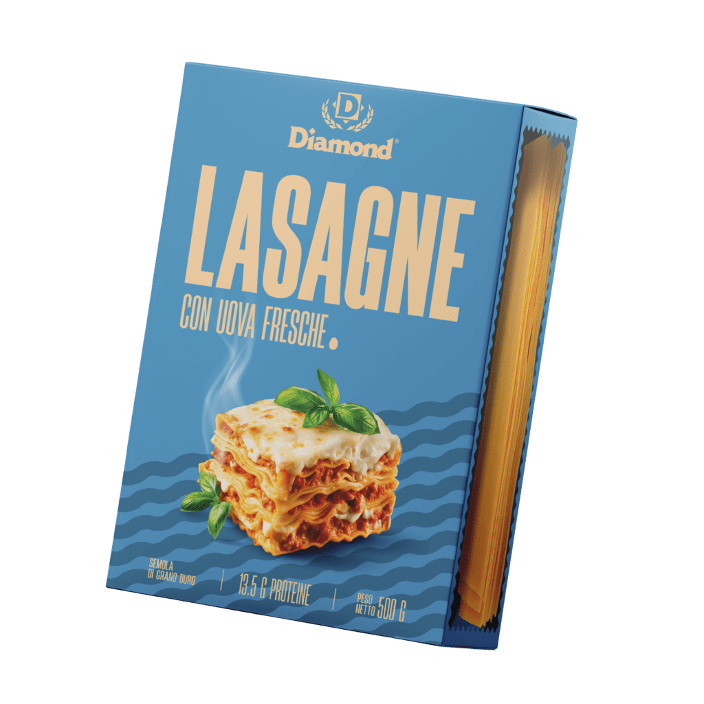
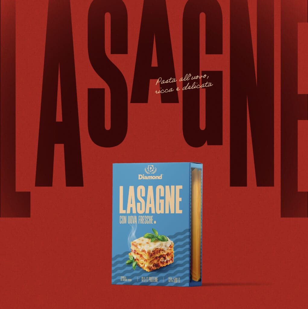
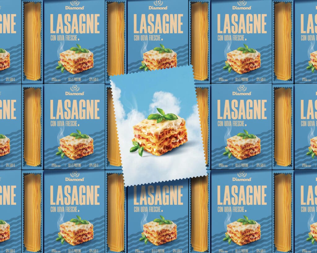
Large typography became the hero. It creates instant recognition and anchors the entire design. From there, we introduced a bold red and blue palette that commands attention in retail.
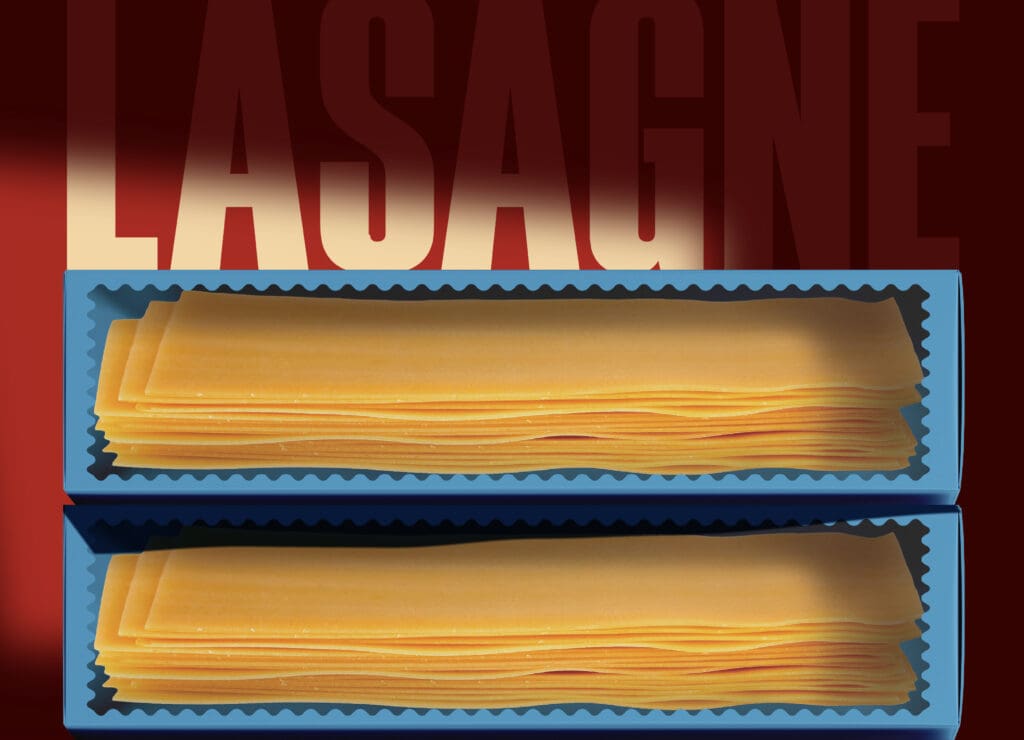
Subtle graphic waves reference lasagne sheets, adding movement without clutter. A transparent side window brings the real product into the design, because freshness should be visible.
With every decision being intentional. Nothing decorative. Nothing forced. The final packaging feels clean, confident, and built to grow with the brand. It’s a contemporary take on a classic product, designed to perform, not just look good.