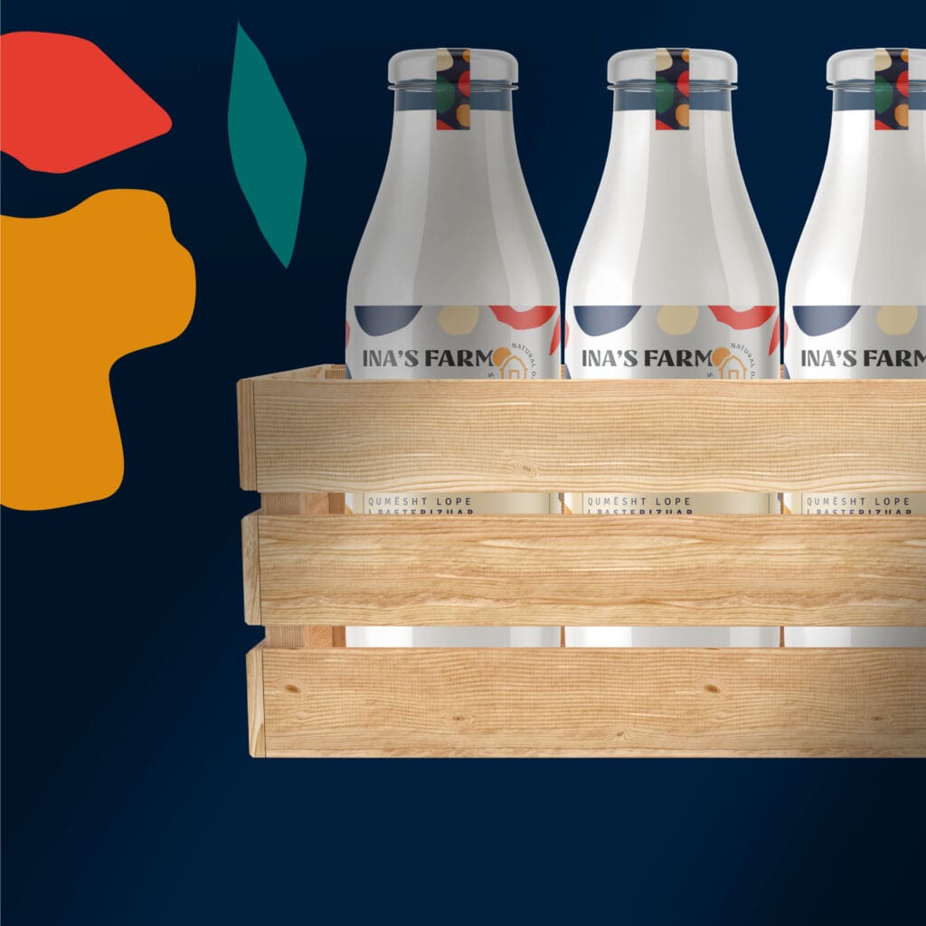
In the world of dairy branding, Ina’s Farm stands out as a beacon of creativity and innovation. Breaking away from traditional organic farm aesthetics, our team embarked on a journey to reimagine dairy branding for Ina’s Farm, infusing it with a modern touch while staying true to the farm’s essence.
Client
Ina's Farm
Industry
Food & Beverage
Year
2020
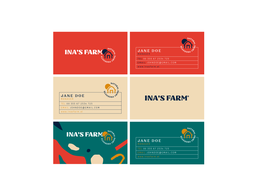
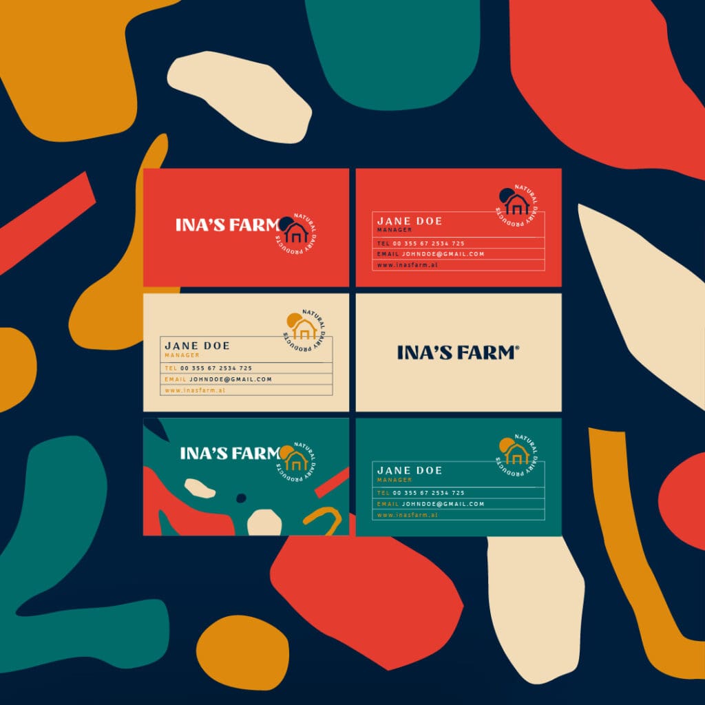
Services
Branding
Challenge
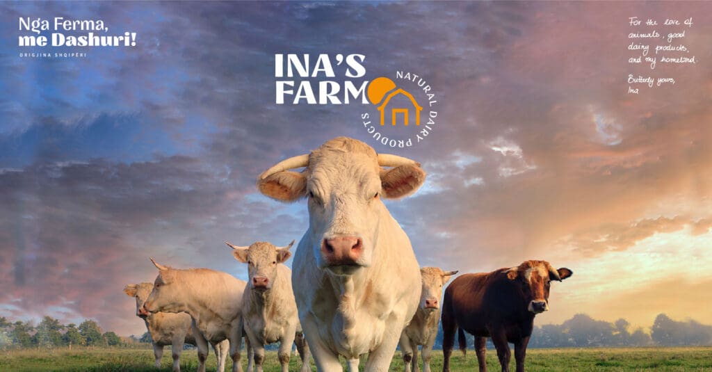
The challenge was to create a fresh brand for Ina’s Farm, departing from clichéd representations often linked to organic farms. The goal? A memorable, family-friendly brand identity for their dairy products in a crowded market.
Solution
Our solution was to breathe new life into Ina’s Farm branding. Drawing inspiration from the farm’s resident cows, sheep, and goats, they gave birth to the whimsical “MUUU,” “BEEE,” and “MEEE” labels, echoing the sounds of these animals.
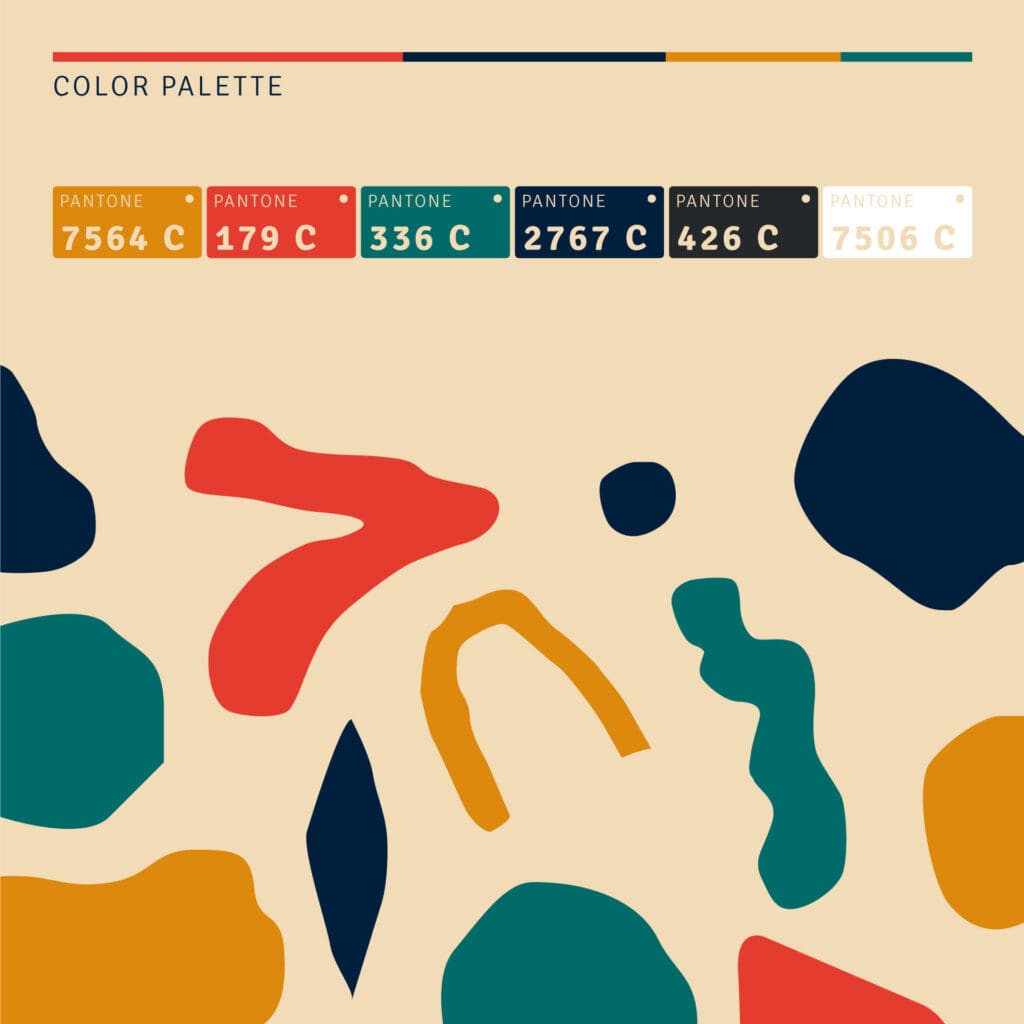
The magic didn’t stop there; graphic elements inspired by animal patterns received a colorful and abstract twist, fostering a cheerful vibe that captivated the hearts of both kids and parents alike. Ina’s Farm emerged as a playful brand, forging genuine connections with families in a fun and memorable way.
This innovative approach redefined dairy branding, making Ina’s Farm a household name that stood out from the herd.