When MORЄ® approached us, they wanted a brand identity as fearless as their vision. We embraced the challenge, ready to craft a look that felt both polished and provocatively spirited.
Client
MORЄ®
Industry
Fashion
Year
2024
Services
Branding
Challenge
We were tasked with designing an identity for MORЄ® that balanced refined sophistication with unapologetic mischief. In a crowded fashion landscape, our branding needed to not only stand out, it had to demand attention.
Solution
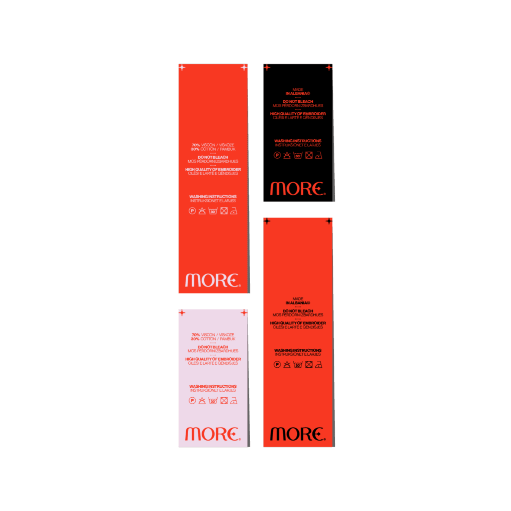
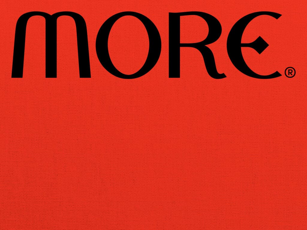
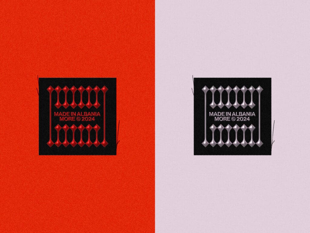
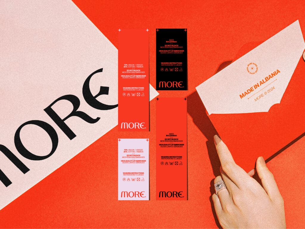
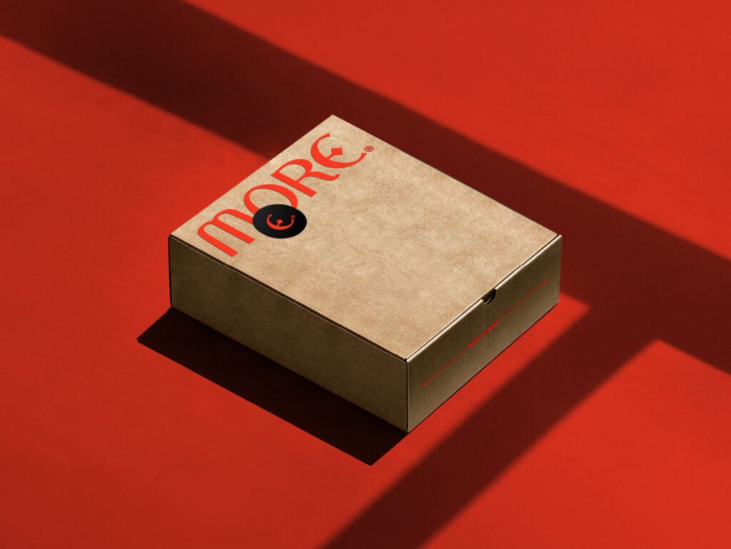
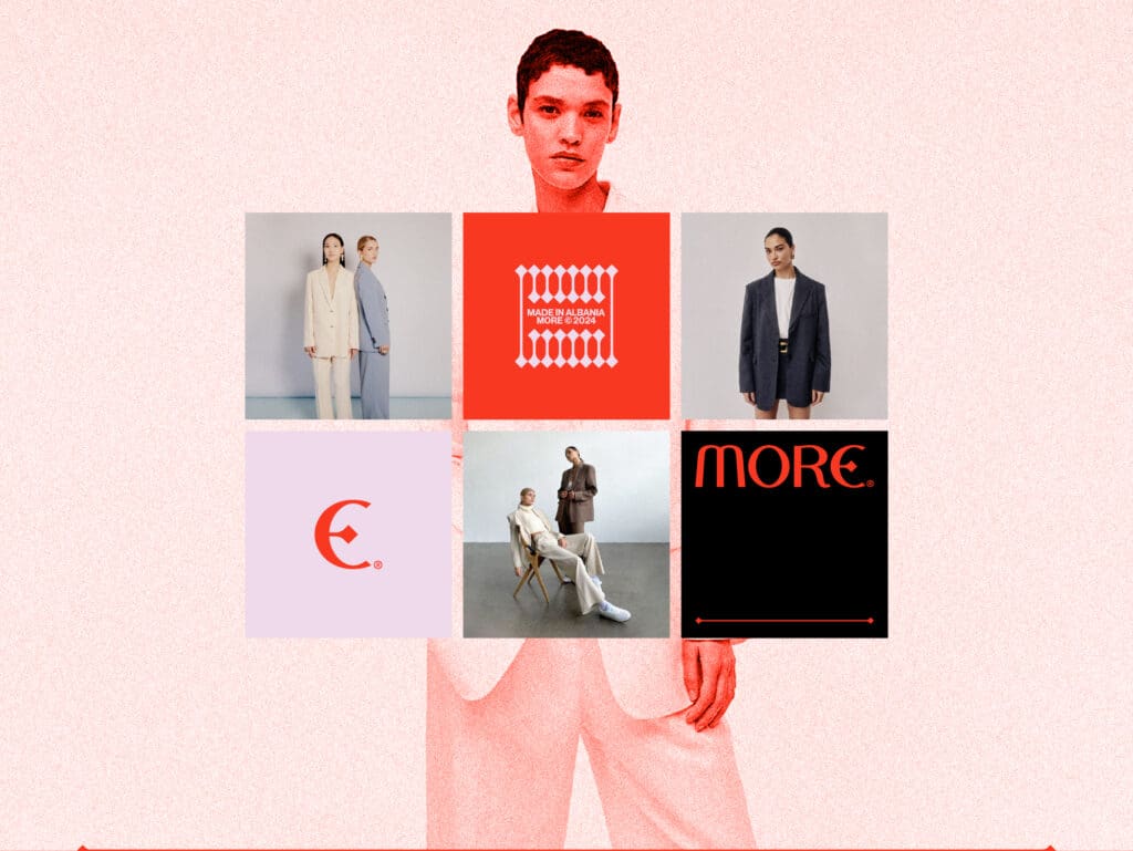
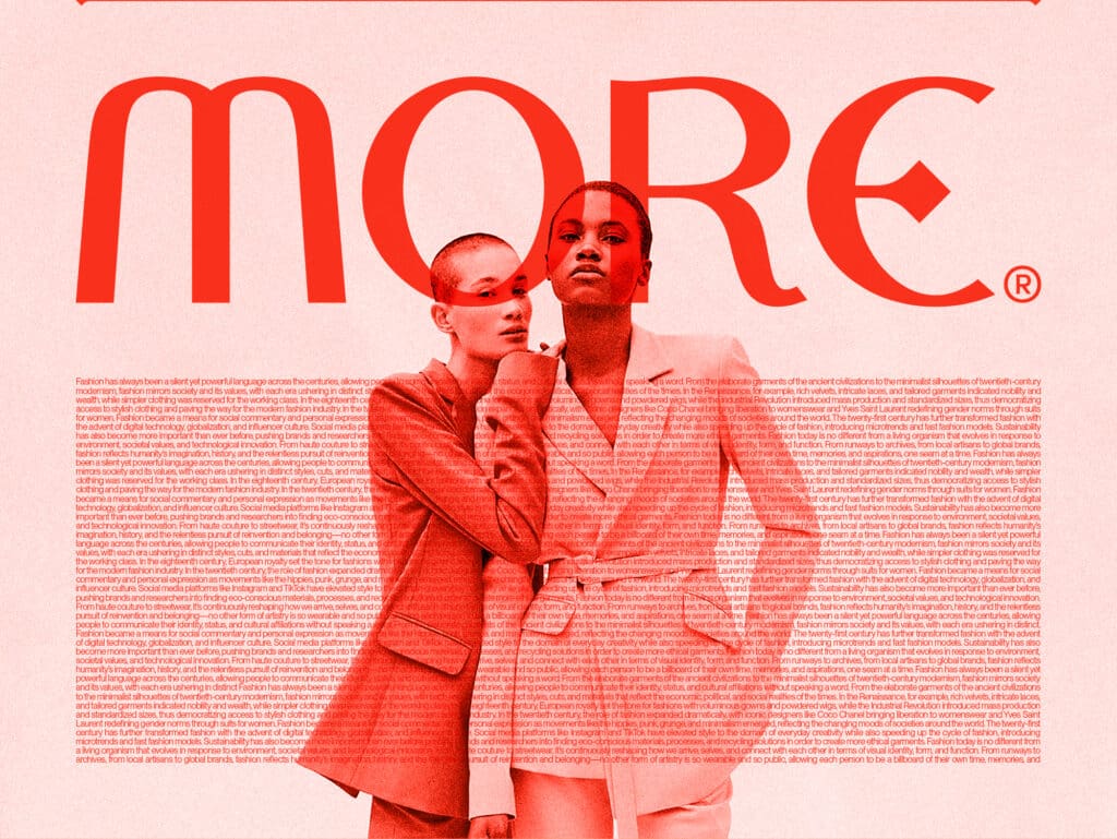
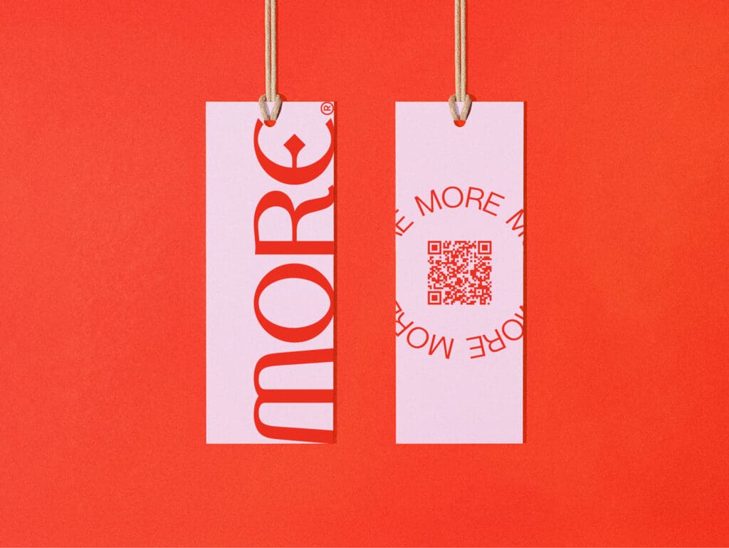
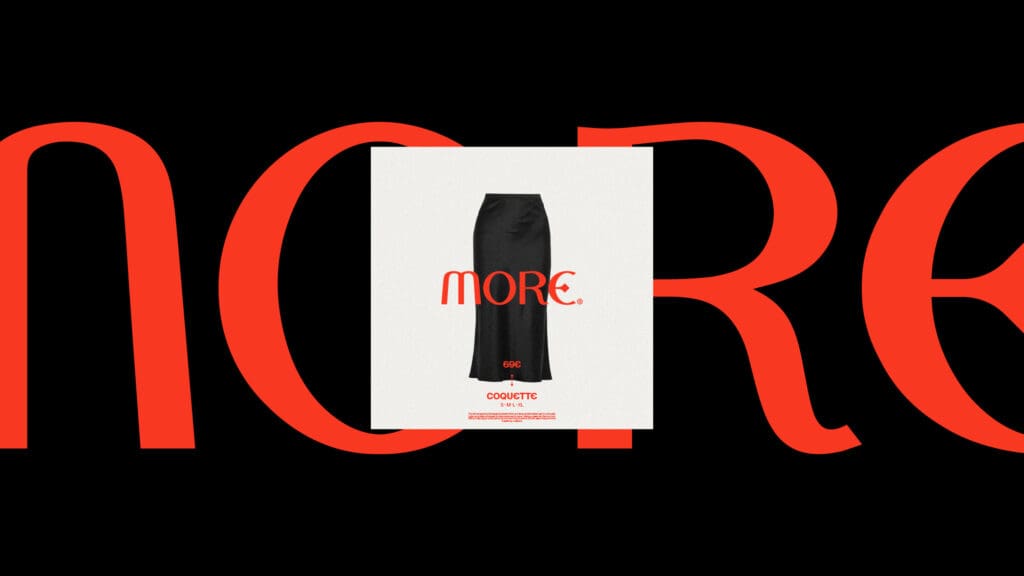
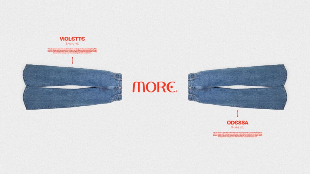
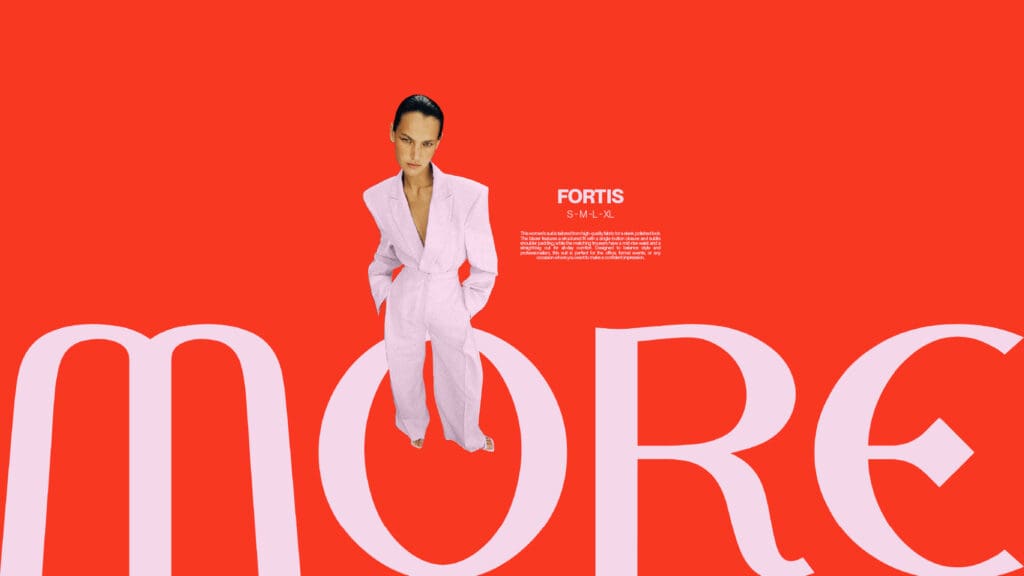
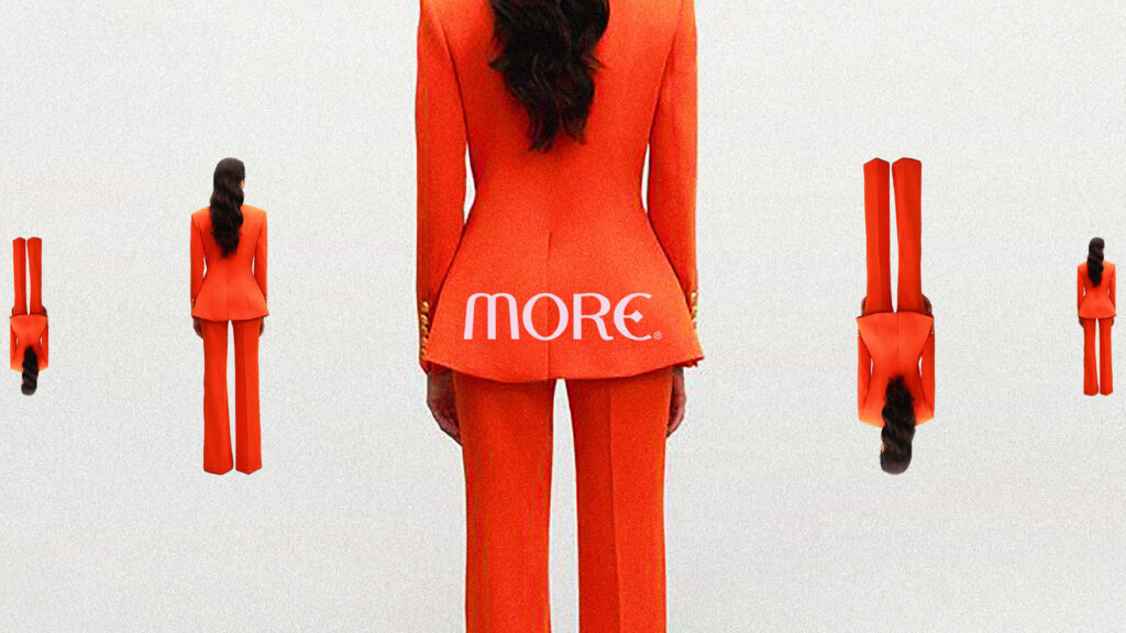
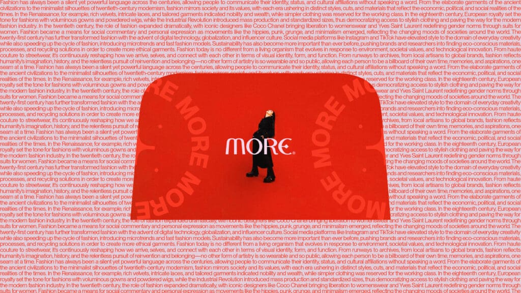
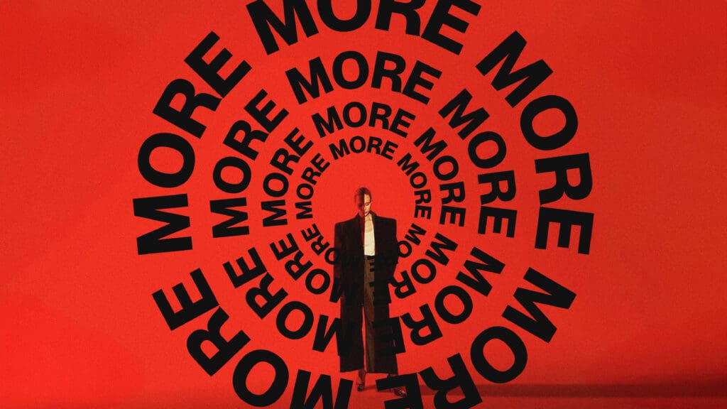
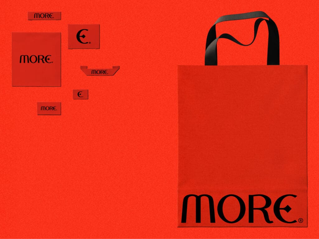
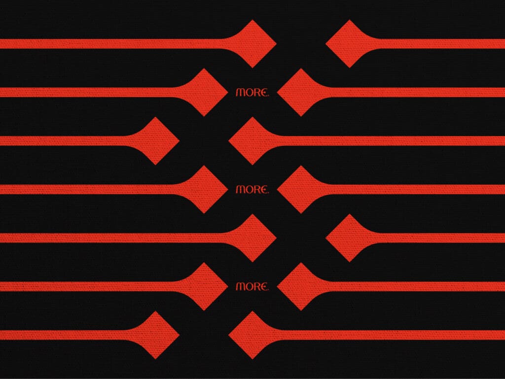
We partnered with MORЄ® to develop a bold fashion brand identity and cohesive branding system. Our logo goes beyond a wordmark: the “M” mirrors structured blazer shoulders; the “Є” hides a subtle plus sign for abundance; and devil horns punctuate the form, hinting at mischief and confidence.
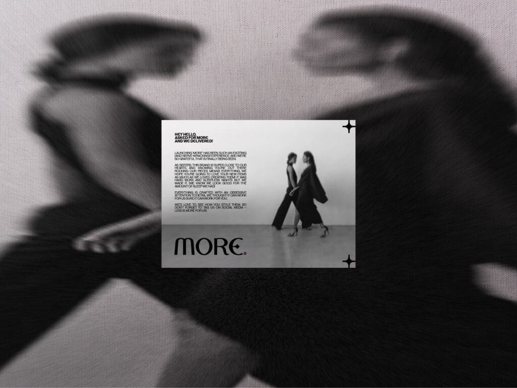
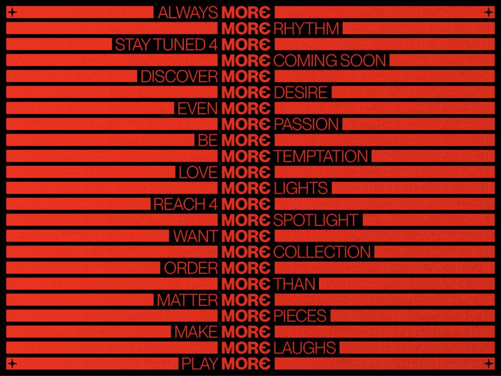
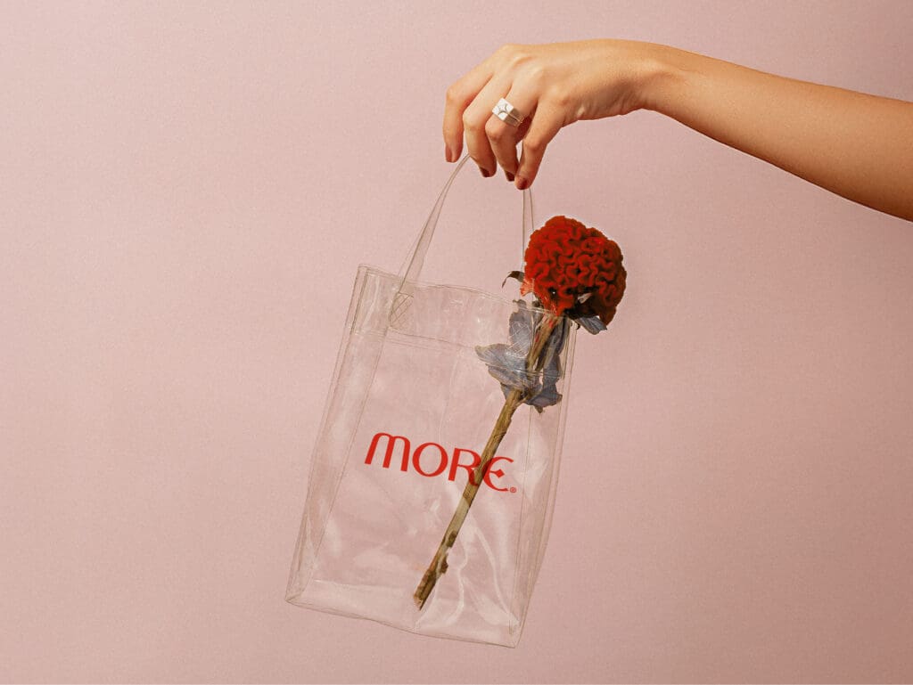
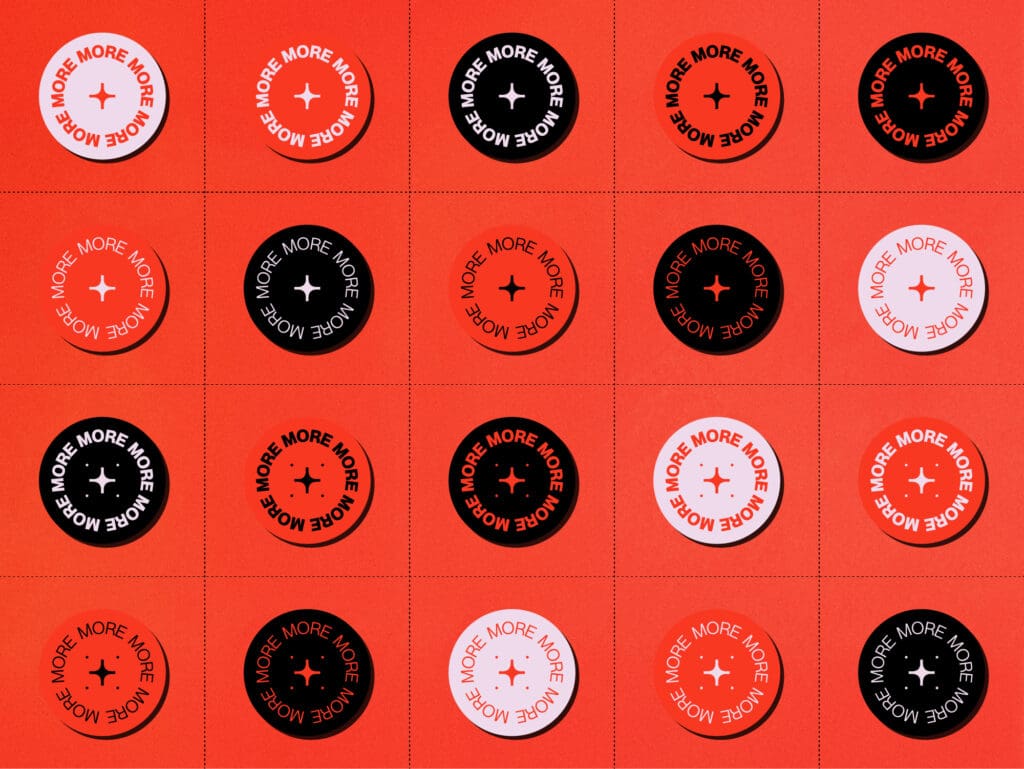
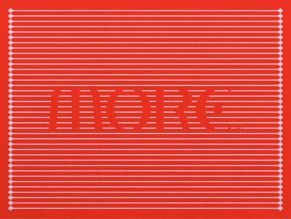
We paired vivid reds with clean packaging and a recurring cross-and-star motif to ensure the branding is tight, expressive, and impossible to ignore. It’s designed for the woman who doesn’t settle, who wants MORЄ love, MORЄ work, MORЄ fun, MORЄ money. The MORЄ Girl Mojo is not just a slogan, it’s a lifestyle in motion. This is more than fashion. This is a brand with something MORЄ®