Italstone®Precision in Stone.
Overview
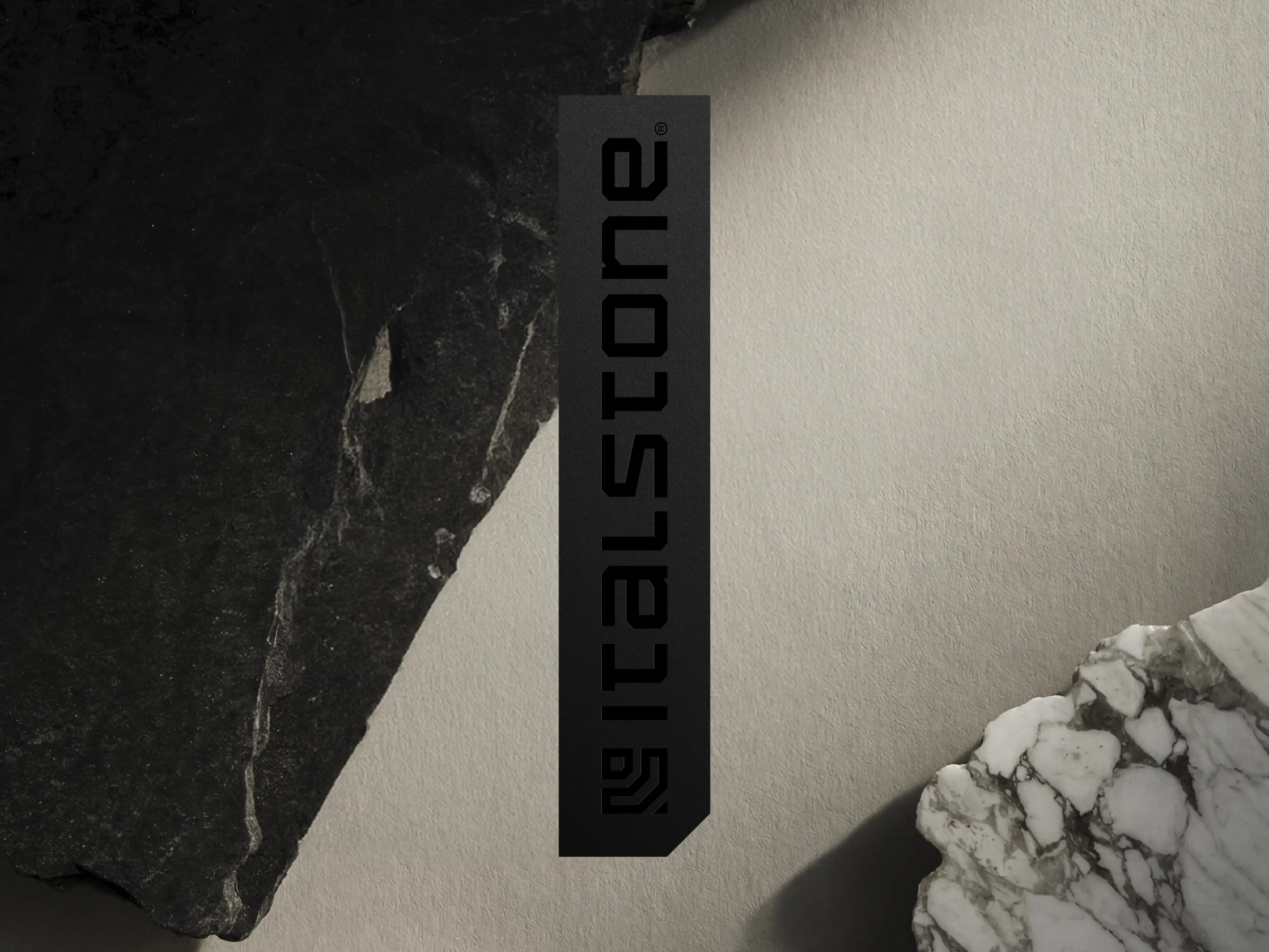
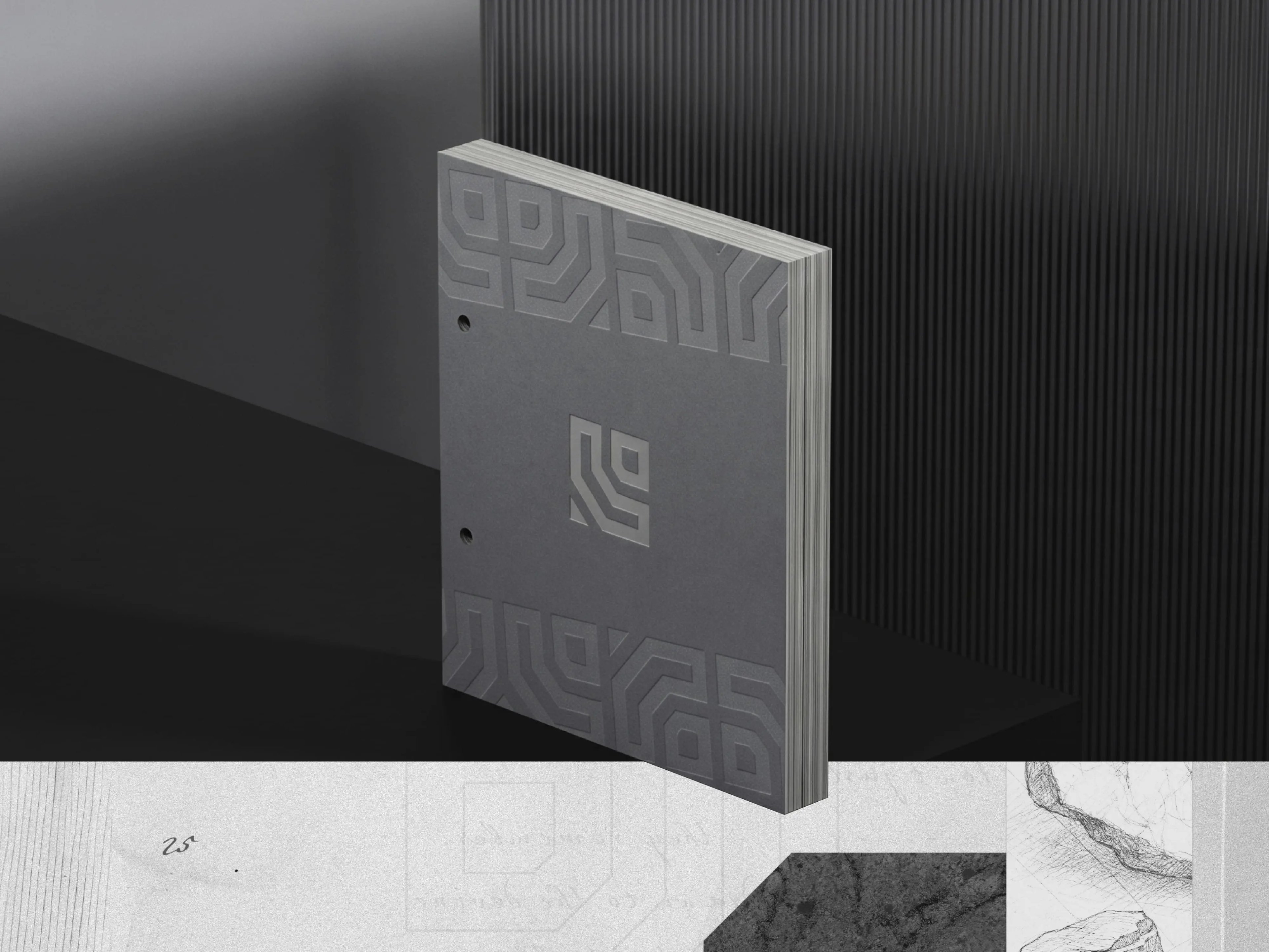
Italstone’s identity was developed as a refined visual system rooted in the strength, precision, and materiality of stone. The project builds on the brand’s existing foundation, evolving the original symbol into a cleaner, stronger, and more contemporary identity while preserving its core recognition.
Challenge
The challenge was to refresh the brand without disconnecting it from its previous visual language. The identity needed to feel more mature, distinctive, and sustainable over time, while reflecting the durability, craftsmanship, and material quality behind the brand.
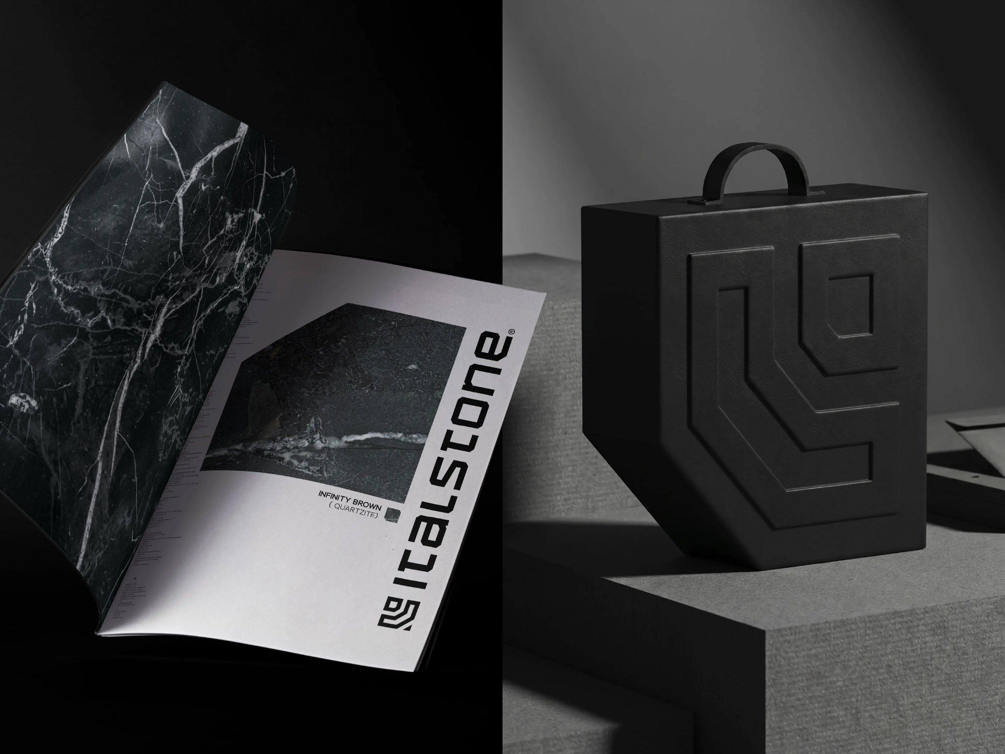
Solution
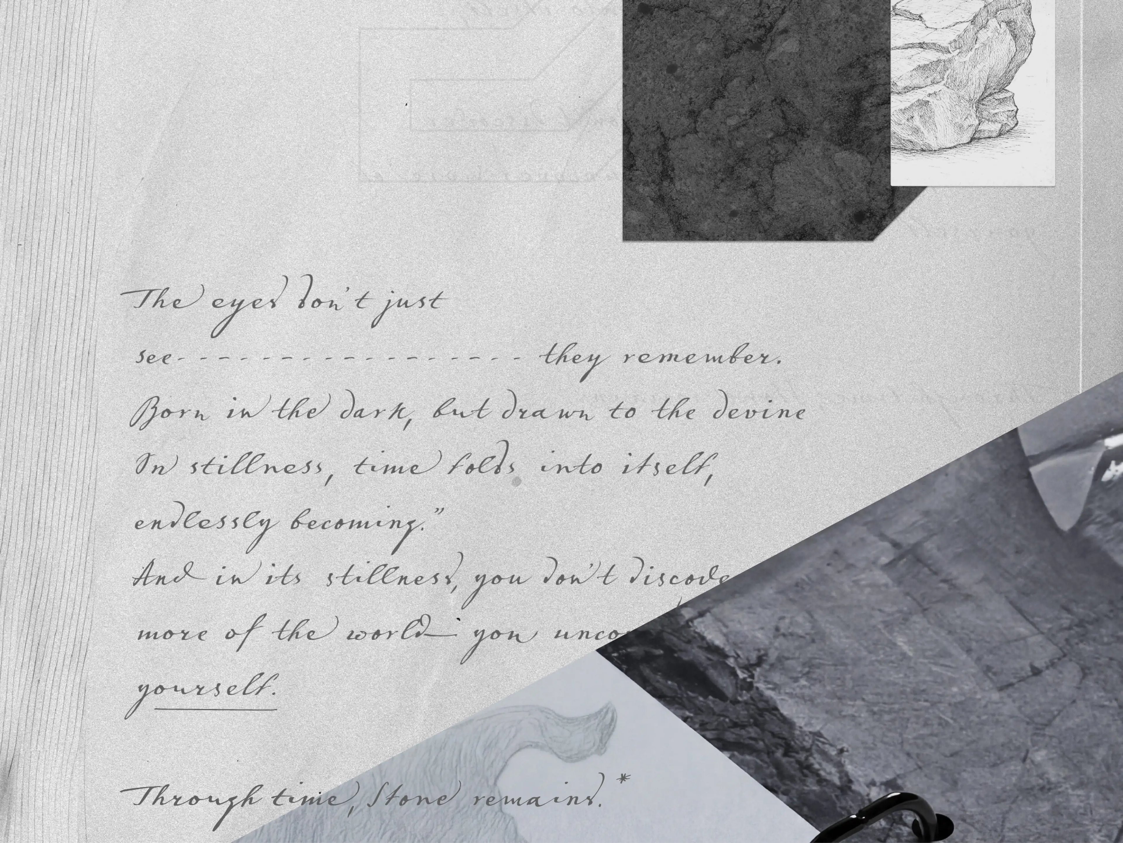
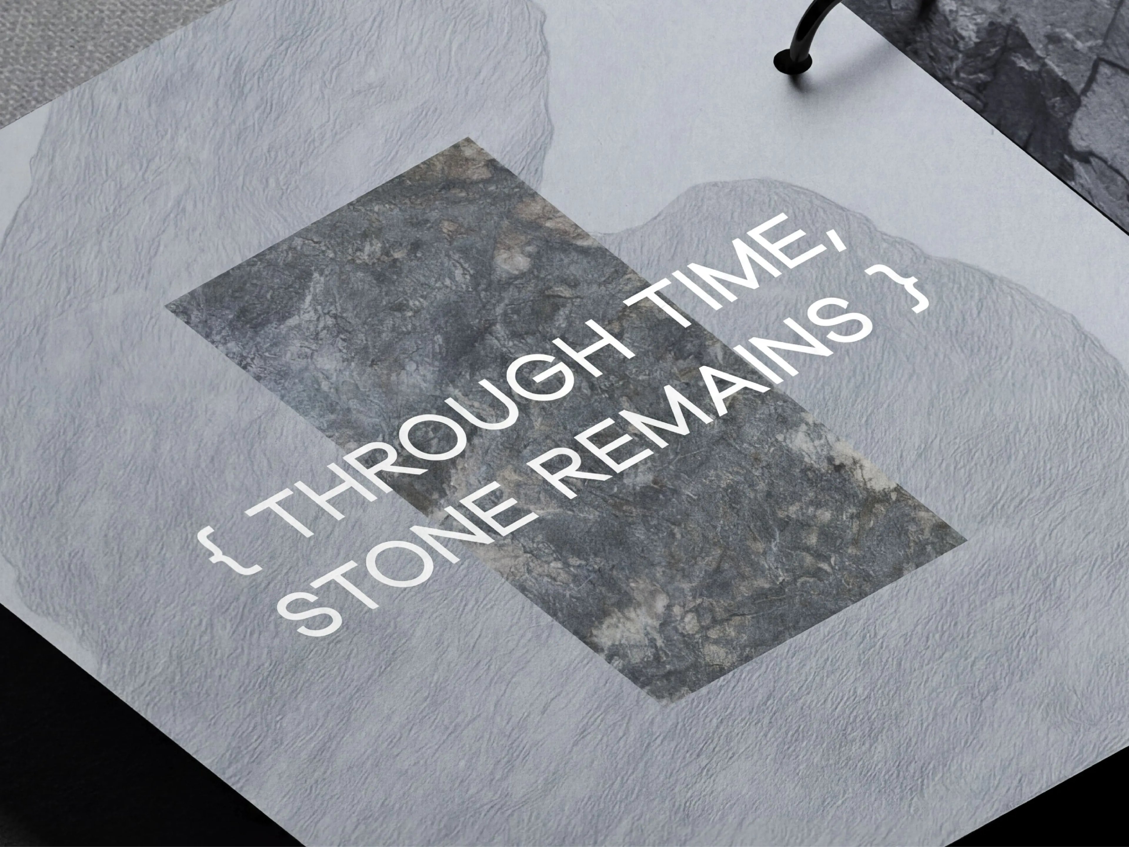
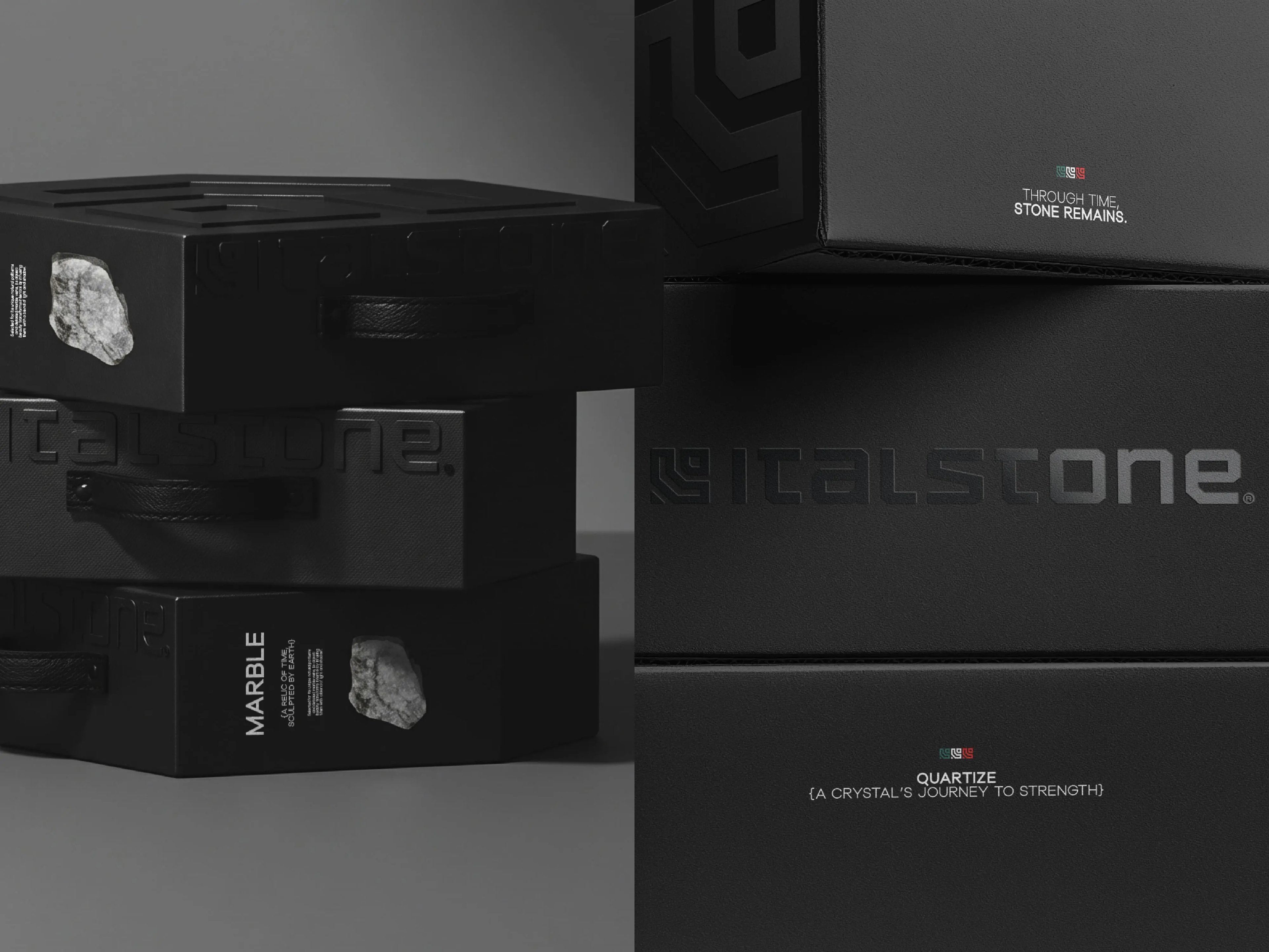
We refined the existing mark and developed a custom typography inspired by the structure of stone, with solid shapes, precise cuts, and a grounded visual rhythm. The packaging design was created for the sample box, built as a custom structure shaped by the brand’s forms and the solidity of the material itself.
Overview
Italstone’s identity was developed as a refined visual system rooted in the strength, precision, and materiality of stone. The project builds on the brand’s existing foundation, evolving the original symbol into a cleaner, stronger, and more contemporary identity while preserving its core recognition.
Challenge
The challenge was to refresh the brand without disconnecting it from its previous visual language. The identity needed to feel more mature, distinctive, and sustainable over time, while reflecting the durability, craftsmanship, and material quality behind the brand.
Solution
We refined the existing mark and developed a custom typography inspired by the structure of stone, with solid shapes, precise cuts, and a grounded visual rhythm. The packaging design was created for the sample box, built as a custom structure shaped by the brand’s forms and the solidity of the material itself.