Overview
What if air wasn’t just traveled through, but shaped? That’s the vision we embraced when airbendr® came to us.
Challenge
The challenge was to create an identity for airbendr® that went beyond traditional aviation cues. The brand needed to express the idea of shaping and controlling airflow, combining technical precision with a sense of movement, innovation, and direction.
Solution
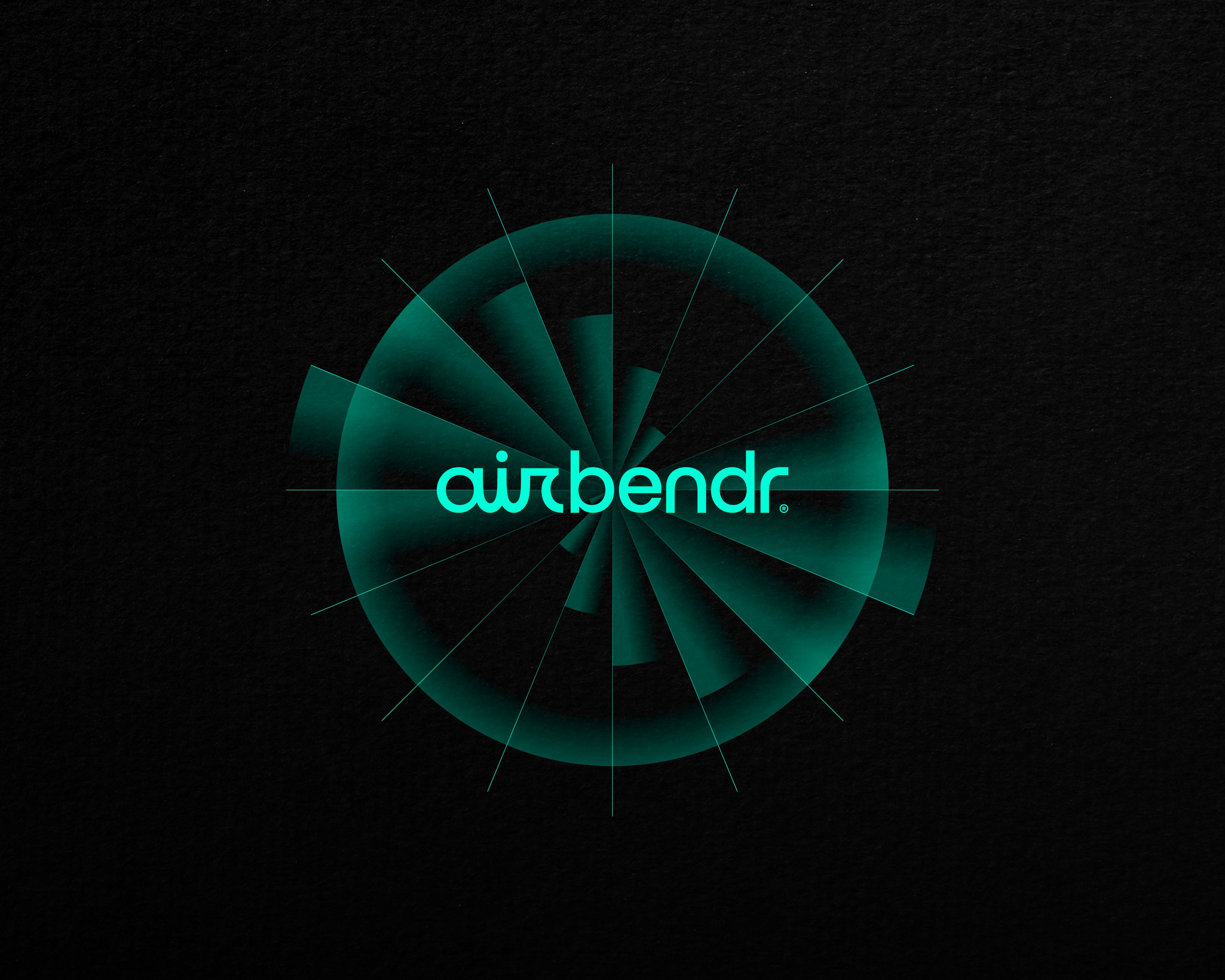
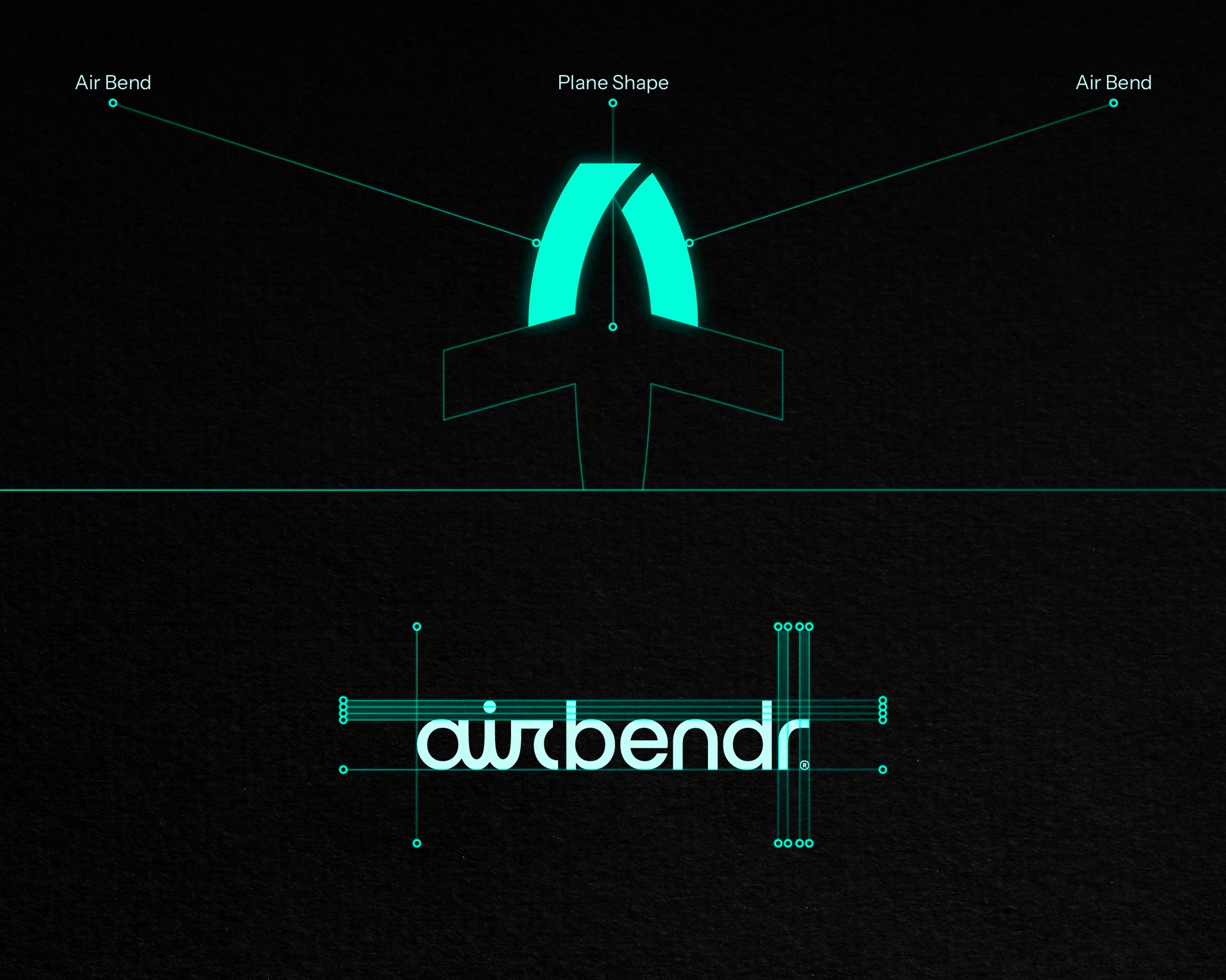
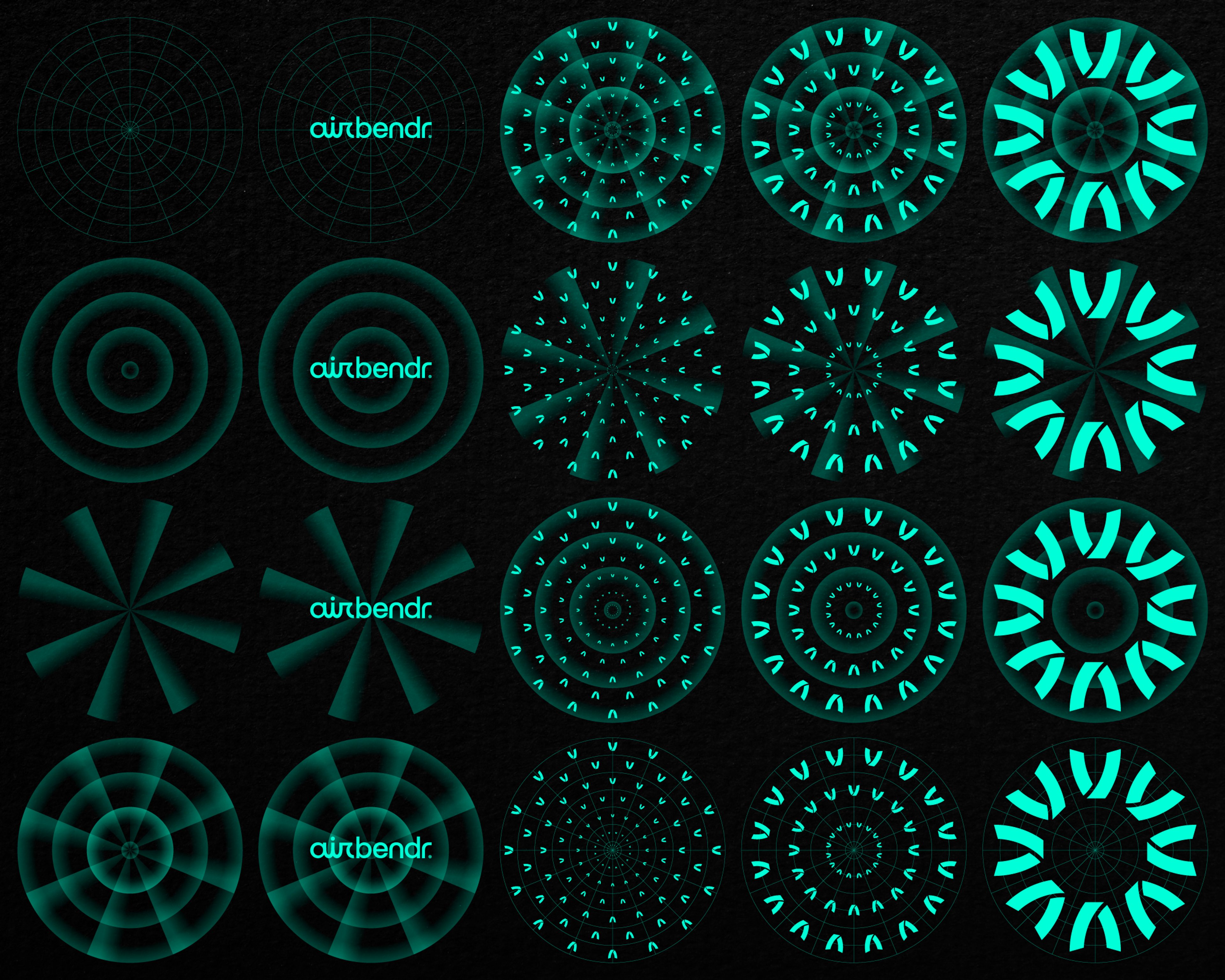
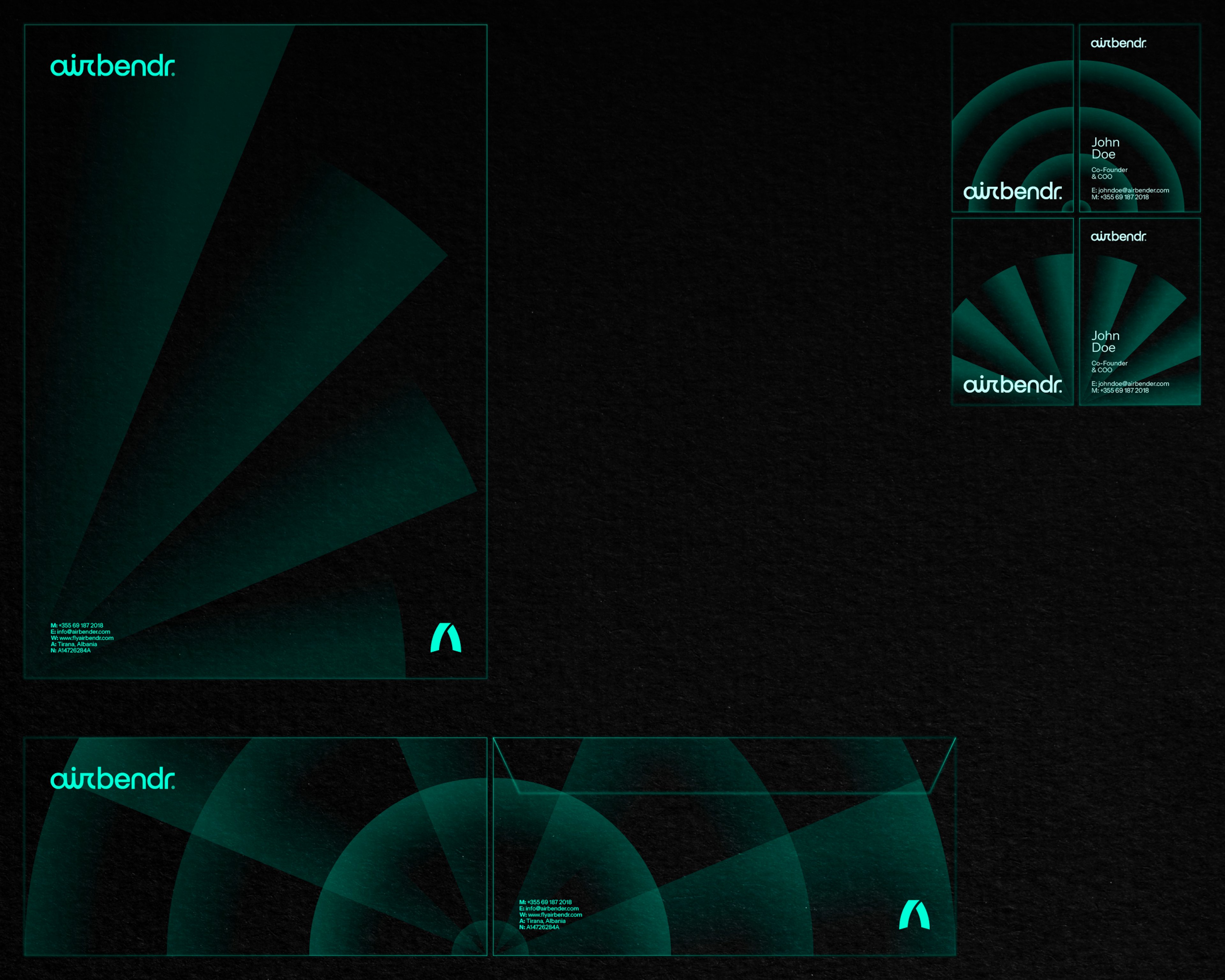
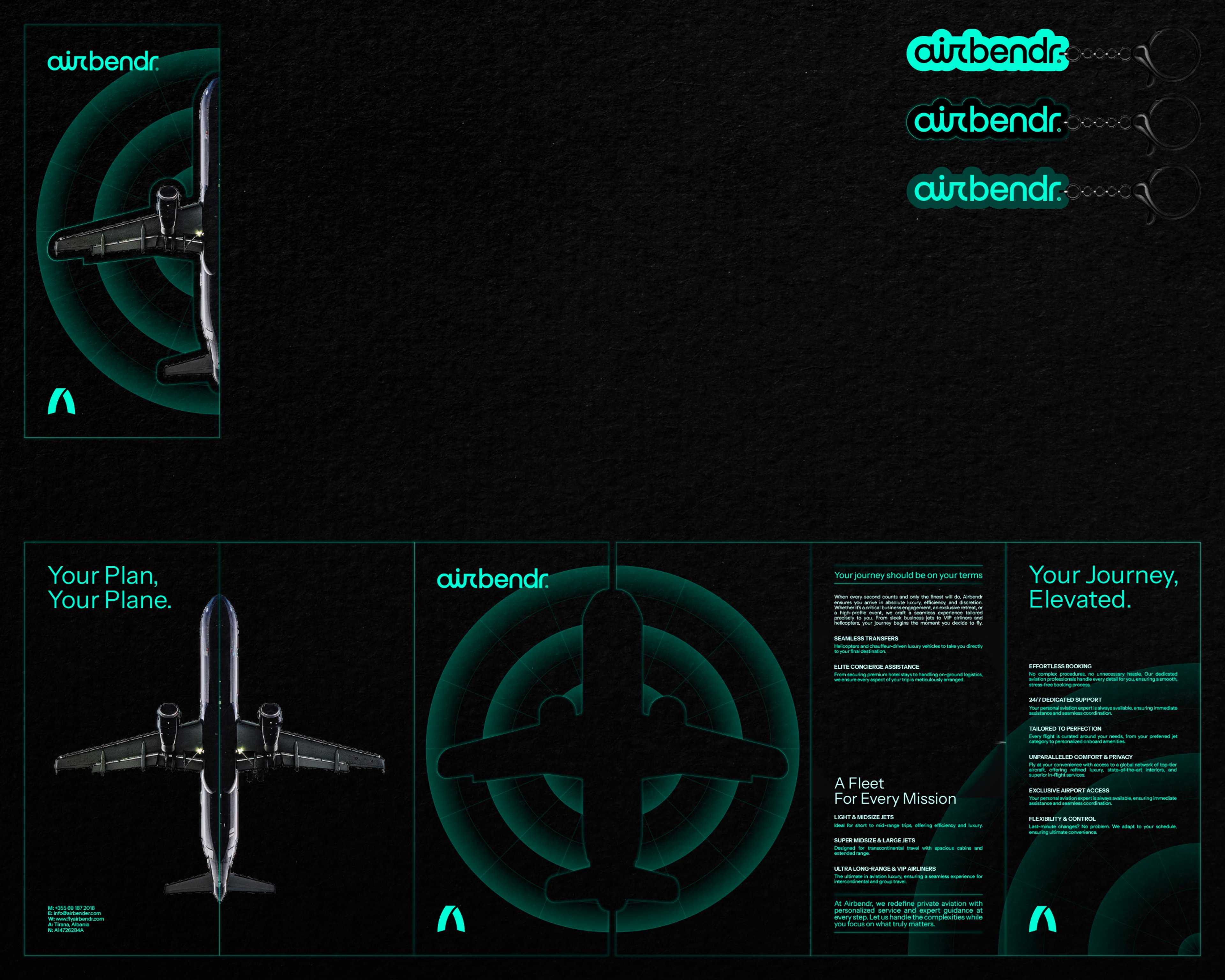
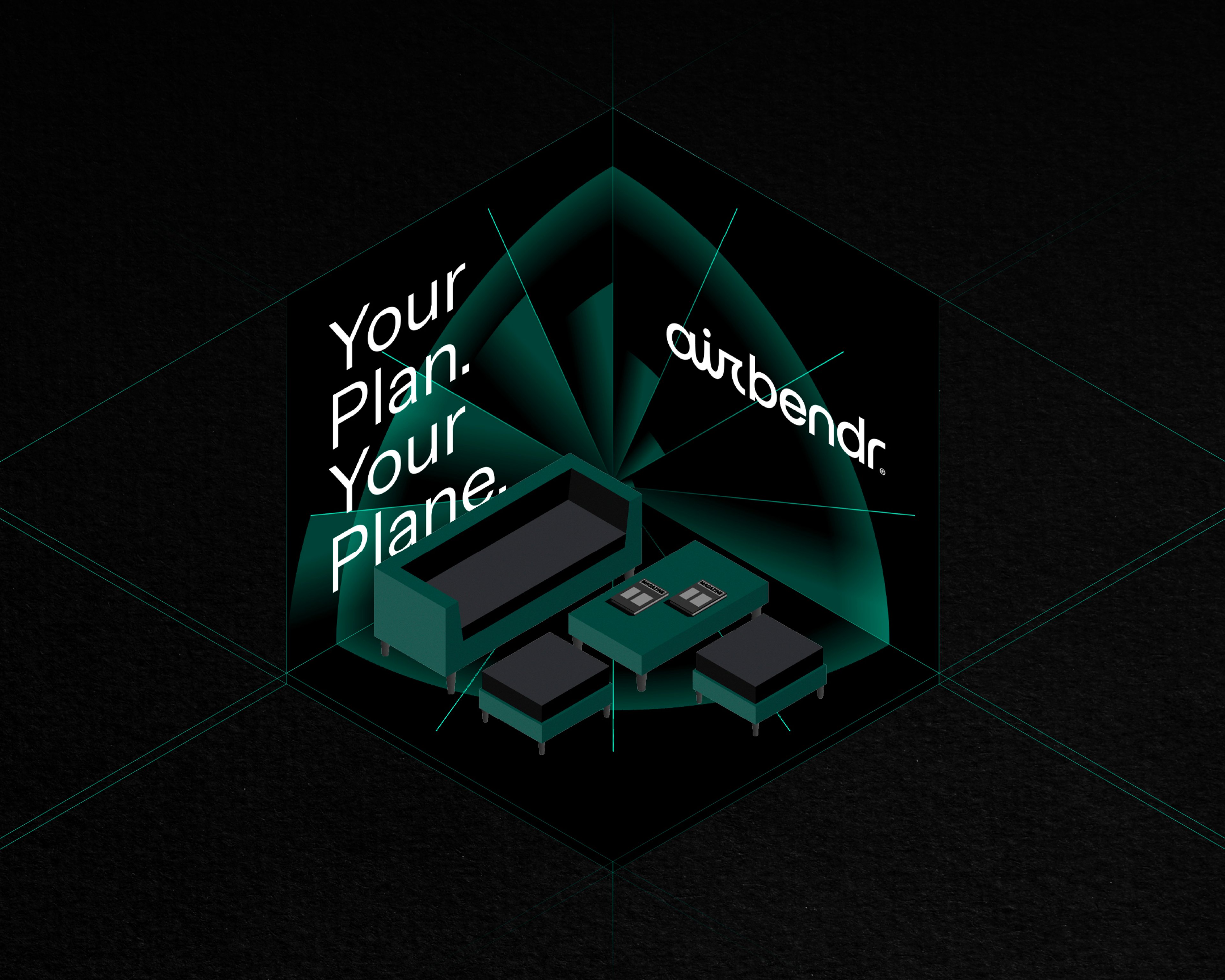
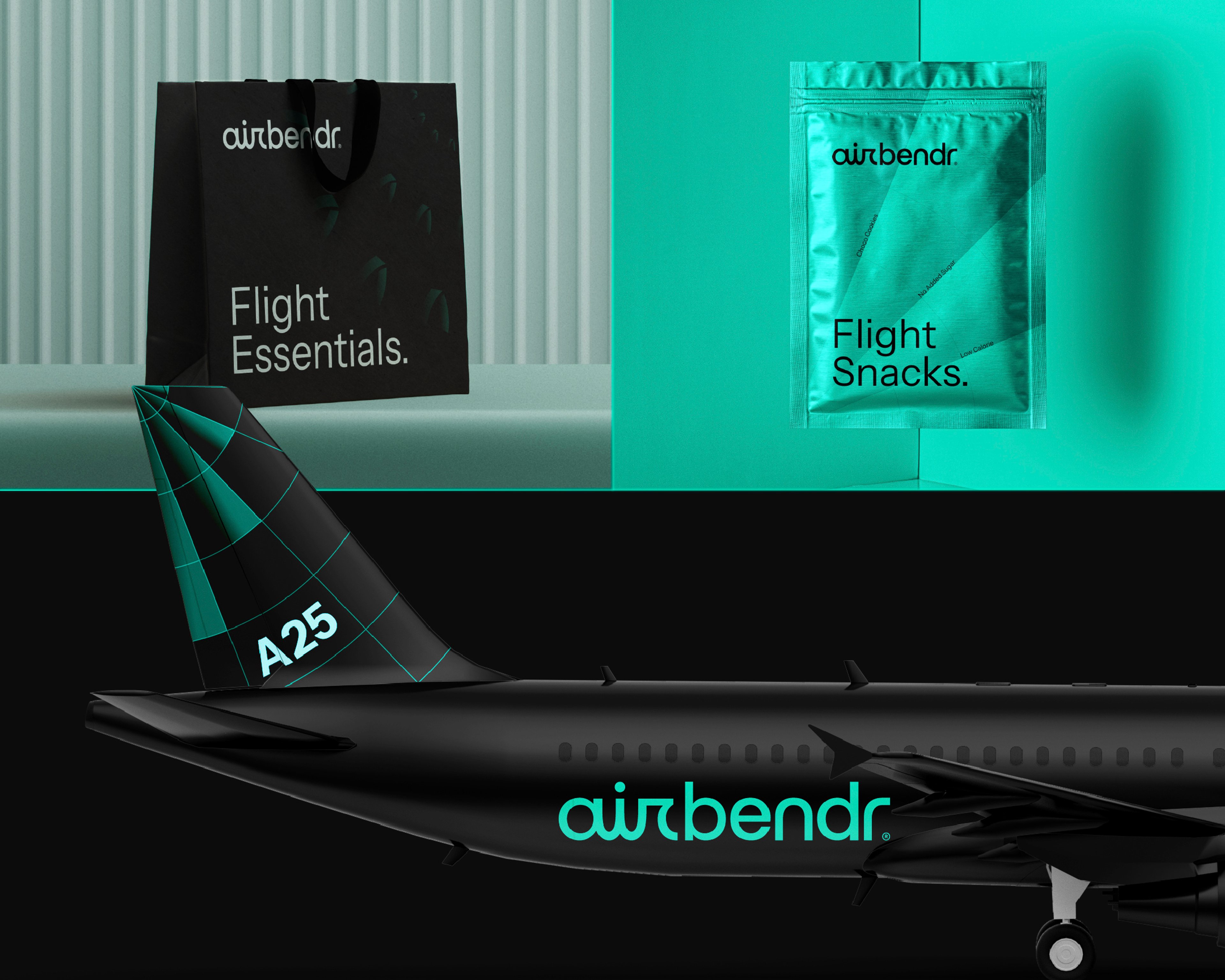
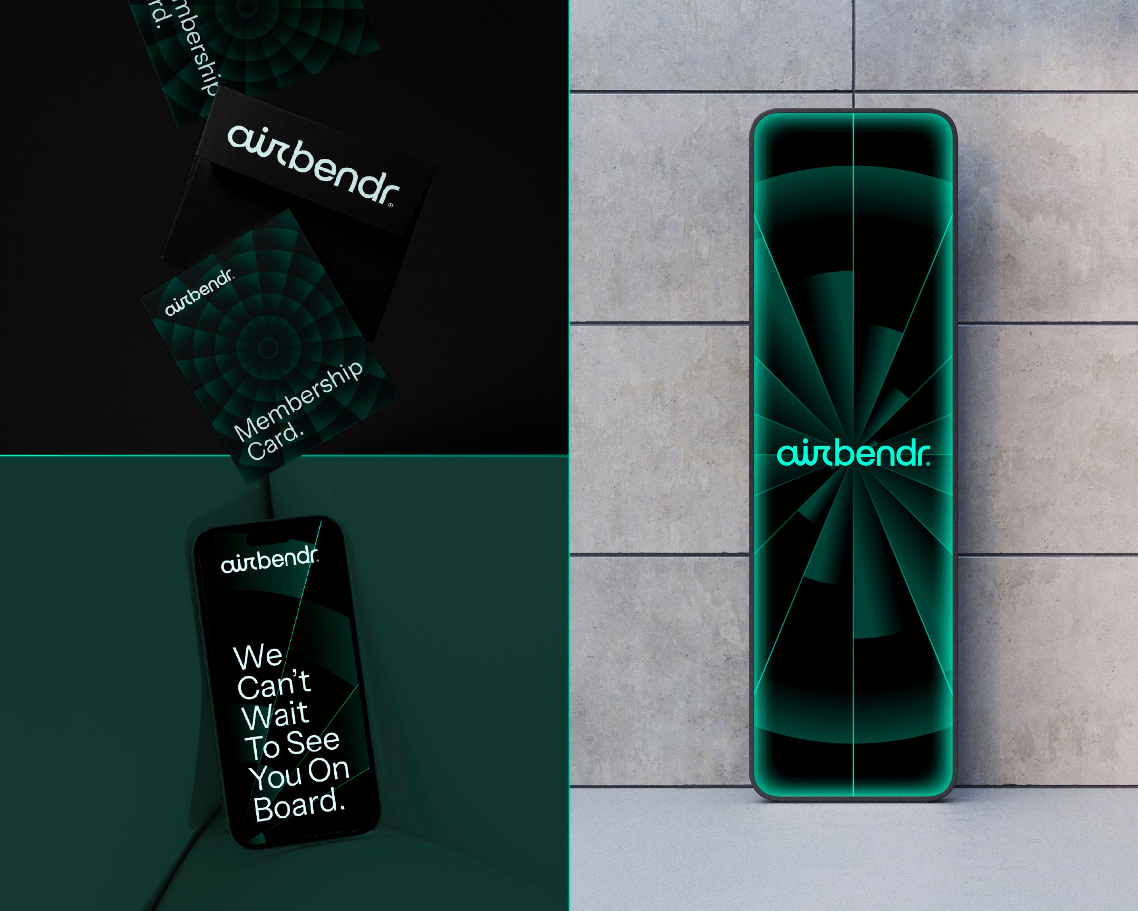
We built the identity around the idea of movement, drawing inspiration from aviation radars, jet propulsion, and the curved geometry of an aircraft tail where airflow changes direction. This form shaped both the logotype and symbol, creating a visual language centered on motion and precision. The wider graphic system references radar pulses and navigational symbols, giving the brand a clear, technical character while keeping the experience human and accessible. The result is an identity that goes beyond aviation itself, translating the idea of shaping air into a distinctive brand built around movement.


Overview
What if air wasn’t just traveled through, but shaped? That’s the vision we embraced when airbendr® came to us.
Challenge
The challenge was to create an identity for airbendr® that went beyond traditional aviation cues. The brand needed to express the idea of shaping and controlling airflow, combining technical precision with a sense of movement, innovation, and direction.
Solution
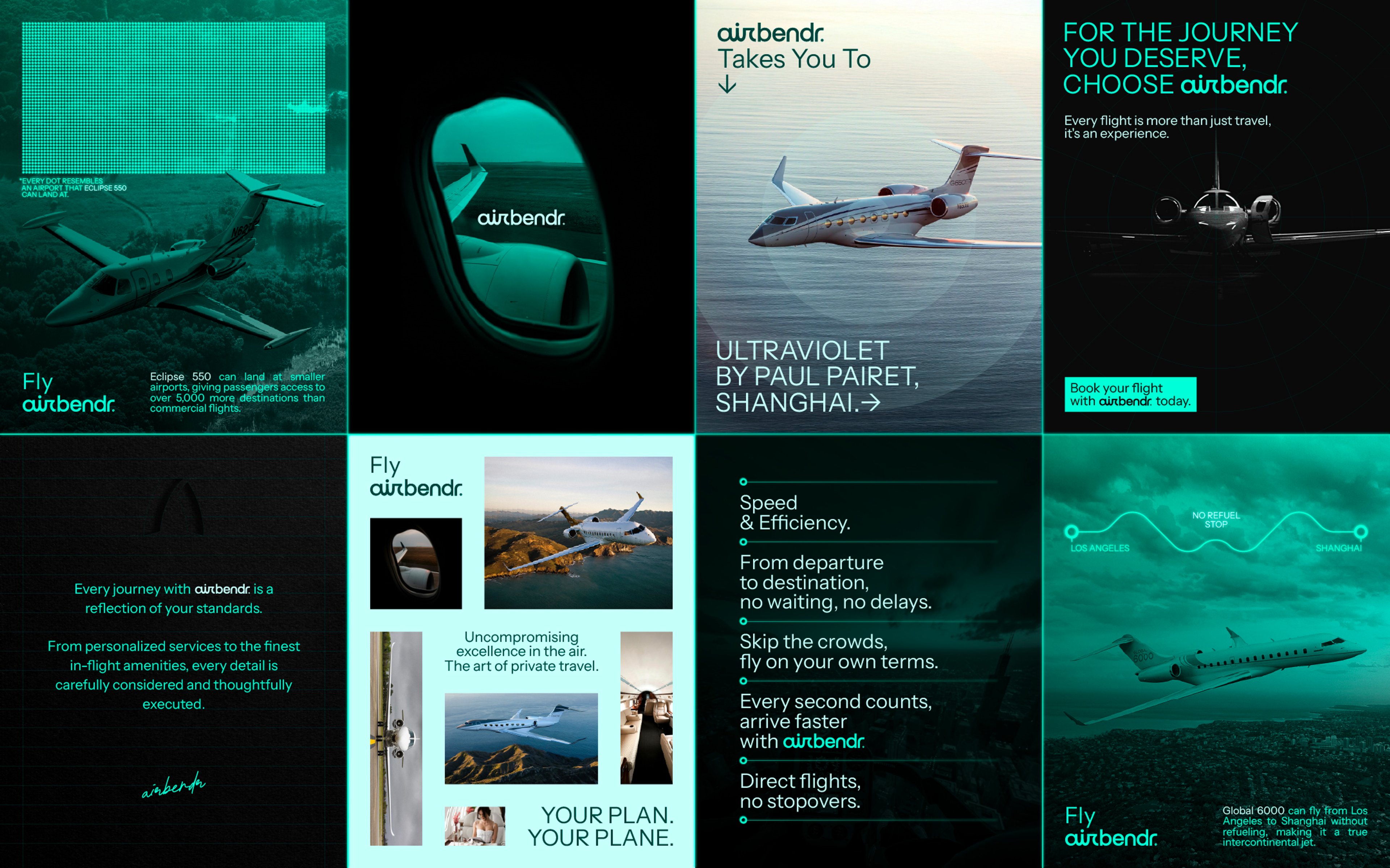
We built the identity around the idea of movement, drawing inspiration from aviation radars, jet propulsion, and the curved geometry of an aircraft tail where airflow changes direction. This form shaped both the logotype and symbol, creating a visual language centered on motion and precision. The wider graphic system references radar pulses and navigational symbols, giving the brand a clear, technical character while keeping the experience human and accessible. The result is an identity that goes beyond aviation itself, translating the idea of shaping air into a distinctive brand built around movement.
Your turn
What are we shaping next?
Tell us what you have in mind. It can be a clear brief or just the start of an idea. We’ll help shape the next steps and keep everything simple from there.