AOOS®Made to be HERD.
Overview
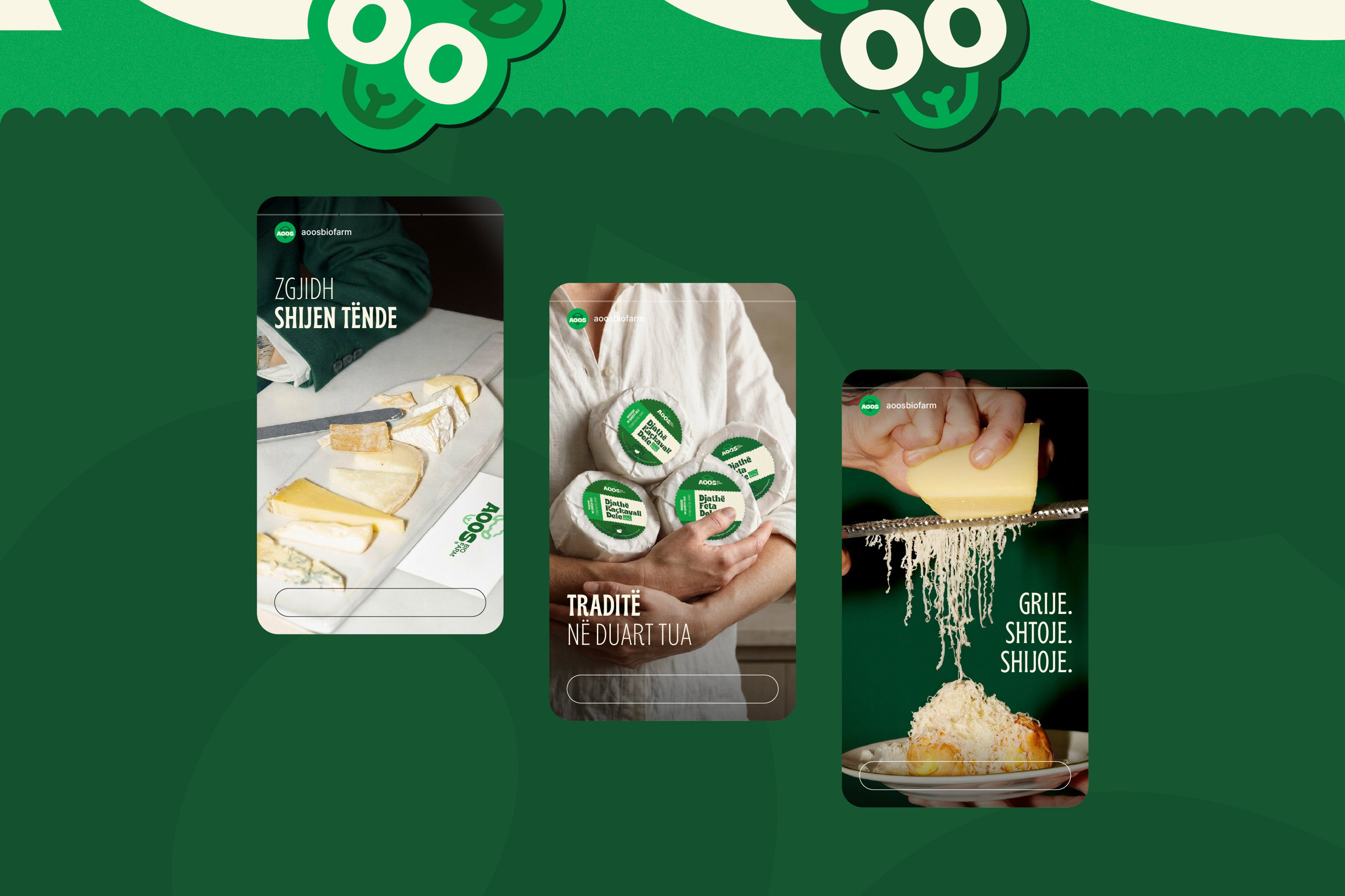
AOOS® is a bio farm brand built around freshness, natural quality, and everyday trust. The visual identity was developed to express these values through a warm, approachable character that feels familiar, distinctive, and easy to recognize across every customer touchpoint.
Challenge
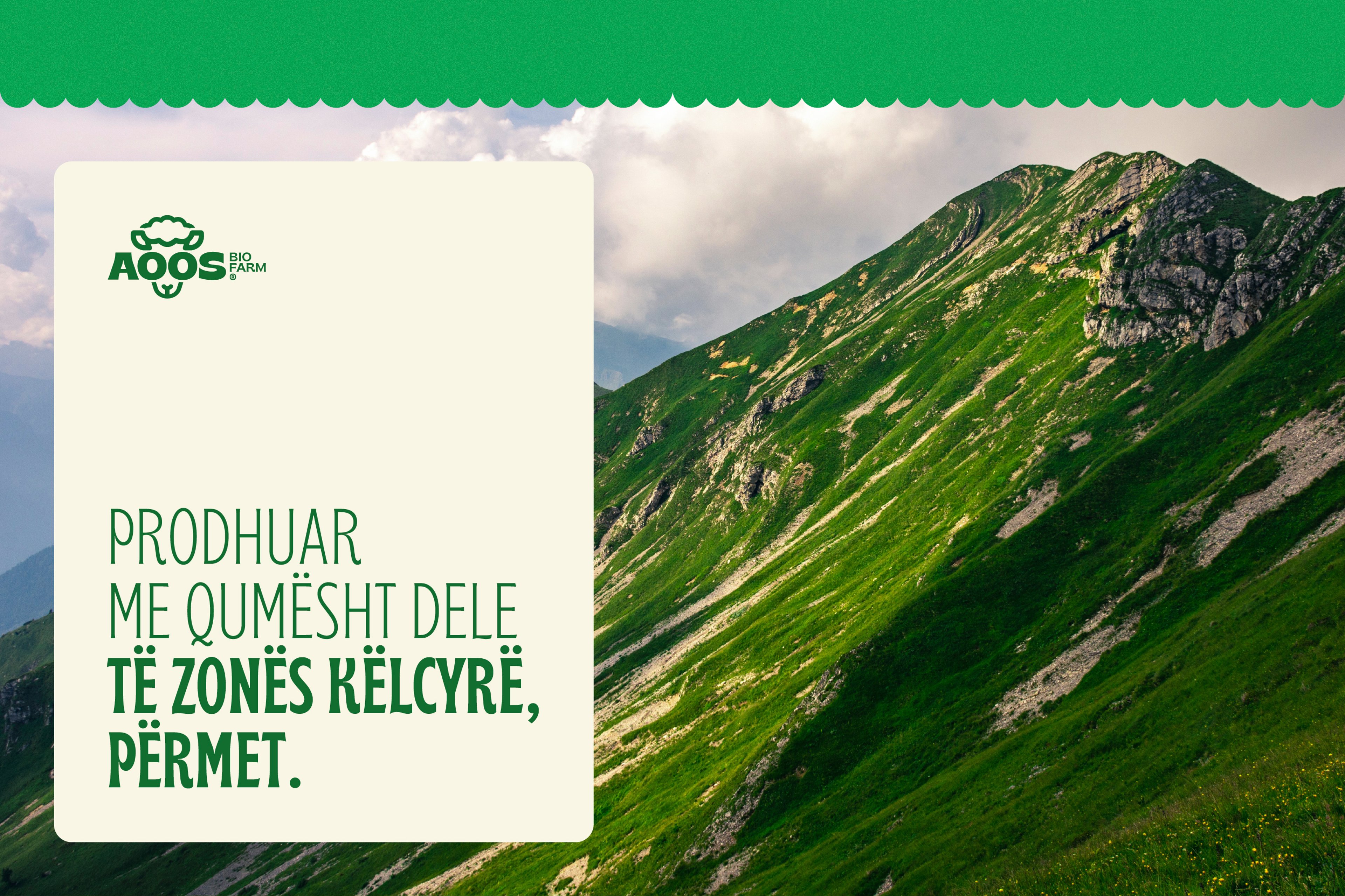
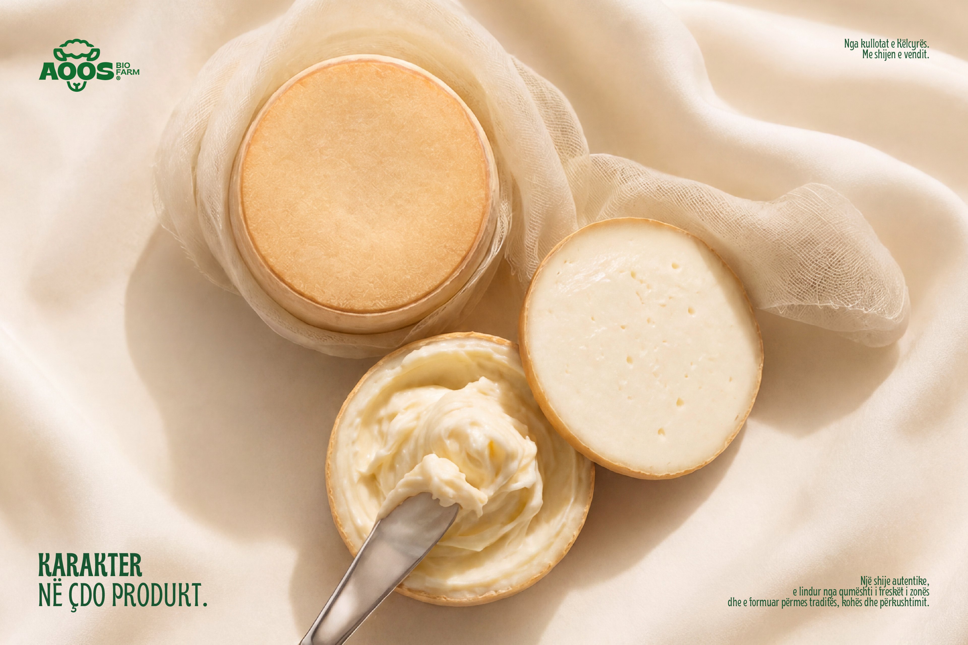
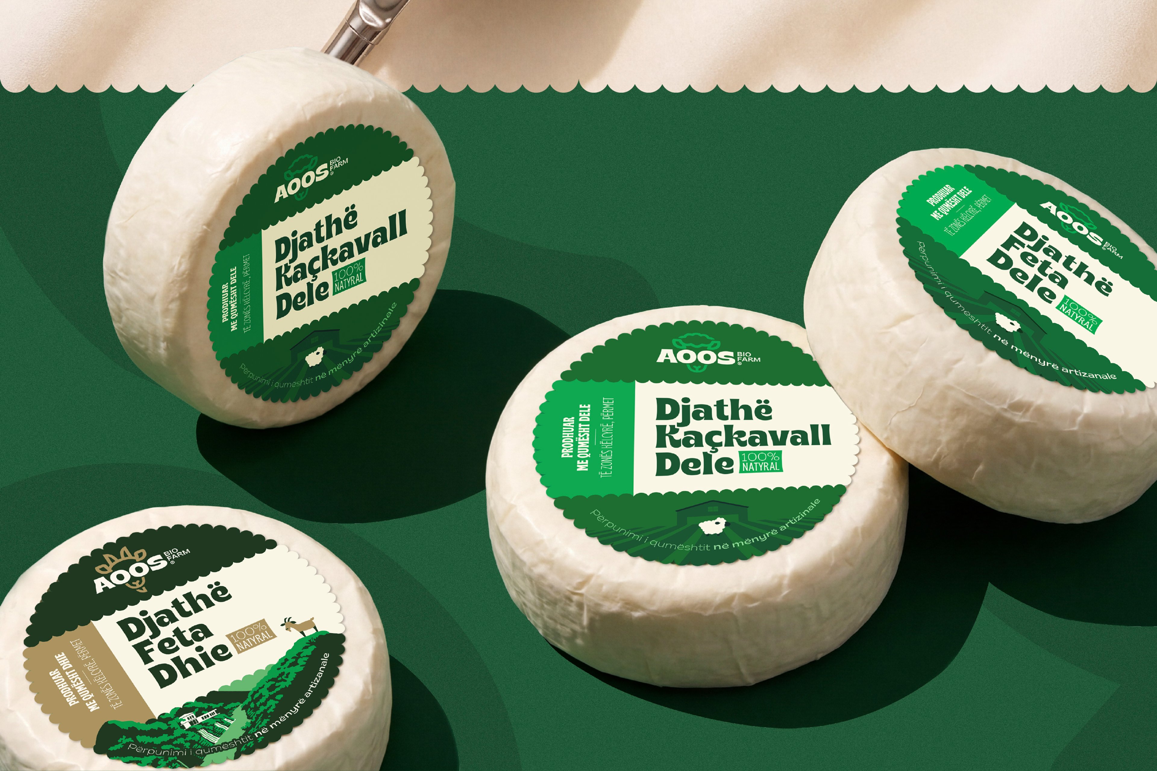
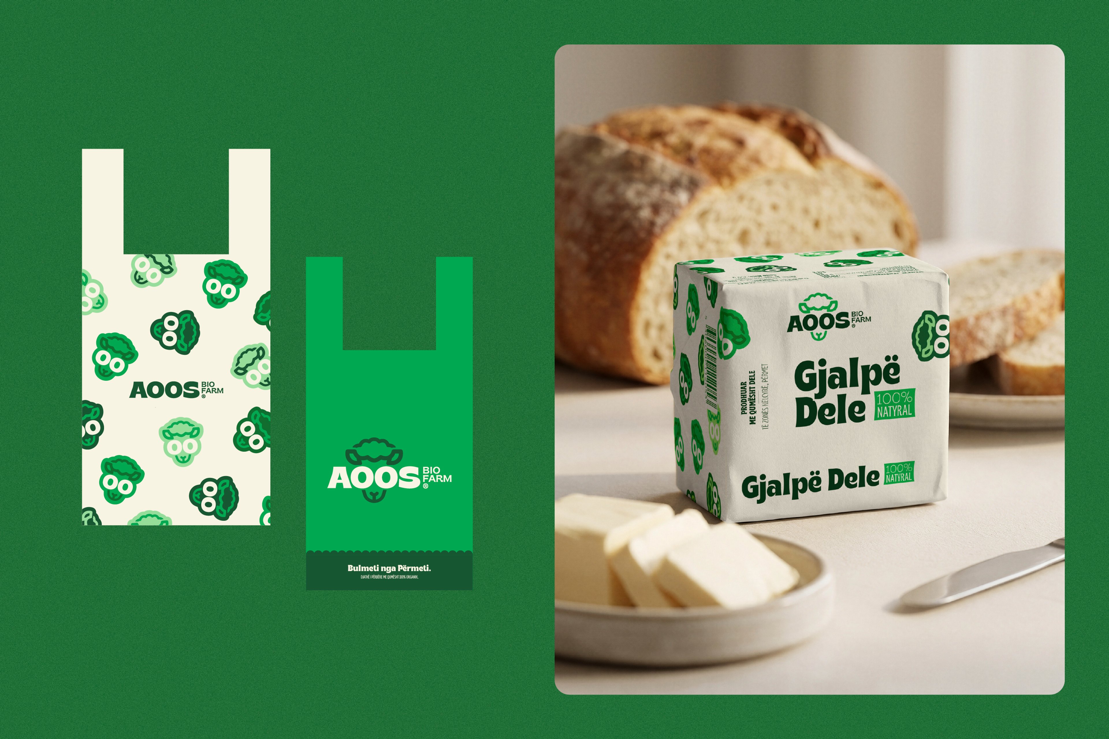
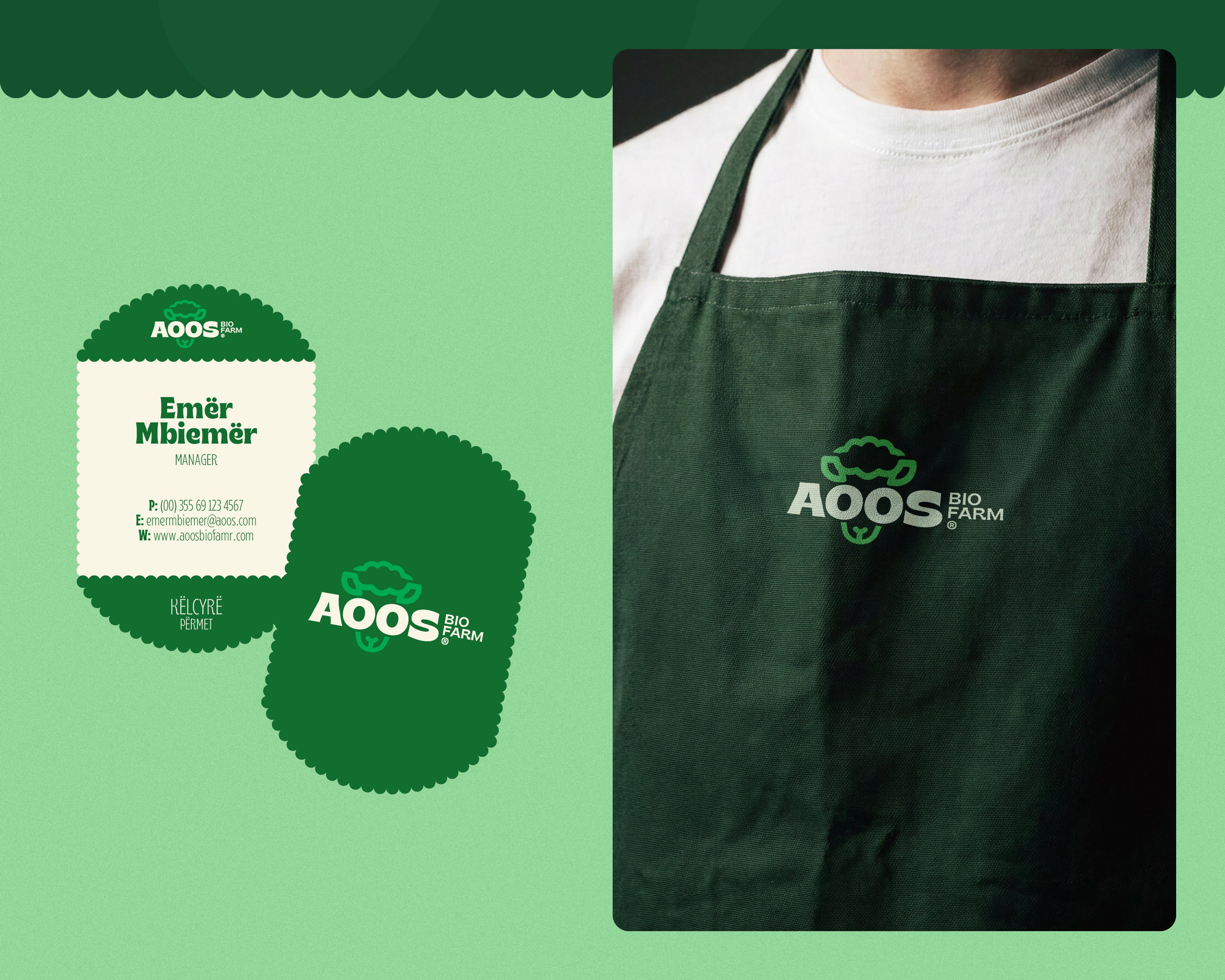
The challenge was to create a brand identity that felt both modern and approachable, while staying closely connected to the brand's natural roots. AOOS® needed a strong visual presence that could stand out clearly across packaging, signage, and retail applications without losing its sense of authenticity.
Solution
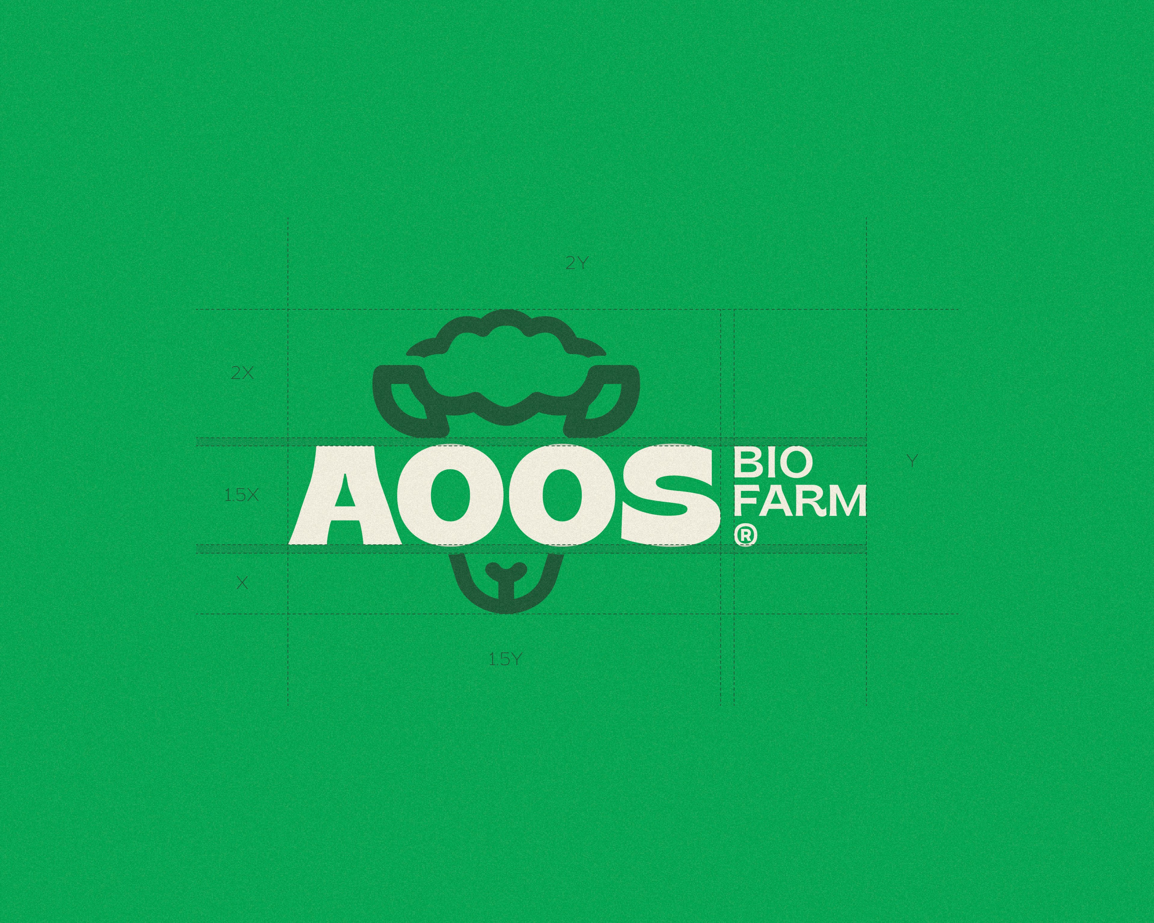
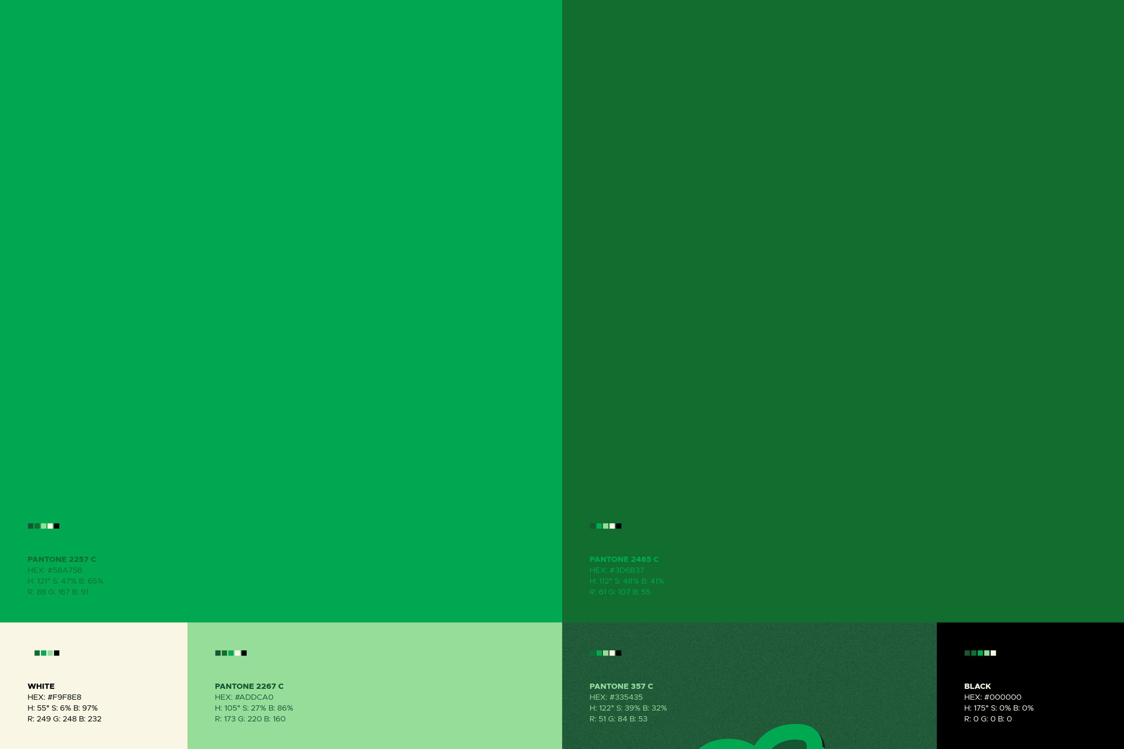
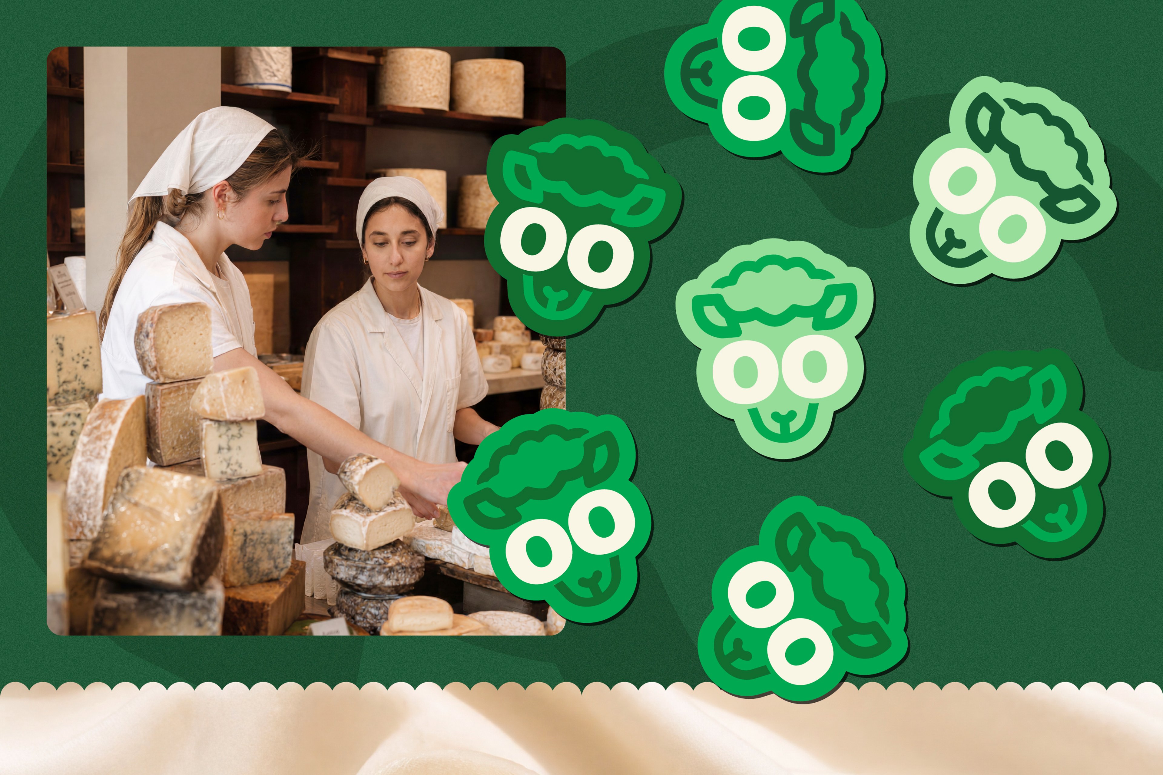
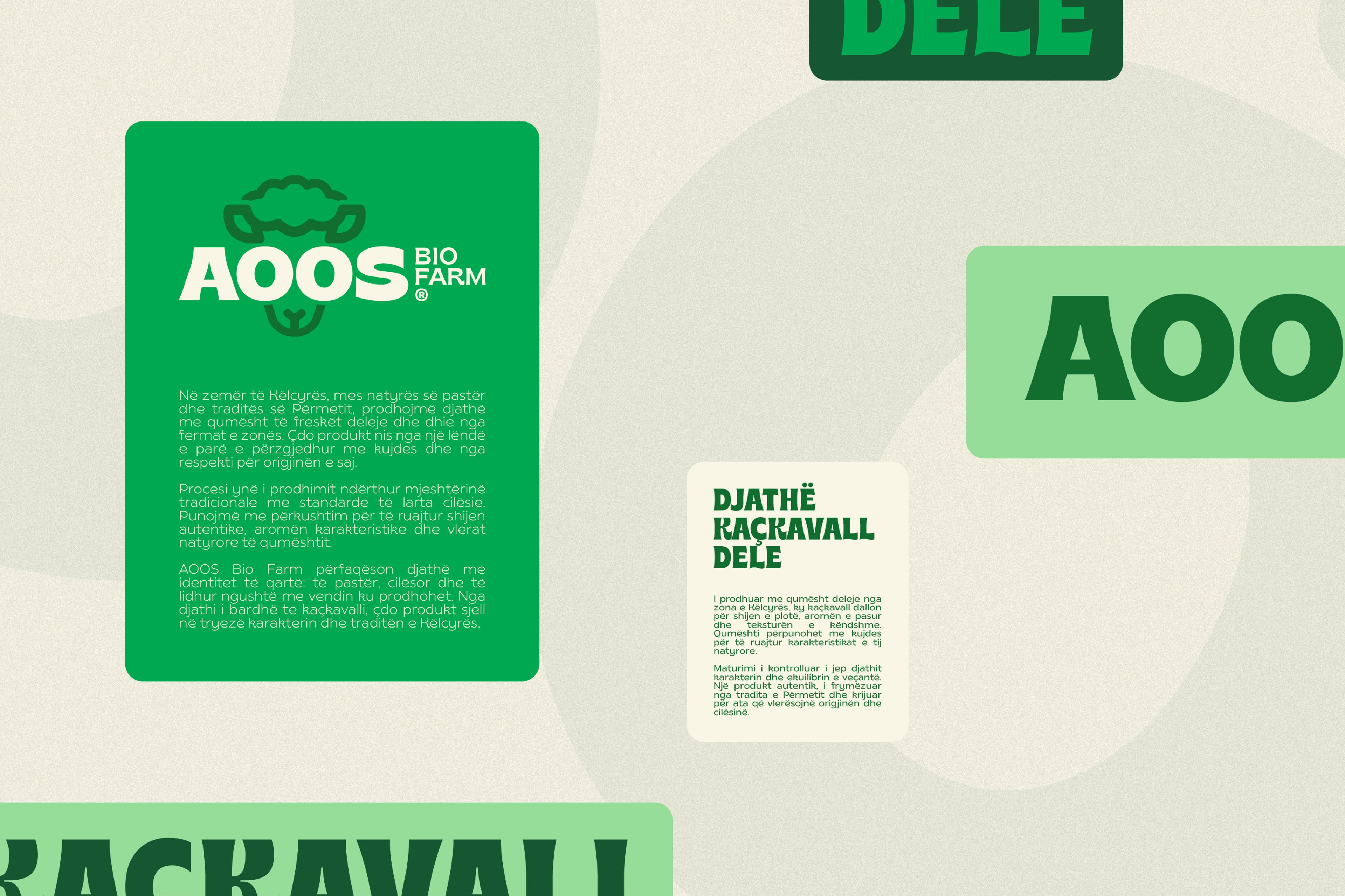
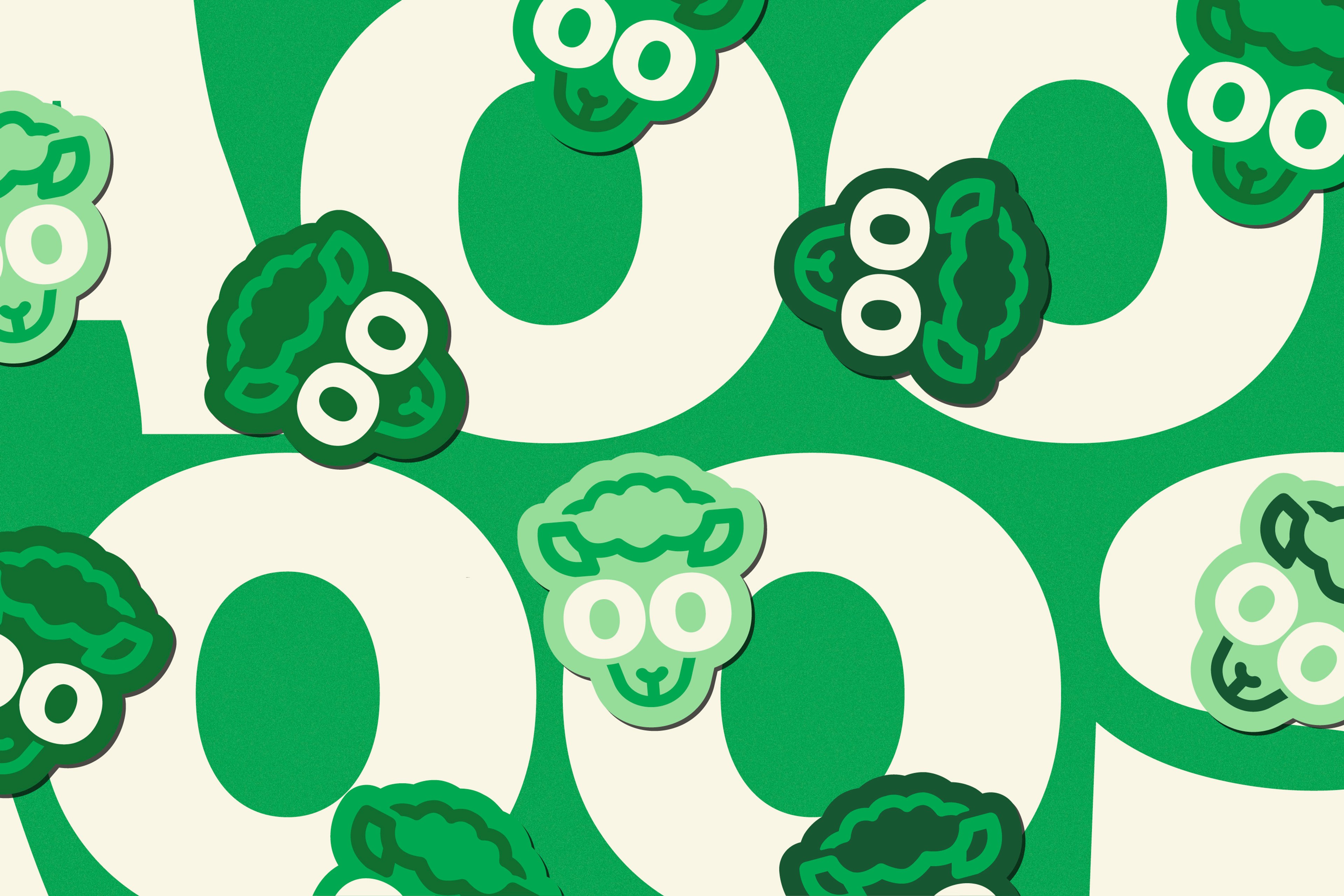
We designed a bold and memorable identity system centered around a playful yet refined logo, inspired by the sheep's facial features. Combined with rounded typography, balanced proportions, and a flexible visual language, the result is a cohesive brand system that feels friendly, recognizable, and highly adaptable across all brand expressions.
Overview
AOOS® is a bio farm brand built around freshness, natural quality, and everyday trust. The visual identity was developed to express these values through a warm, approachable character that feels familiar, distinctive, and easy to recognize across every customer touchpoint.
Challenge
The challenge was to create a brand identity that felt both modern and approachable, while staying closely connected to the brand's natural roots. AOOS® needed a strong visual presence that could stand out clearly across packaging, signage, and retail applications without losing its sense of authenticity.
Solution
We designed a bold and memorable identity system centered around a playful yet refined logo, inspired by the sheep's facial features. Combined with rounded typography, balanced proportions, and a flexible visual language, the result is a cohesive brand system that feels friendly, recognizable, and highly adaptable across all brand expressions.