Overview
ASF® is built around a clear belief: financial development should be accessible, responsible, and based on partnership. Their work connects individuals and institutions through programs designed to create long-term impact. As the organization grew, they realized that the way they looked did not fully reflect the way they worked. Their branding and identity needed to communicate trust, continuity, and structure in a way that felt clear and human.
Challenge
ASF® needed an identity that could communicate trust and stability without feeling distant or overly corporate. The system also had to bring together different programs, reports, campaigns, presentations, and digital touchpoints under one consistent visual language. The challenge was to create structure without losing the human and collaborative character of the organization.
Solution
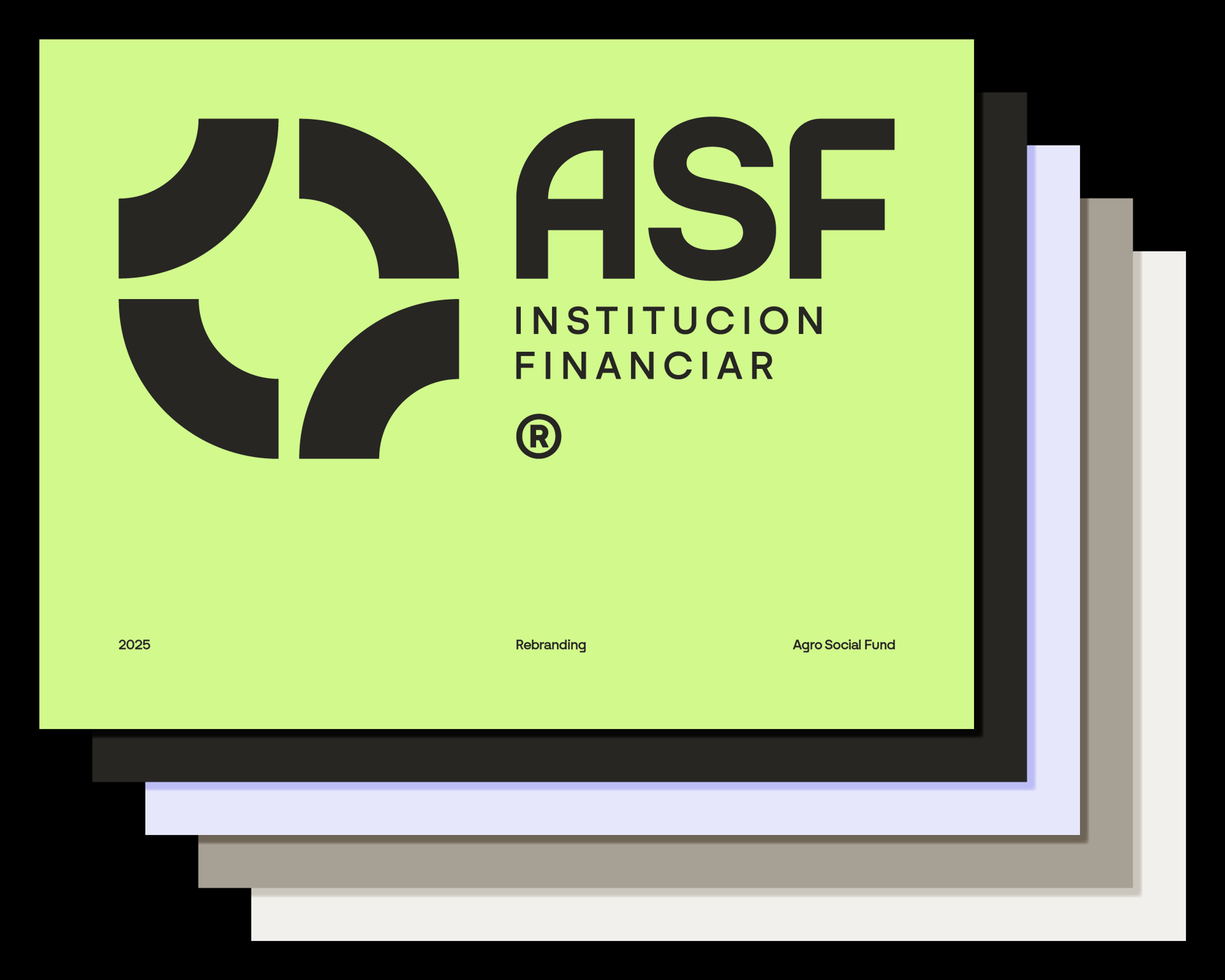
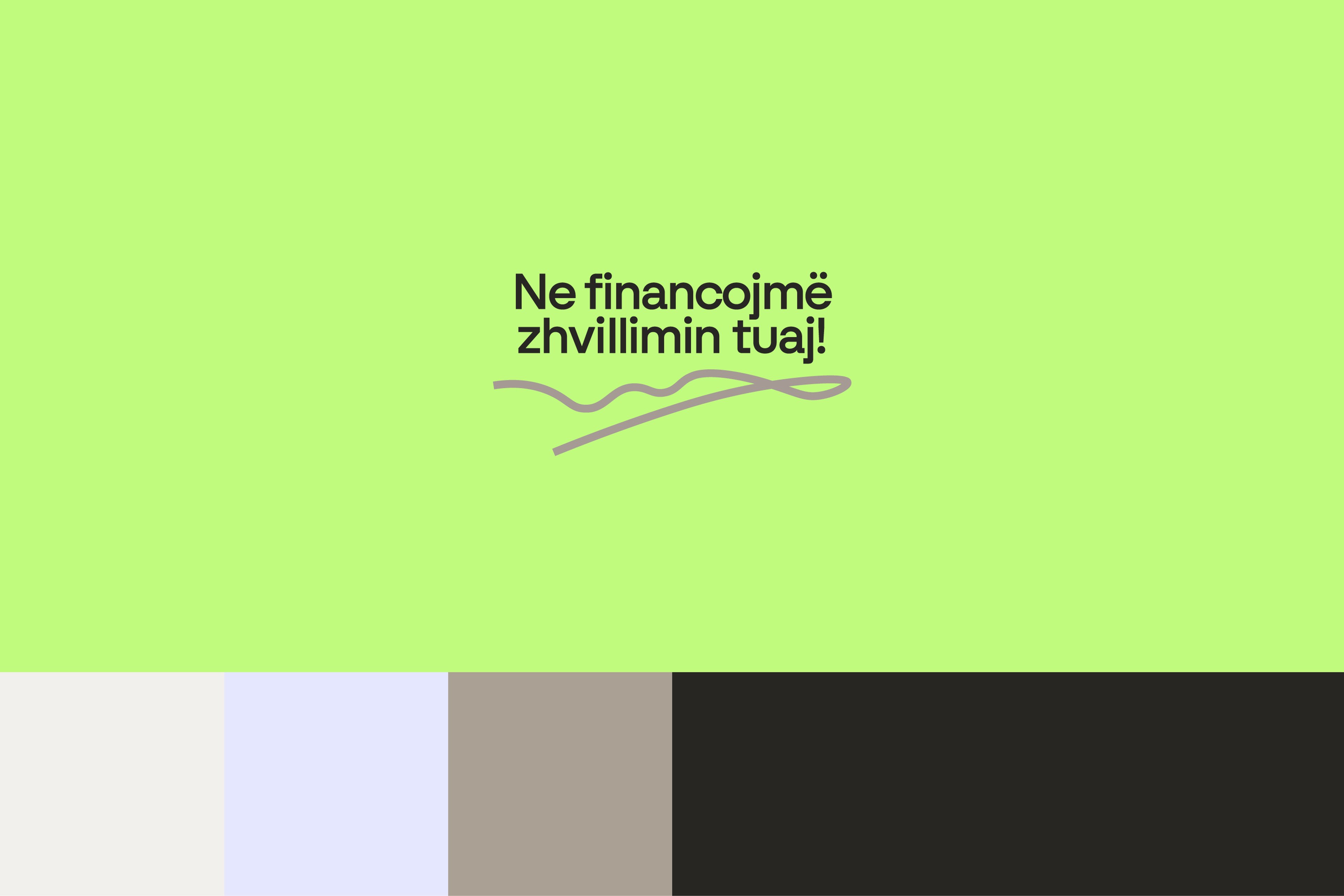
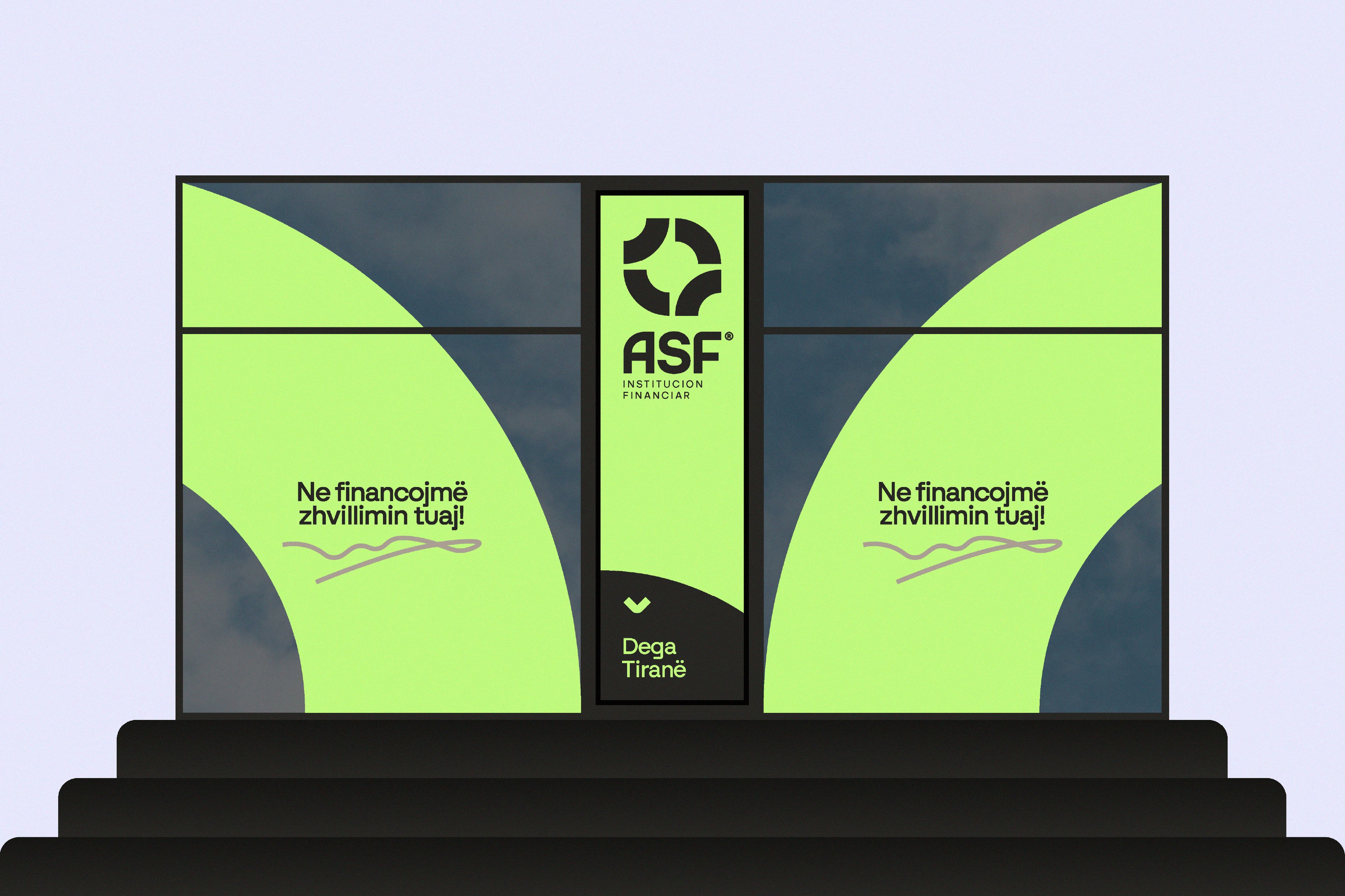
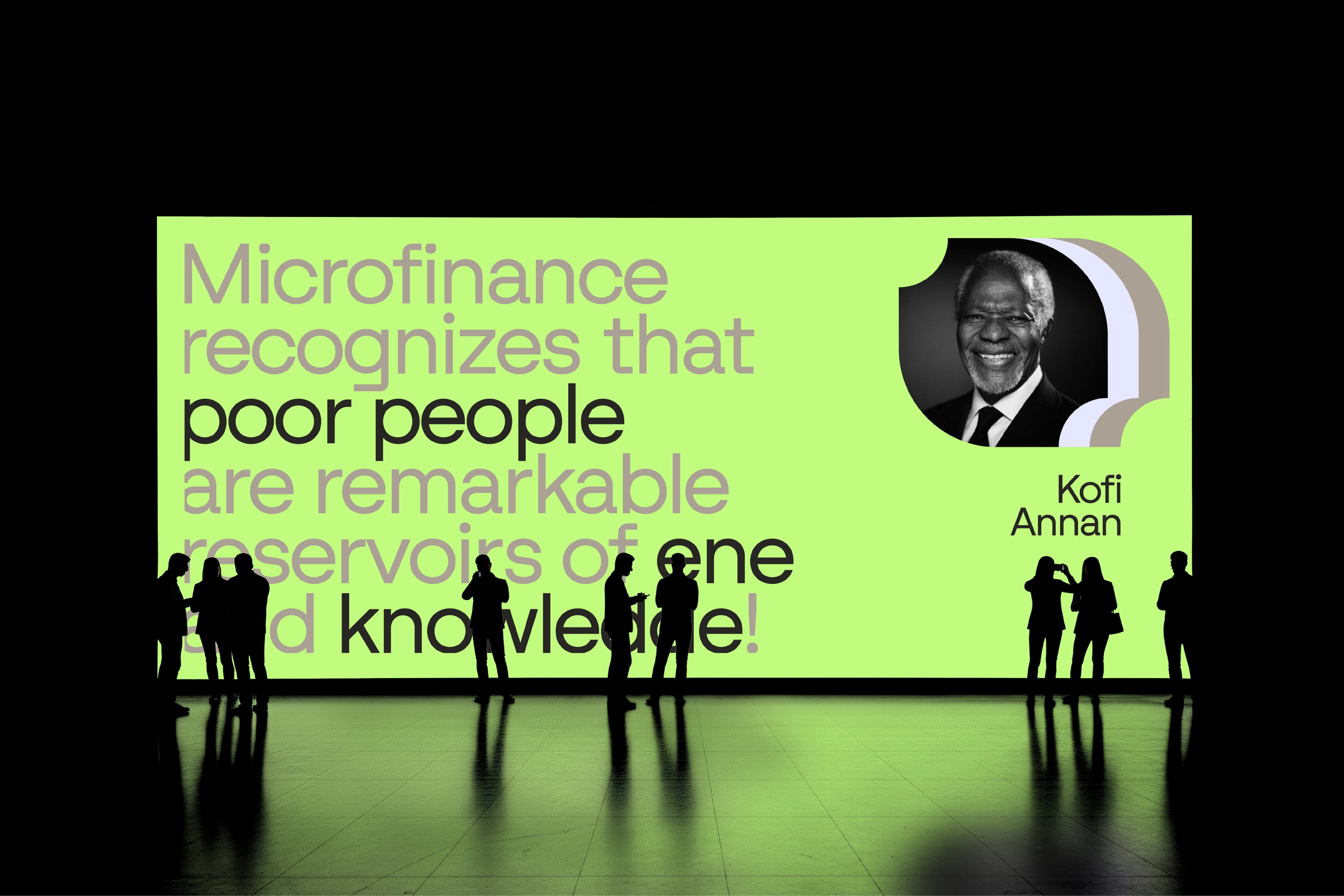
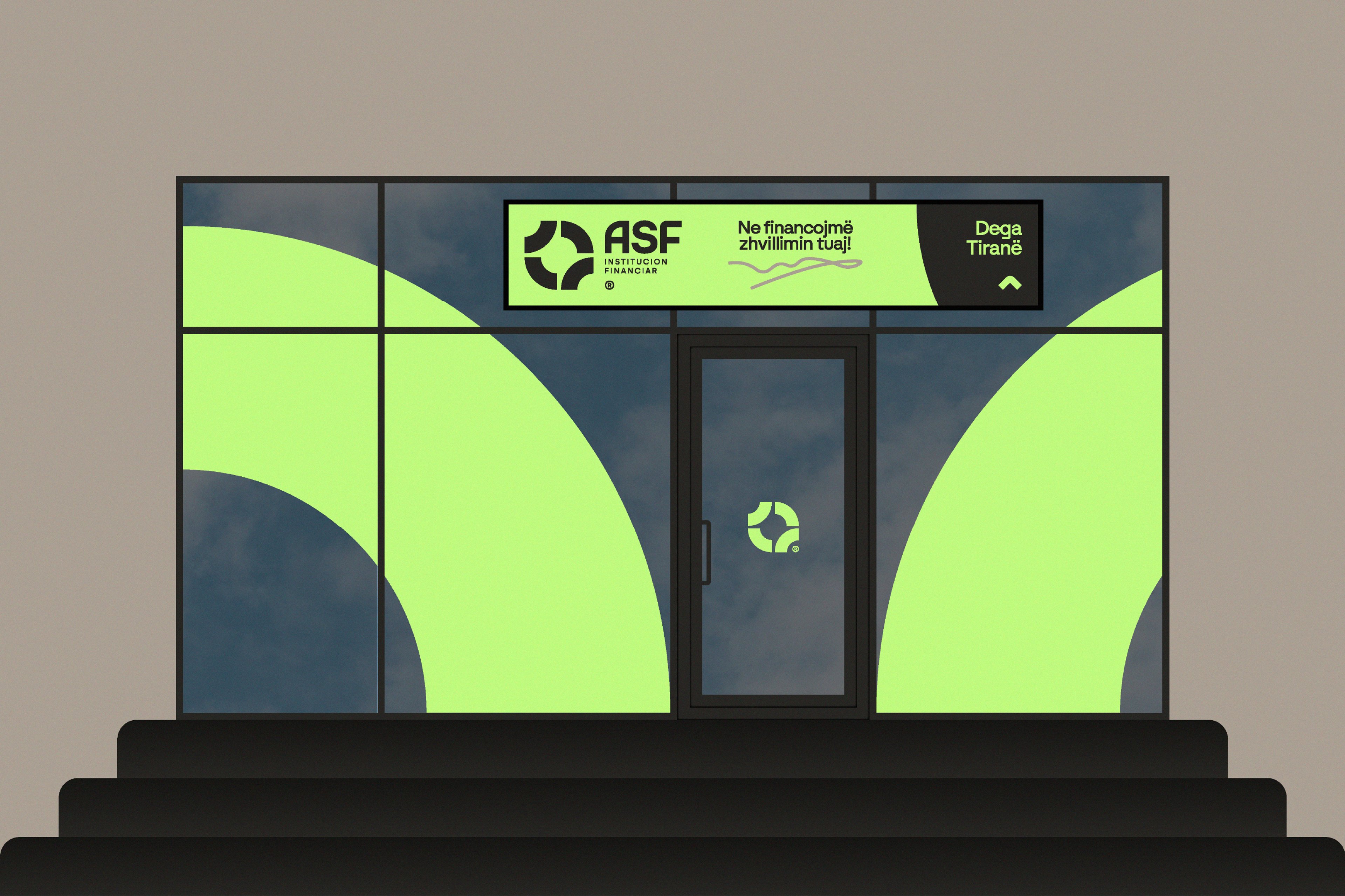
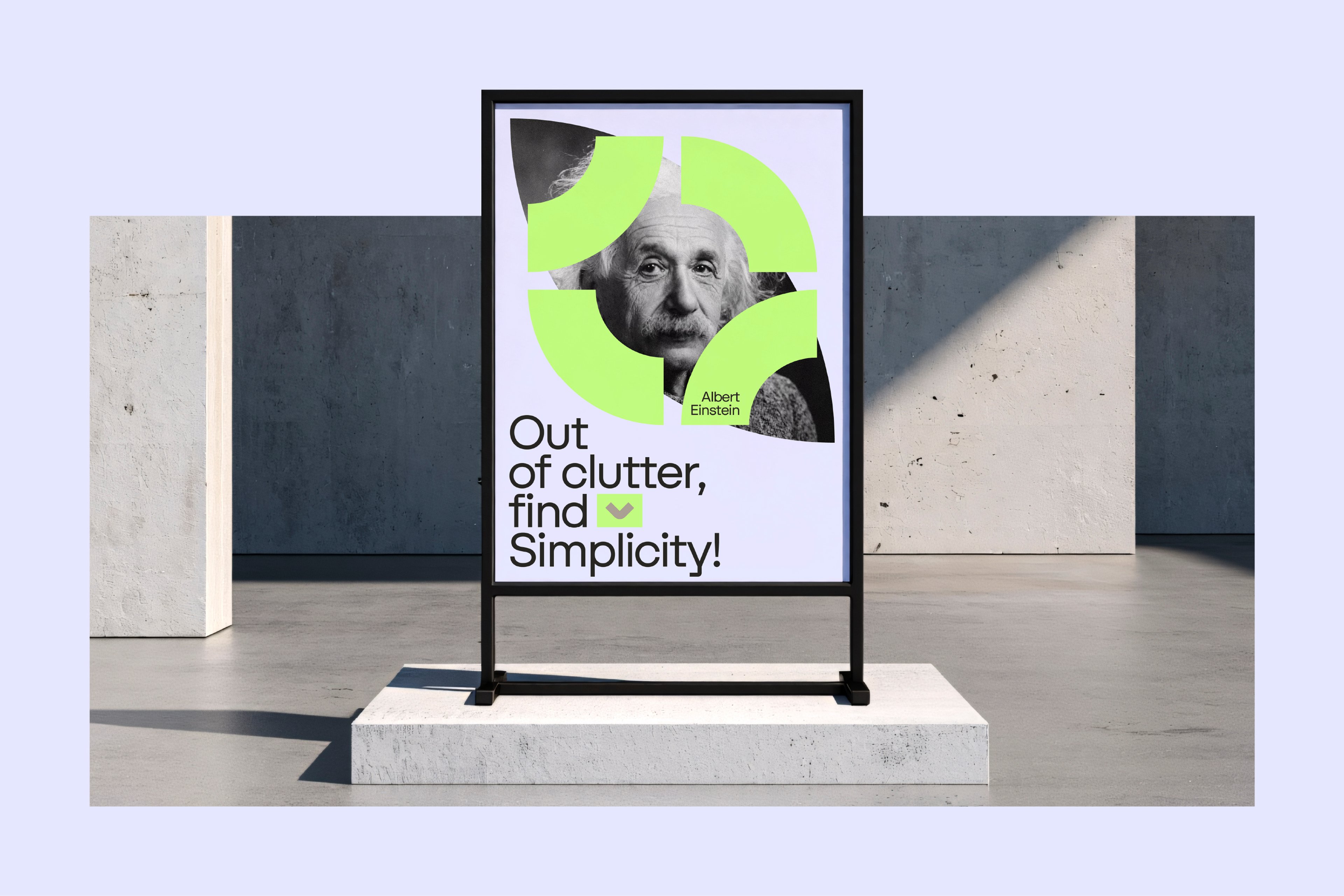
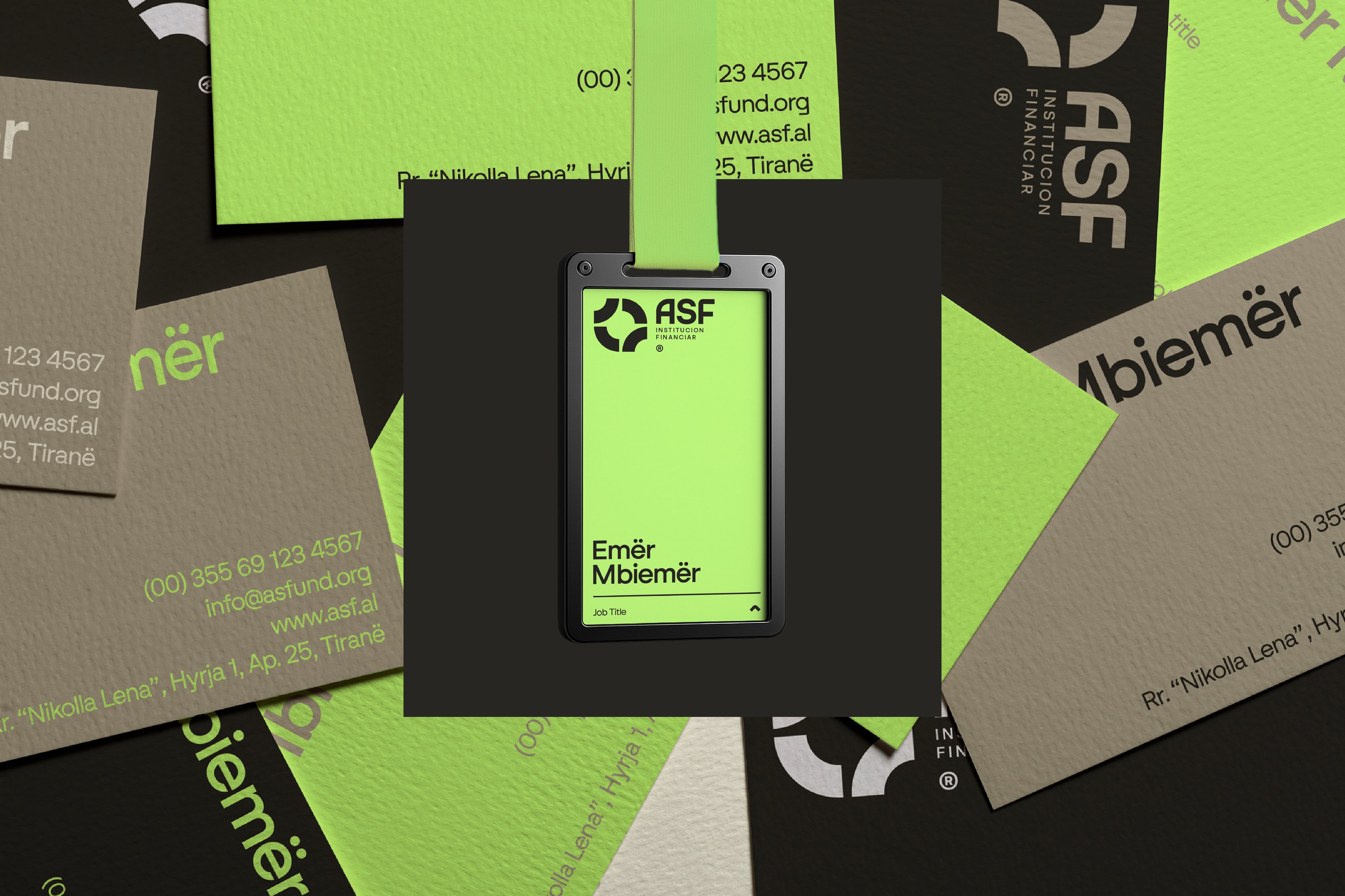
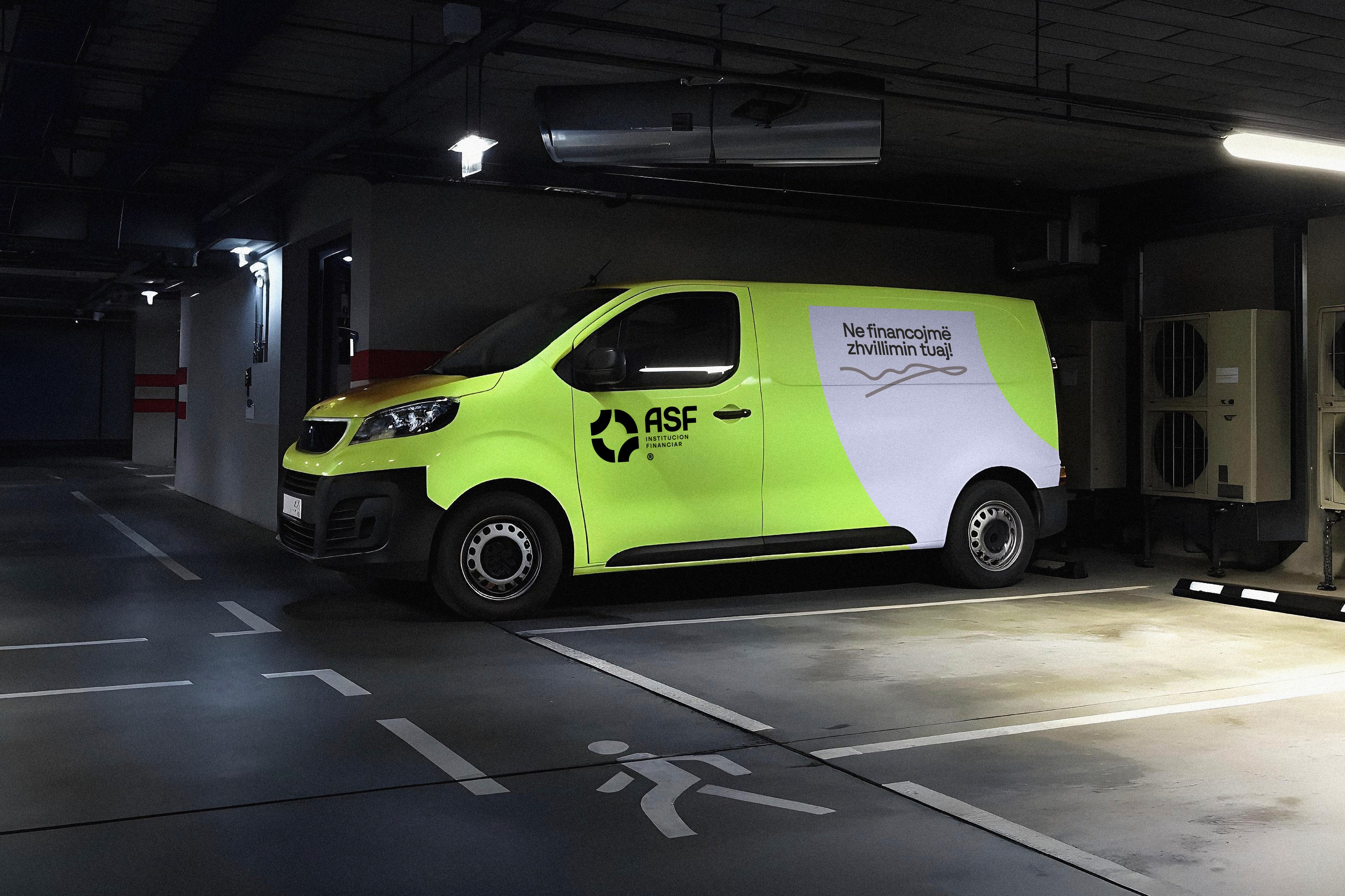
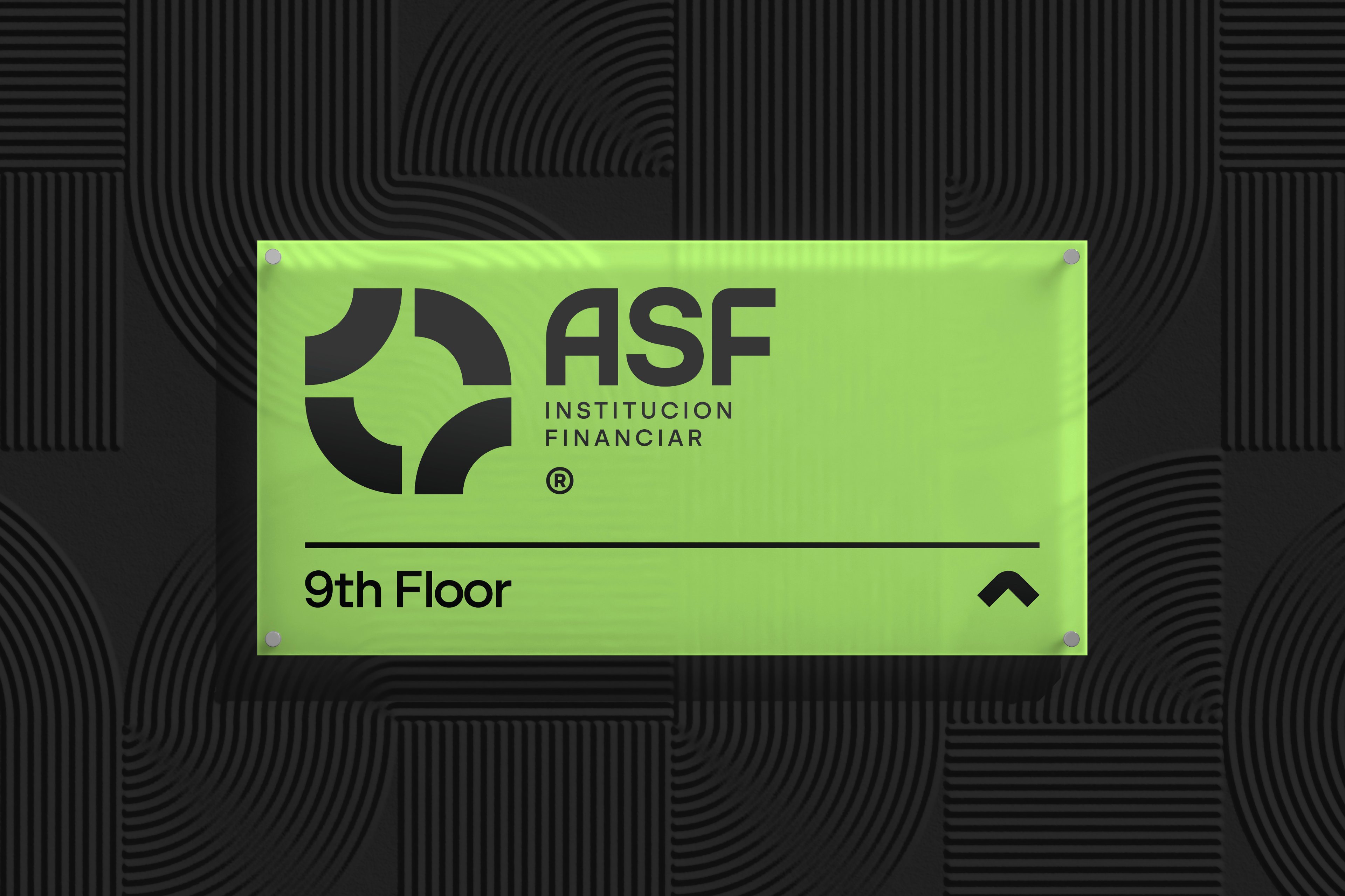
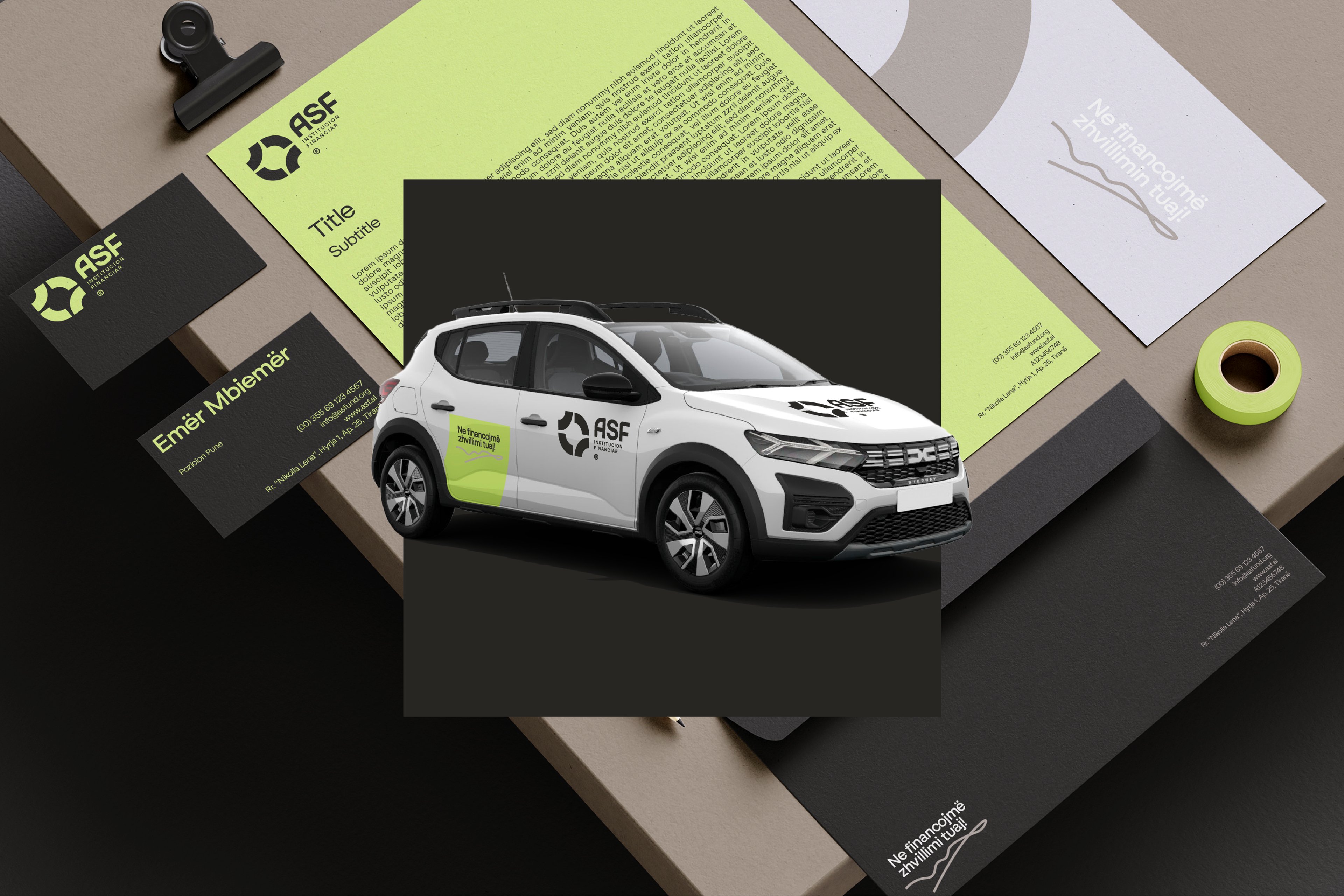
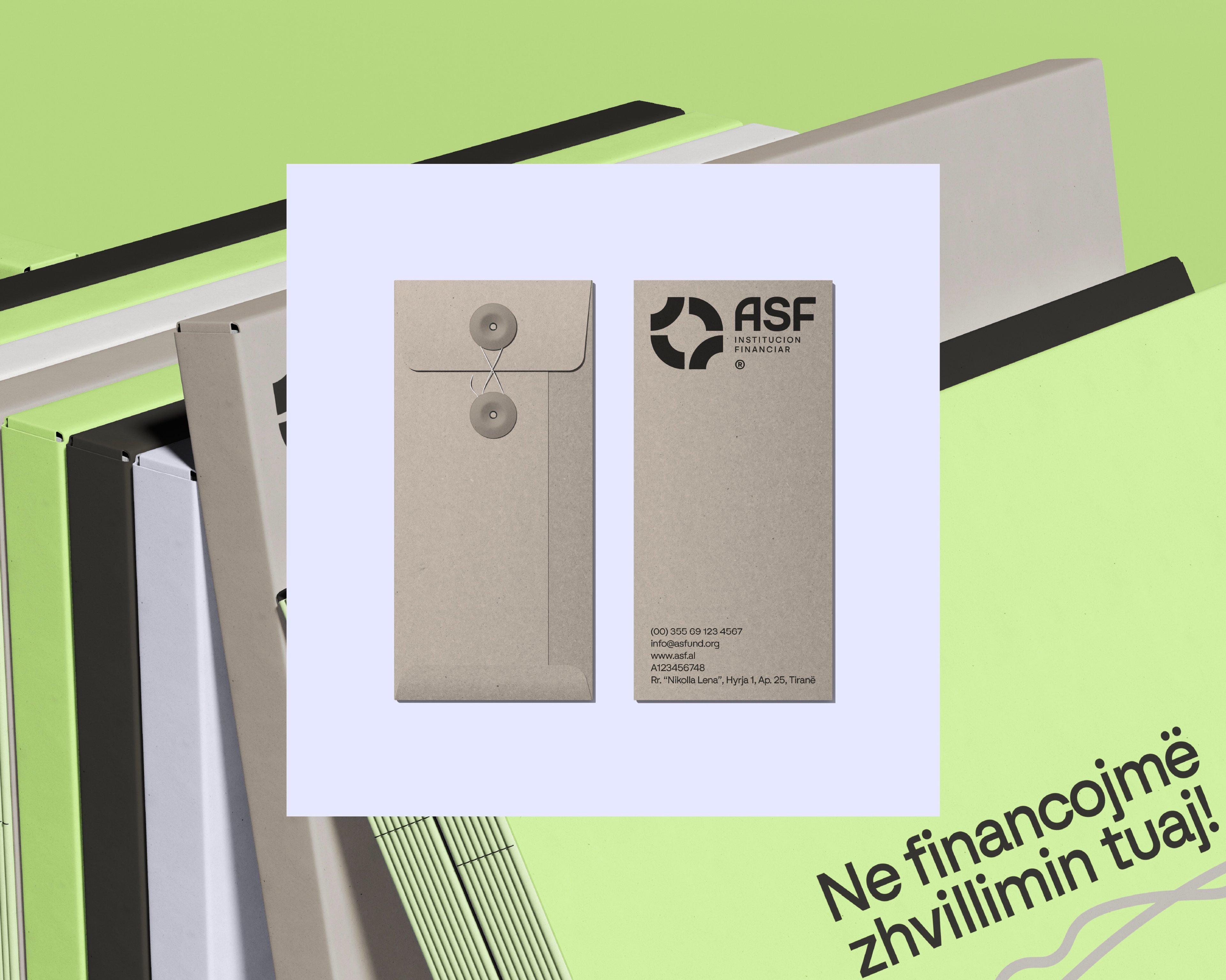
We built the identity around a circular system that became the core visual device across the brand, representing continuity, shared responsibility, and progress. The framework was designed to scale across reports, campaigns, presentations, and digital platforms, supported by a restrained color palette, clear typography, and imagery that reinforces the message rather than competing with it. The result is a consistent and flexible system that gives ASF® a stronger, more recognizable presence across every touchpoint.



Overview
ASF® is built around a clear belief: financial development should be accessible, responsible, and based on partnership. Their work connects individuals and institutions through programs designed to create long-term impact. As the organization grew, they realized that the way they looked did not fully reflect the way they worked. Their branding and identity needed to communicate trust, continuity, and structure in a way that felt clear and human.
Challenge
ASF® needed an identity that could communicate trust and stability without feeling distant or overly corporate. The system also had to bring together different programs, reports, campaigns, presentations, and digital touchpoints under one consistent visual language. The challenge was to create structure without losing the human and collaborative character of the organization.
Solution
We built the identity around a circular system that became the core visual device across the brand, representing continuity, shared responsibility, and progress. The framework was designed to scale across reports, campaigns, presentations, and digital platforms, supported by a restrained color palette, clear typography, and imagery that reinforces the message rather than competing with it. The result is a consistent and flexible system that gives ASF® a stronger, more recognizable presence across every touchpoint.
Your turn
What are we shaping next?
Tell us what you have in mind. It can be a clear brief or just the start of an idea. We’ll help shape the next steps and keep everything simple from there.