Hako®Simply Delicious!.
Overview
In the dynamic world of processed meat products, HAKO® has carved its niche as a premier brand in Albania. Their iconic products, "E Tymosur" and "Hot Dog", have become synonymous with quality and taste. But after 12 years, it was time for a fresh face, and they turned to BoldCrest for a transformative rebranding experience.
Challenge
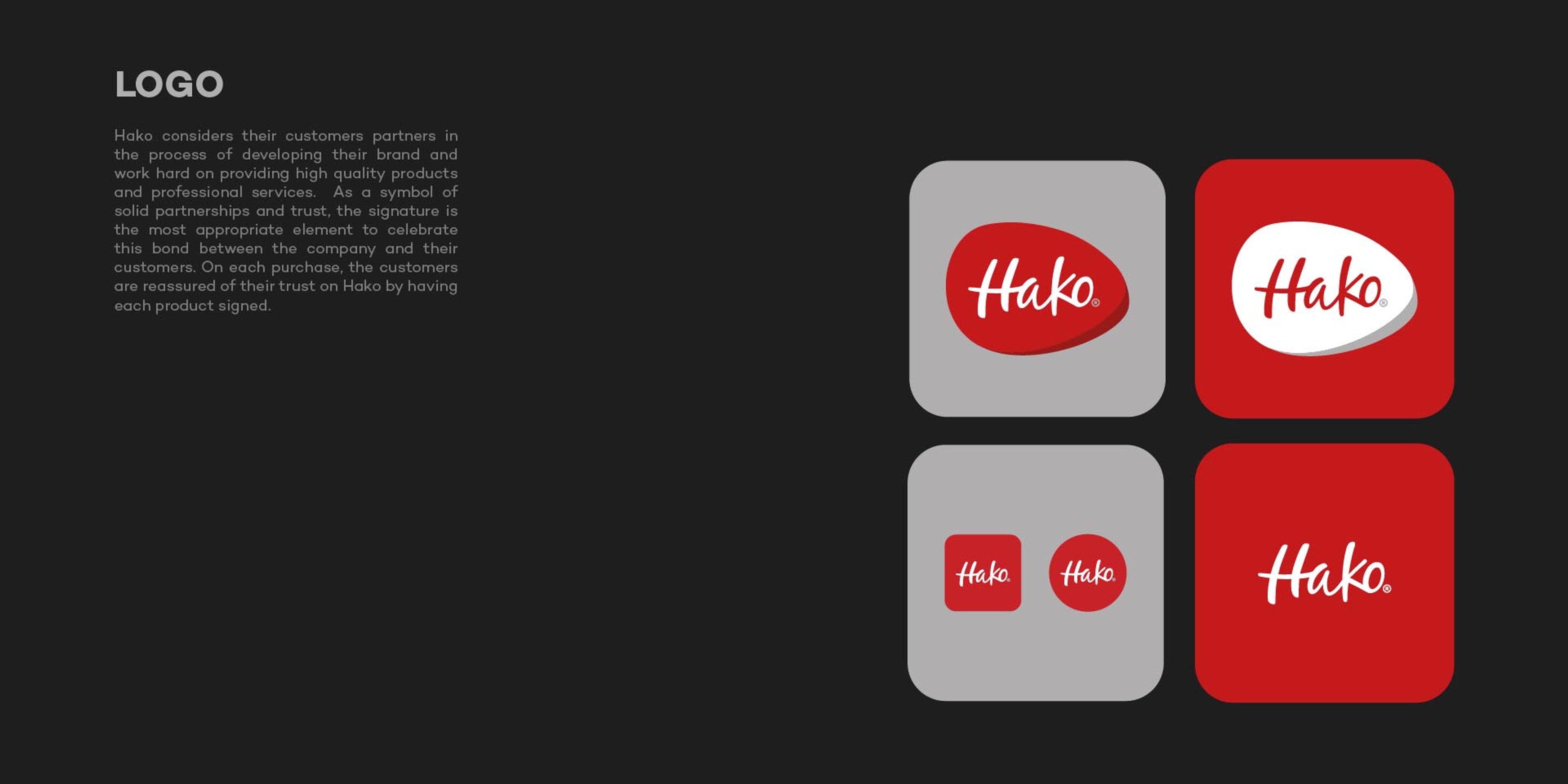
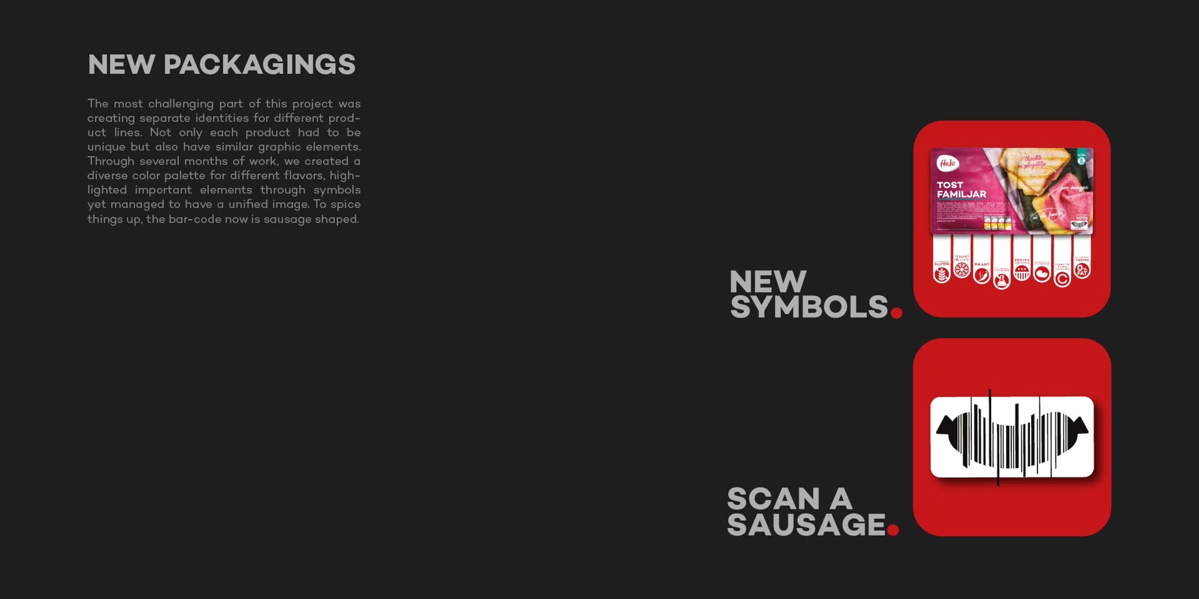
After more than a decade in the market, HAKO® needed a refreshed identity that could support a portfolio of over 70 products while creating stronger consistency across the brand. The existing logo was no longer resonating as intended, making it necessary to build a more recognizable and cohesive visual system.
Solution
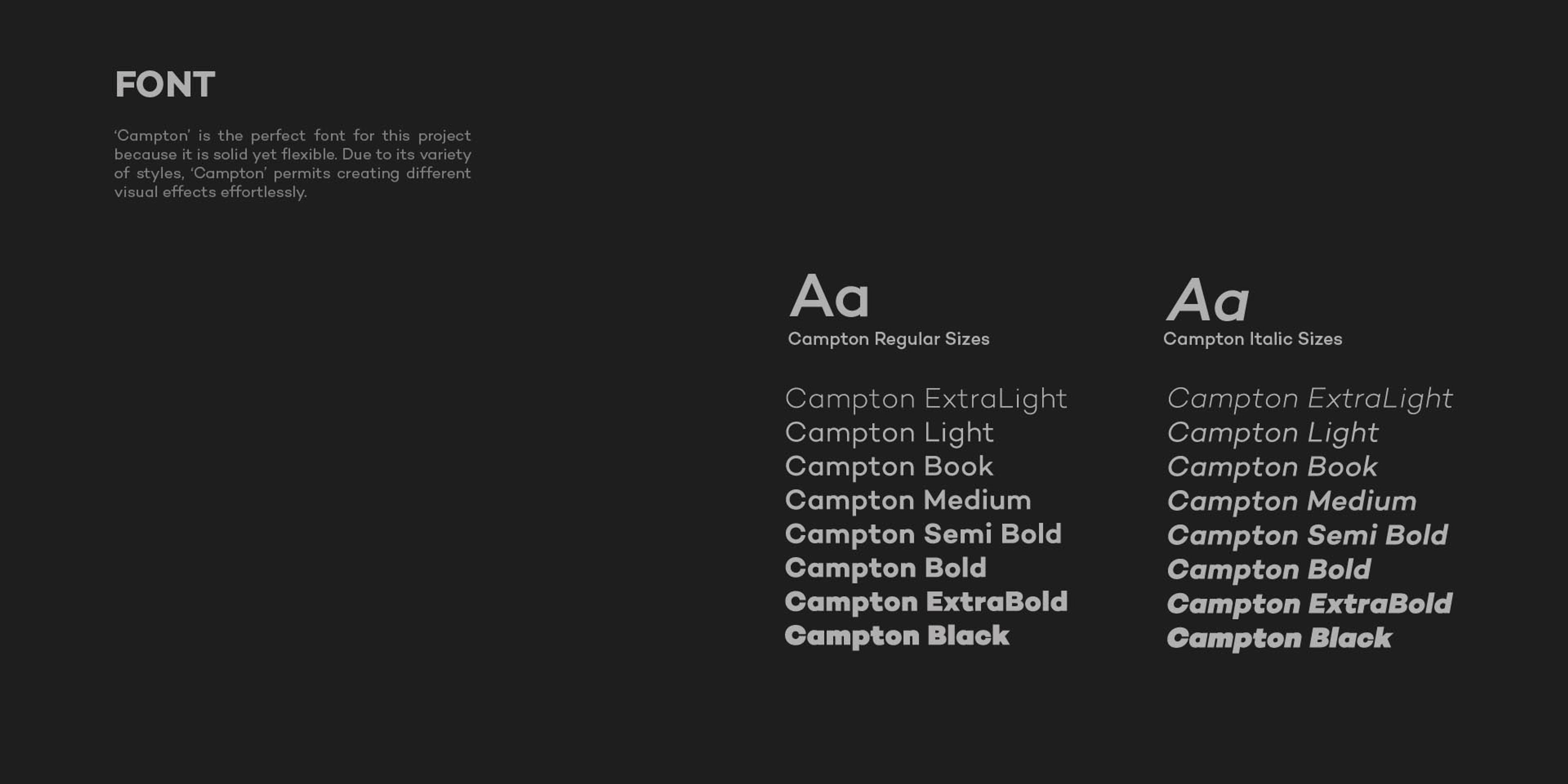
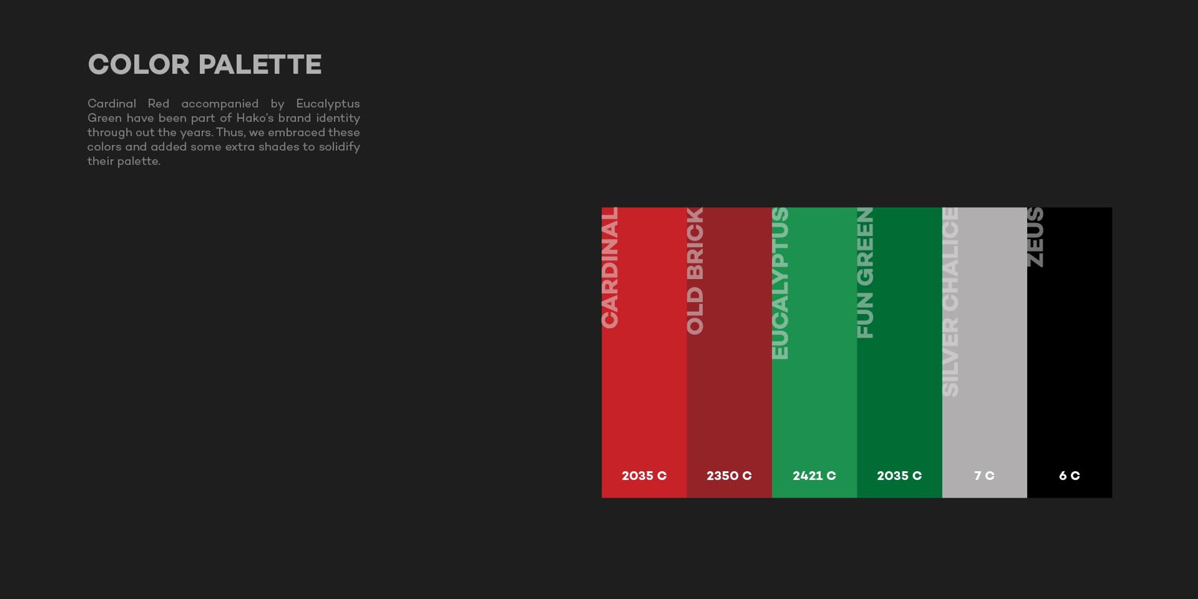
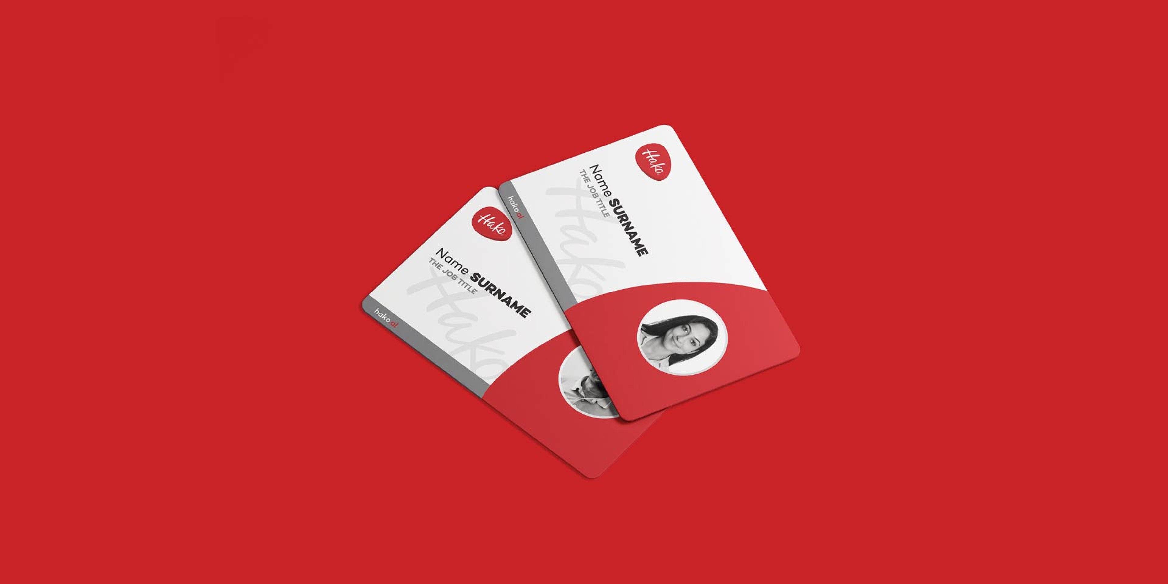
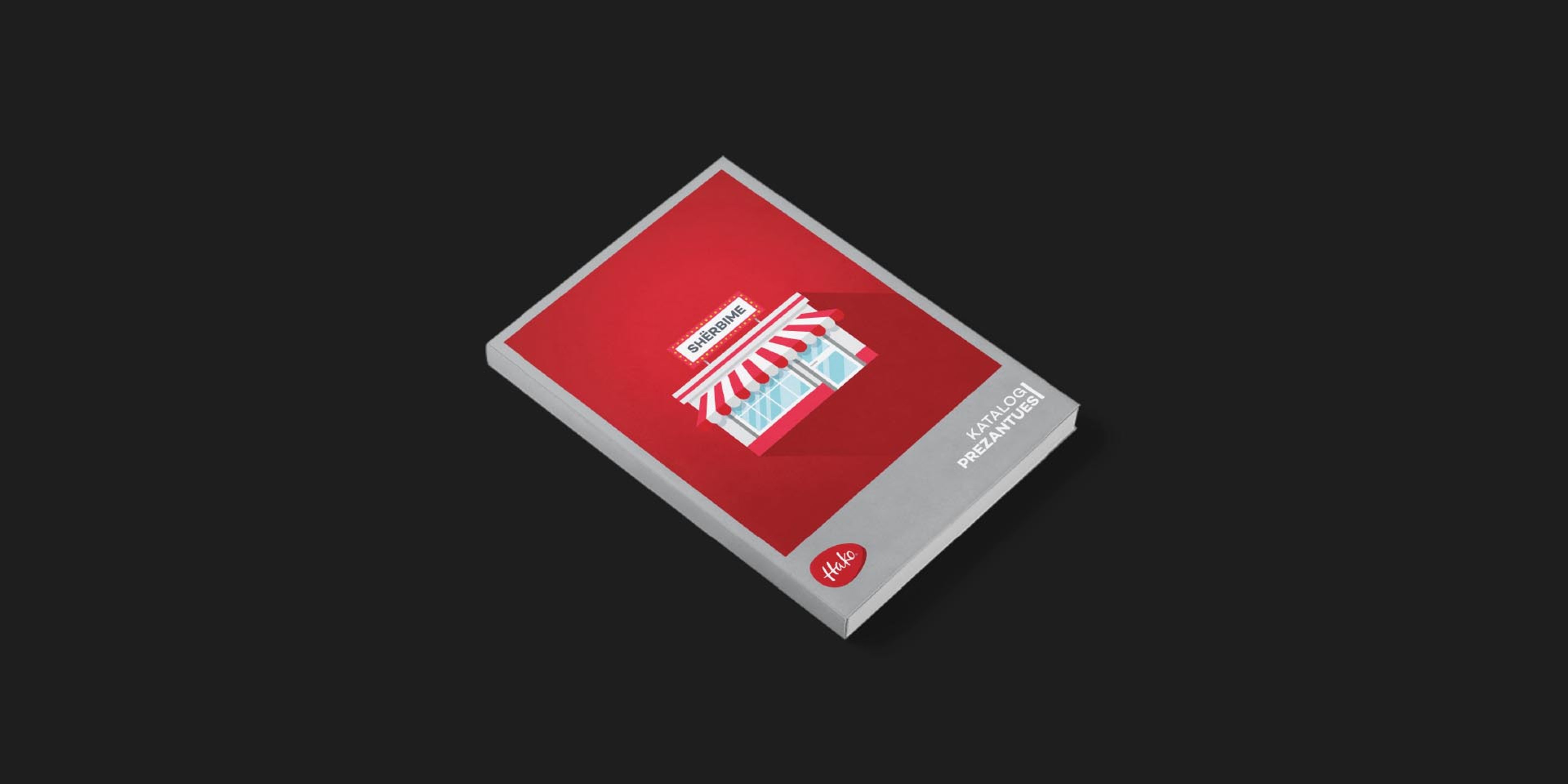
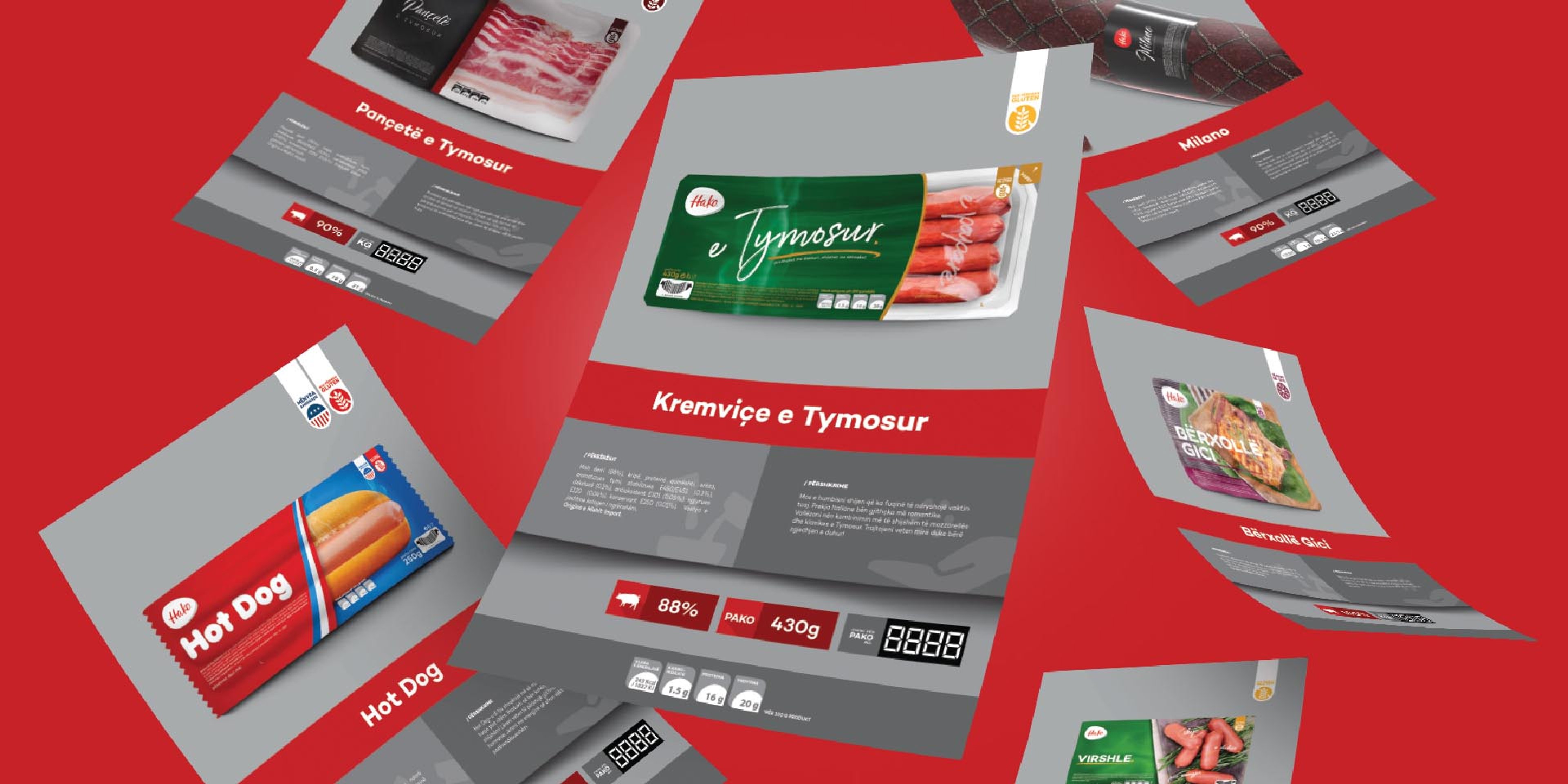
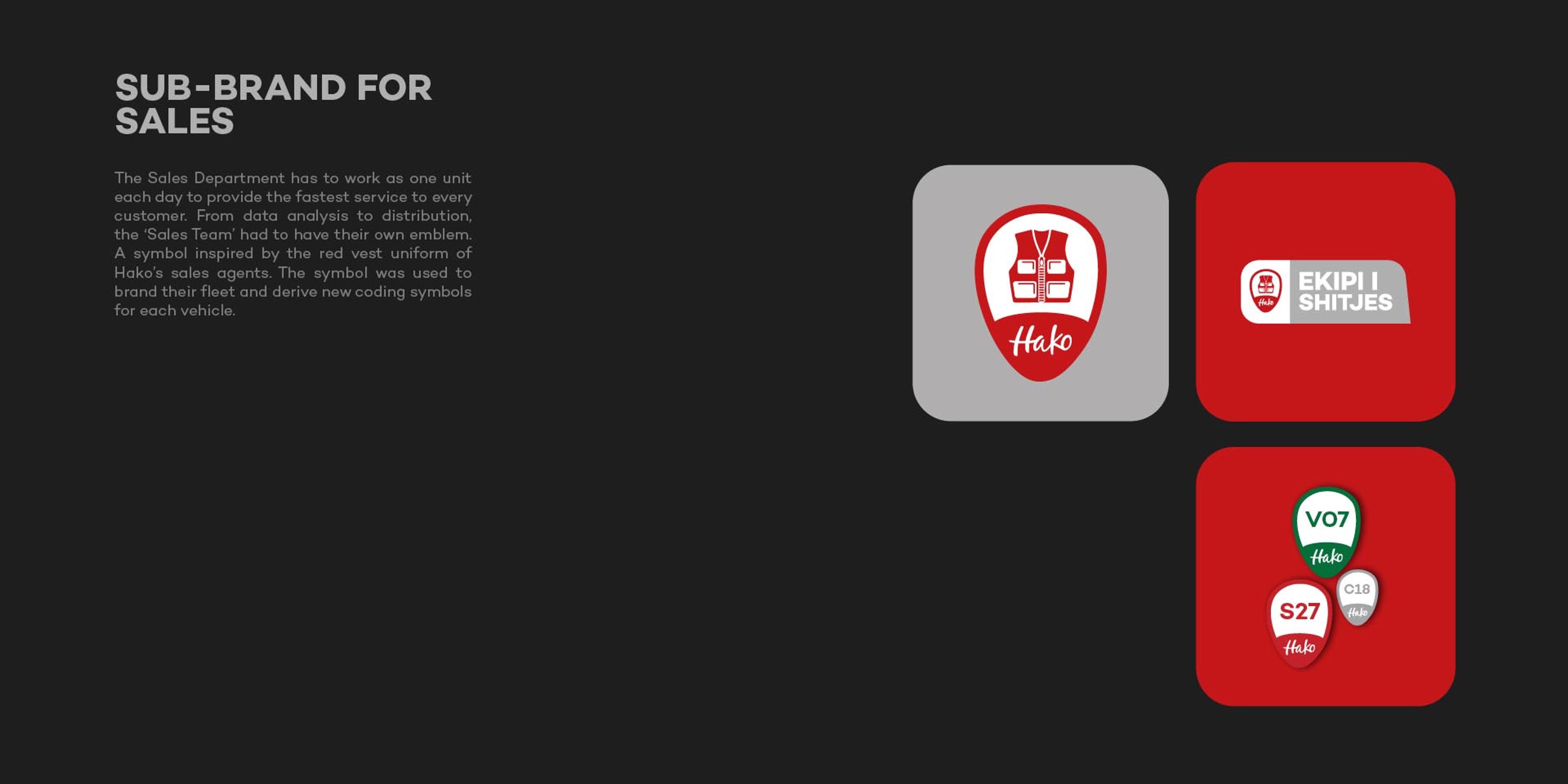
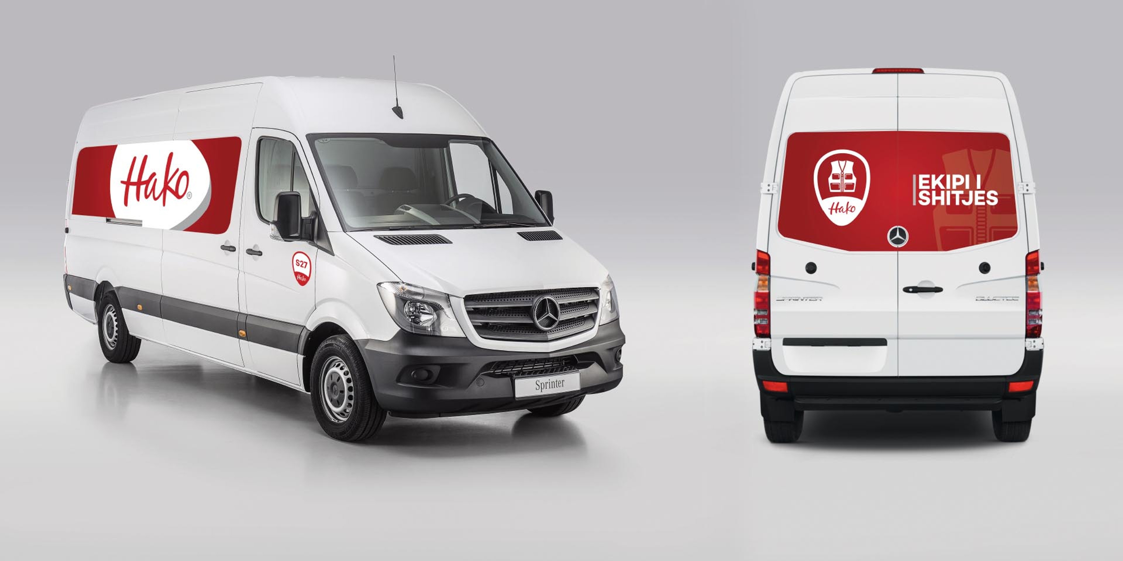
We developed a renewed brand identity that retained HAKO®’s most recognizable elements while giving them a more contemporary expression. The system was expanded across 10 product lines, each with its own character while remaining connected to the master brand.
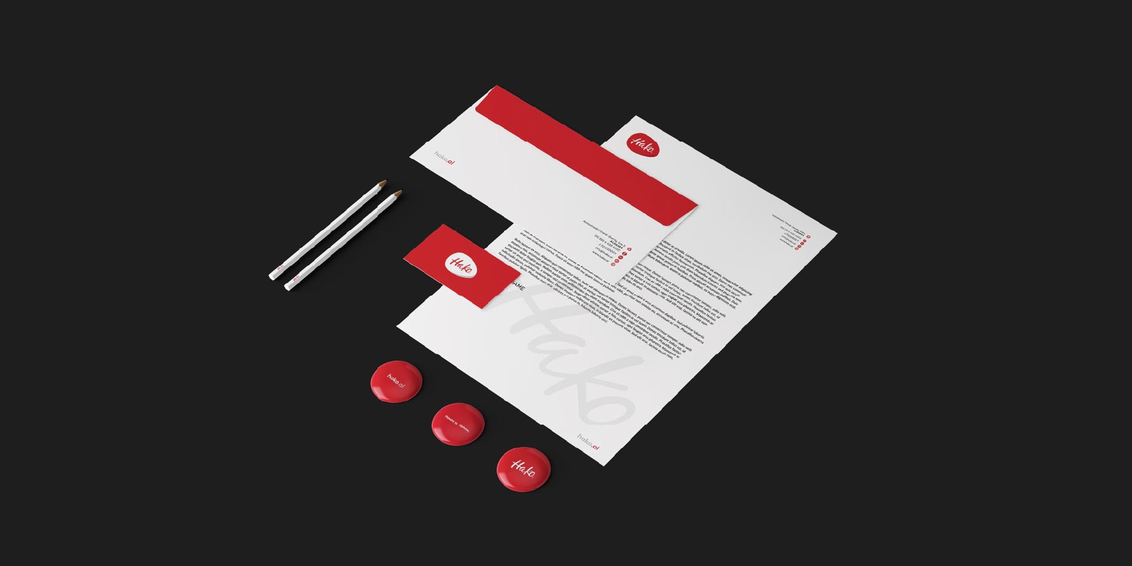
The result is a clearer, stronger identity designed to unify the portfolio and reinforce HAKO®’s presence across every touchpoint.
Overview
In the dynamic world of processed meat products, HAKO® has carved its niche as a premier brand in Albania. Their iconic products, "E Tymosur" and "Hot Dog", have become synonymous with quality and taste. But after 12 years, it was time for a fresh face, and they turned to BoldCrest for a transformative rebranding experience.
Challenge
After more than a decade in the market, HAKO® needed a refreshed identity that could support a portfolio of over 70 products while creating stronger consistency across the brand. The existing logo was no longer resonating as intended, making it necessary to build a more recognizable and cohesive visual system.
Solution
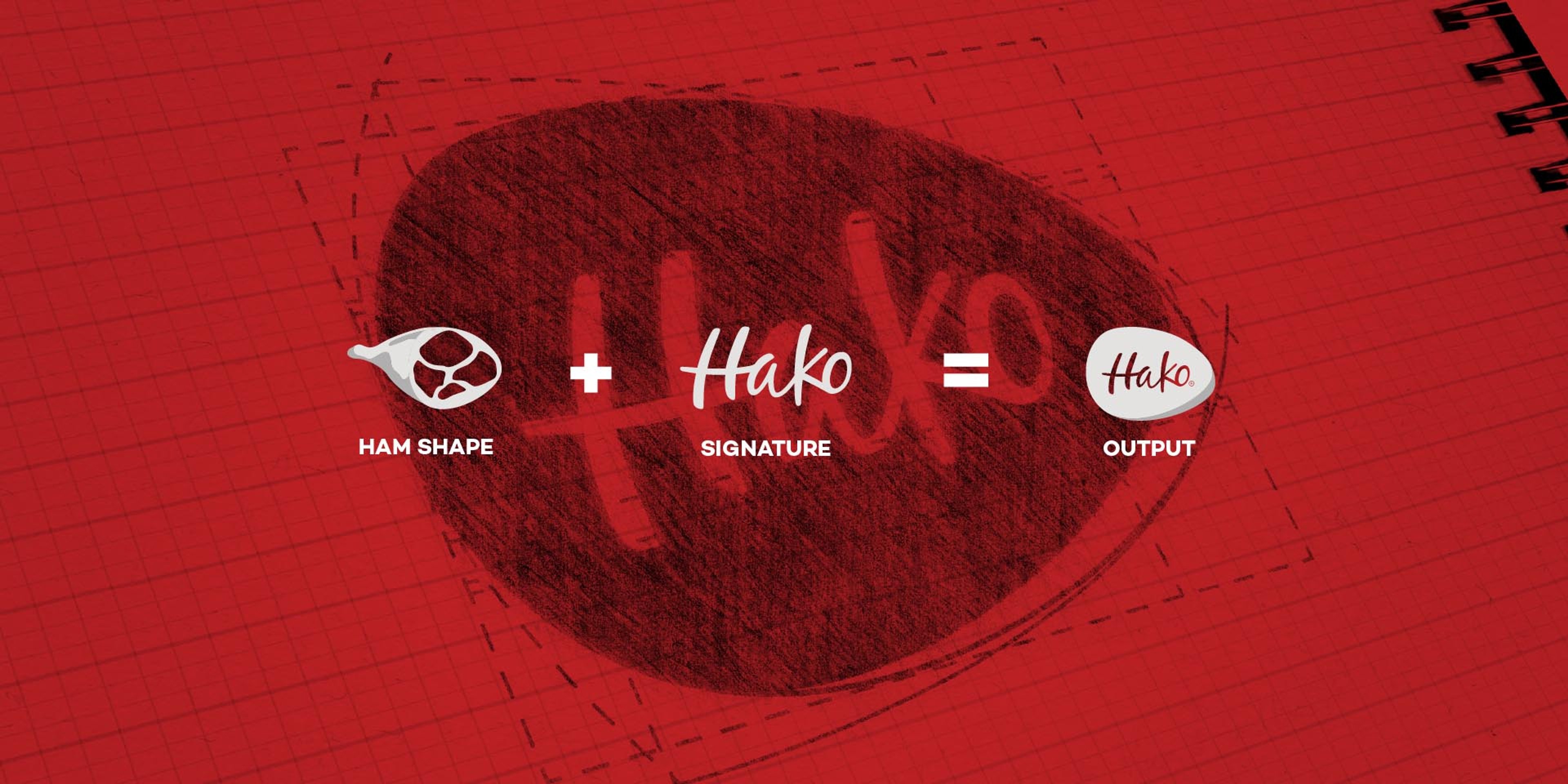
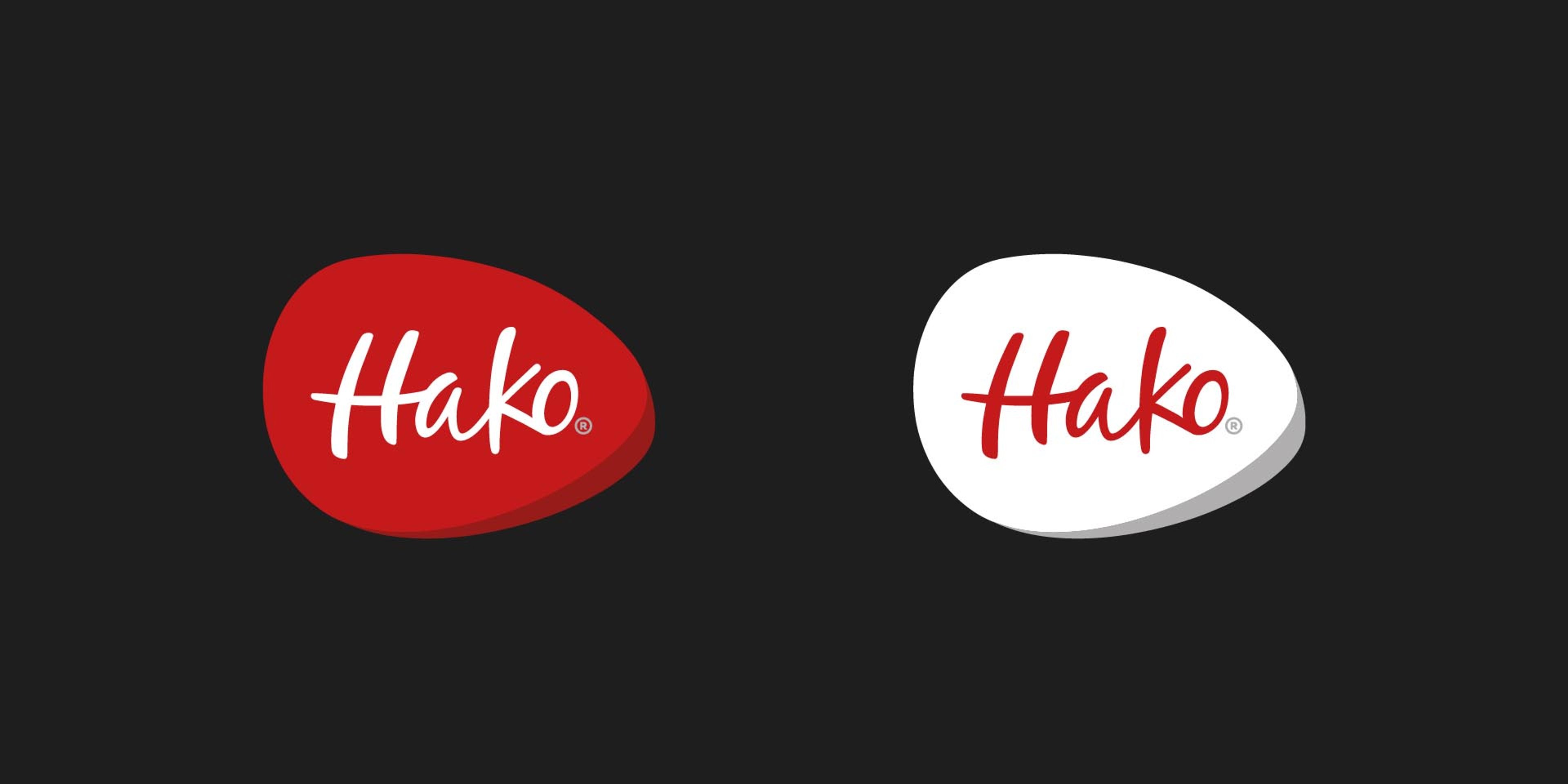
We developed a renewed brand identity that retained HAKO®’s most recognizable elements while giving them a more contemporary expression. The system was expanded across 10 product lines, each with its own character while remaining connected to the master brand.
The result is a clearer, stronger identity designed to unify the portfolio and reinforce HAKO®’s presence across every touchpoint.
Your turn
What are we shaping next?
Tell us what you have in mind. It can be a clear brief or just the start of an idea. We’ll help shape the next steps and keep everything simple from there.