SANFEST®Day n’ Nite.
Overview
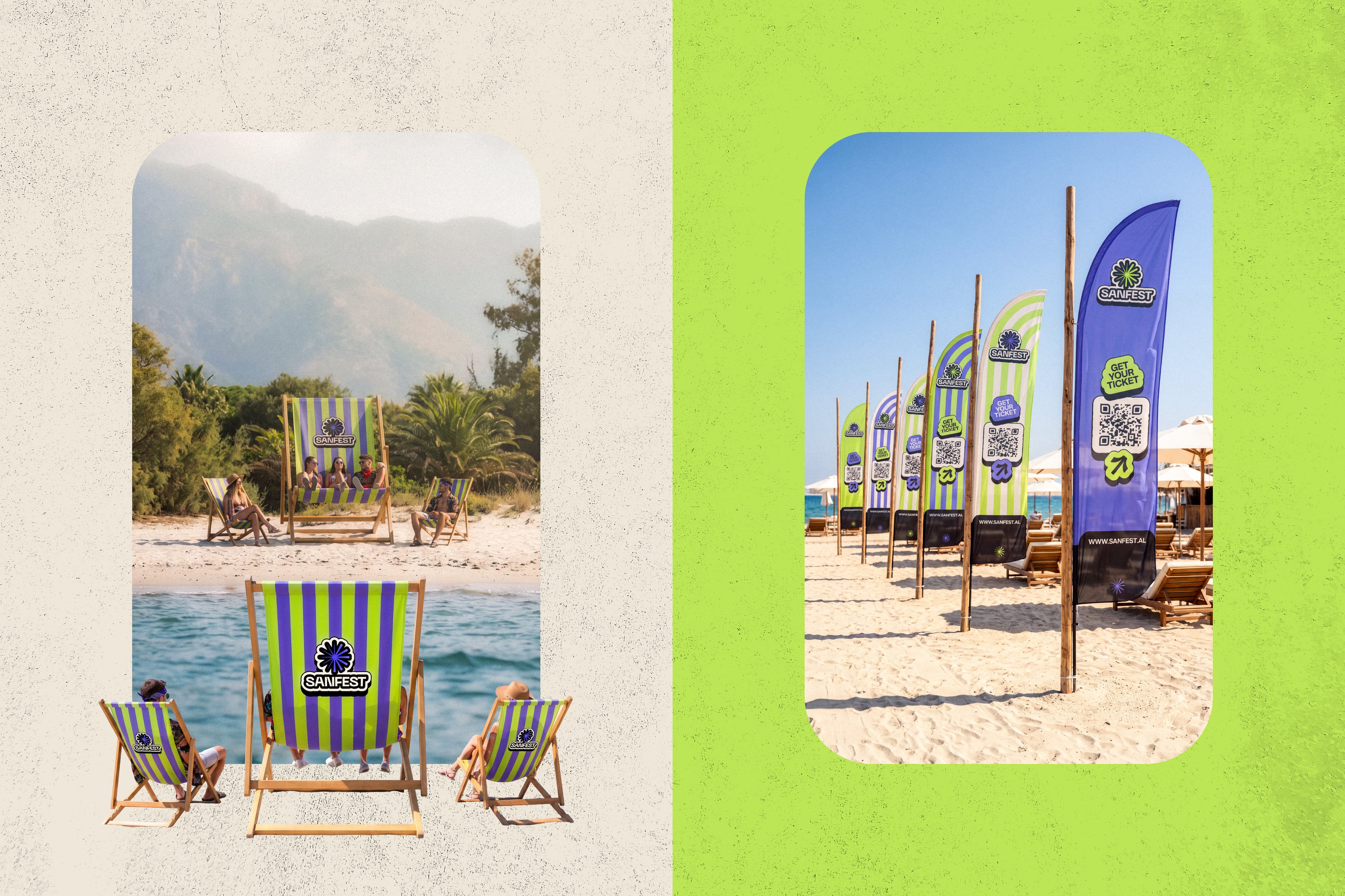
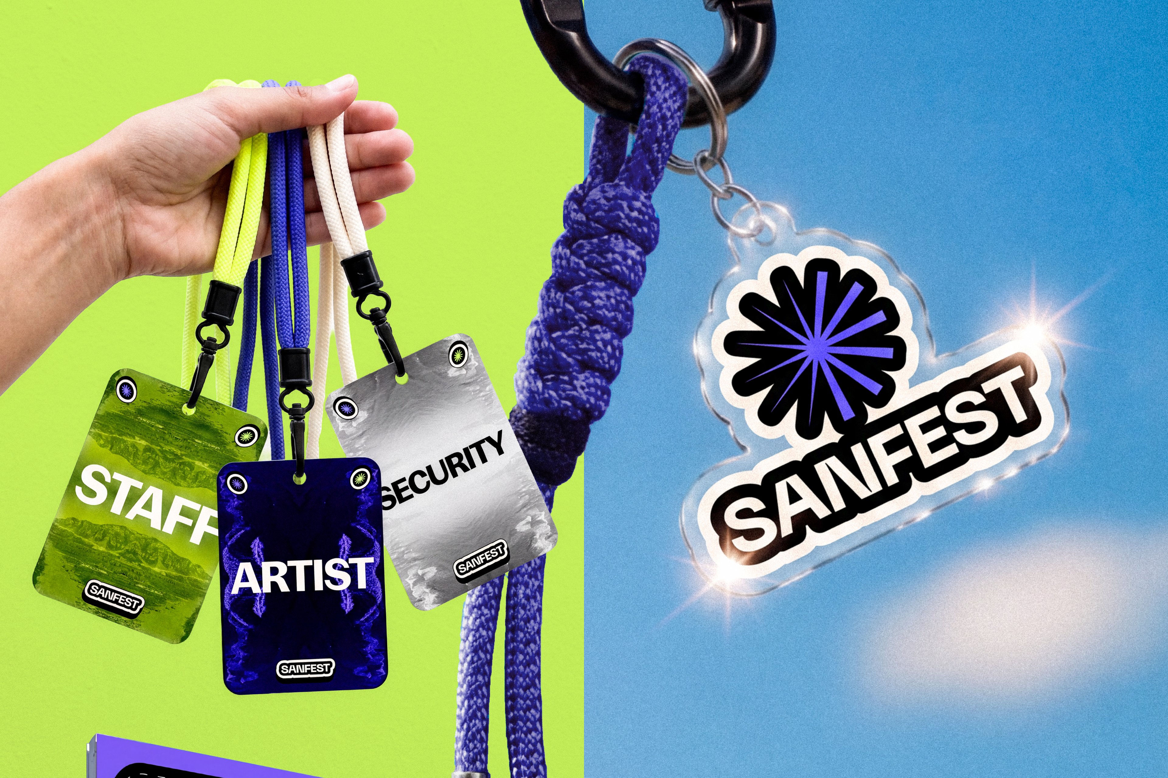
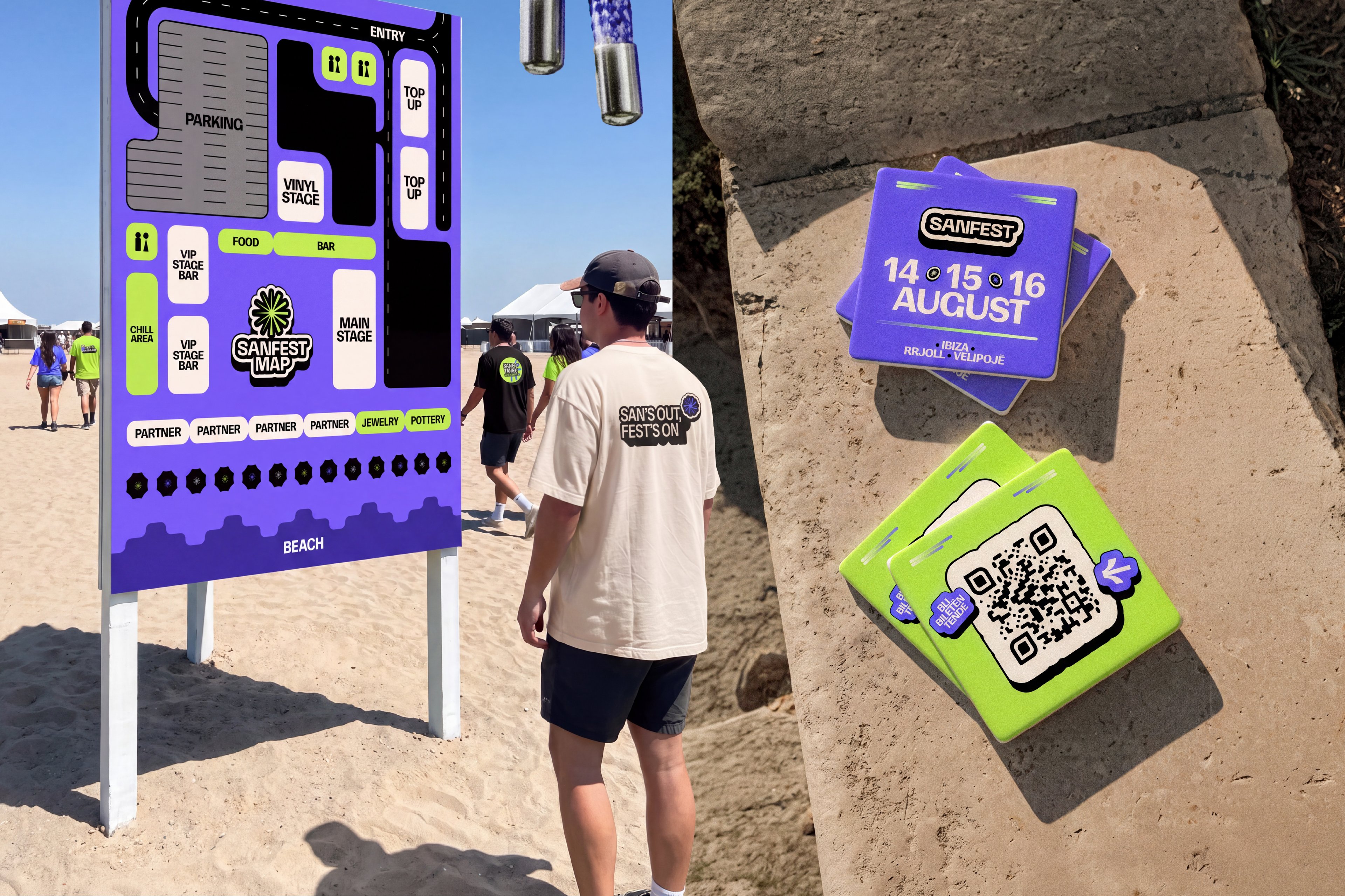
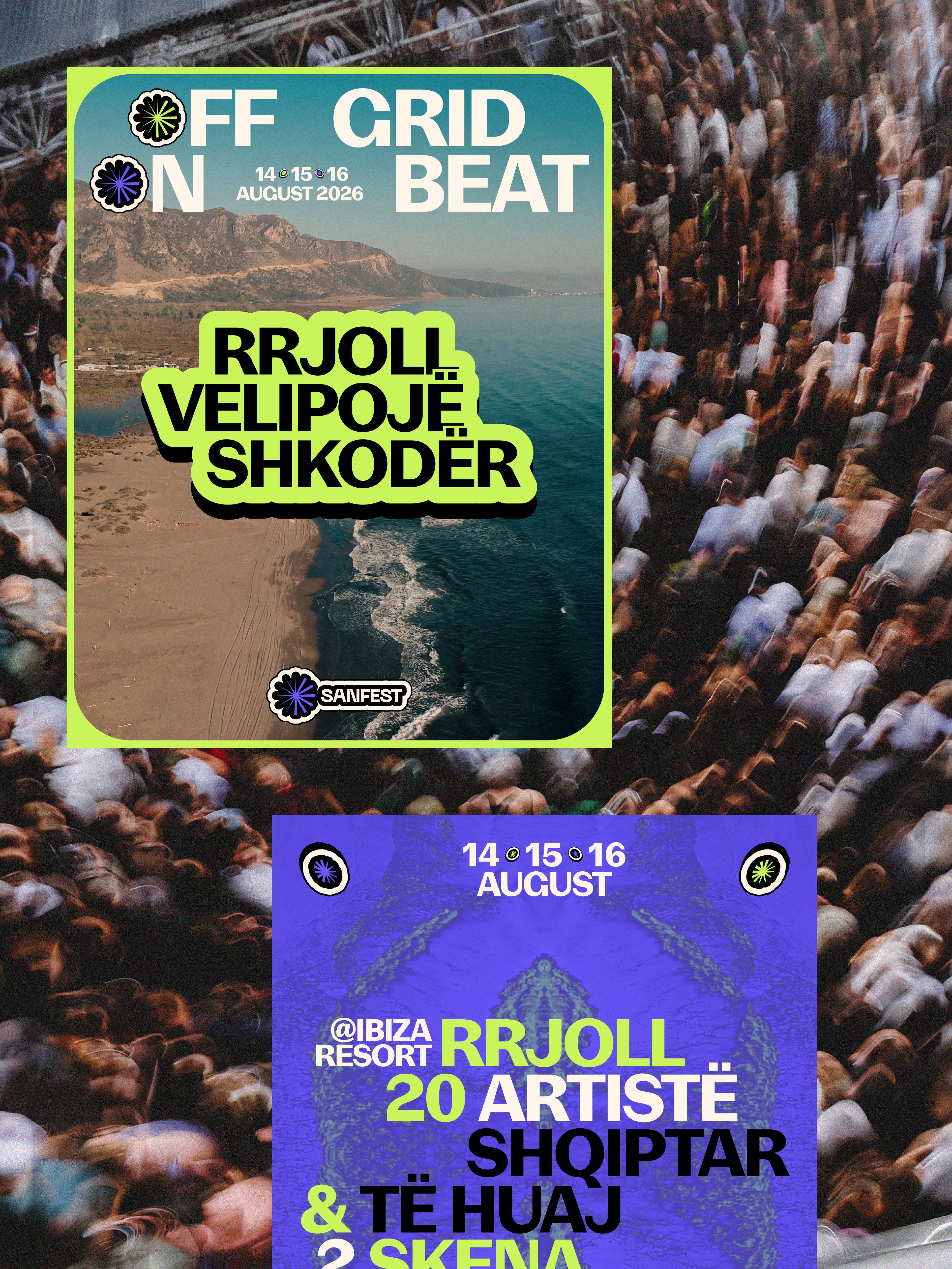
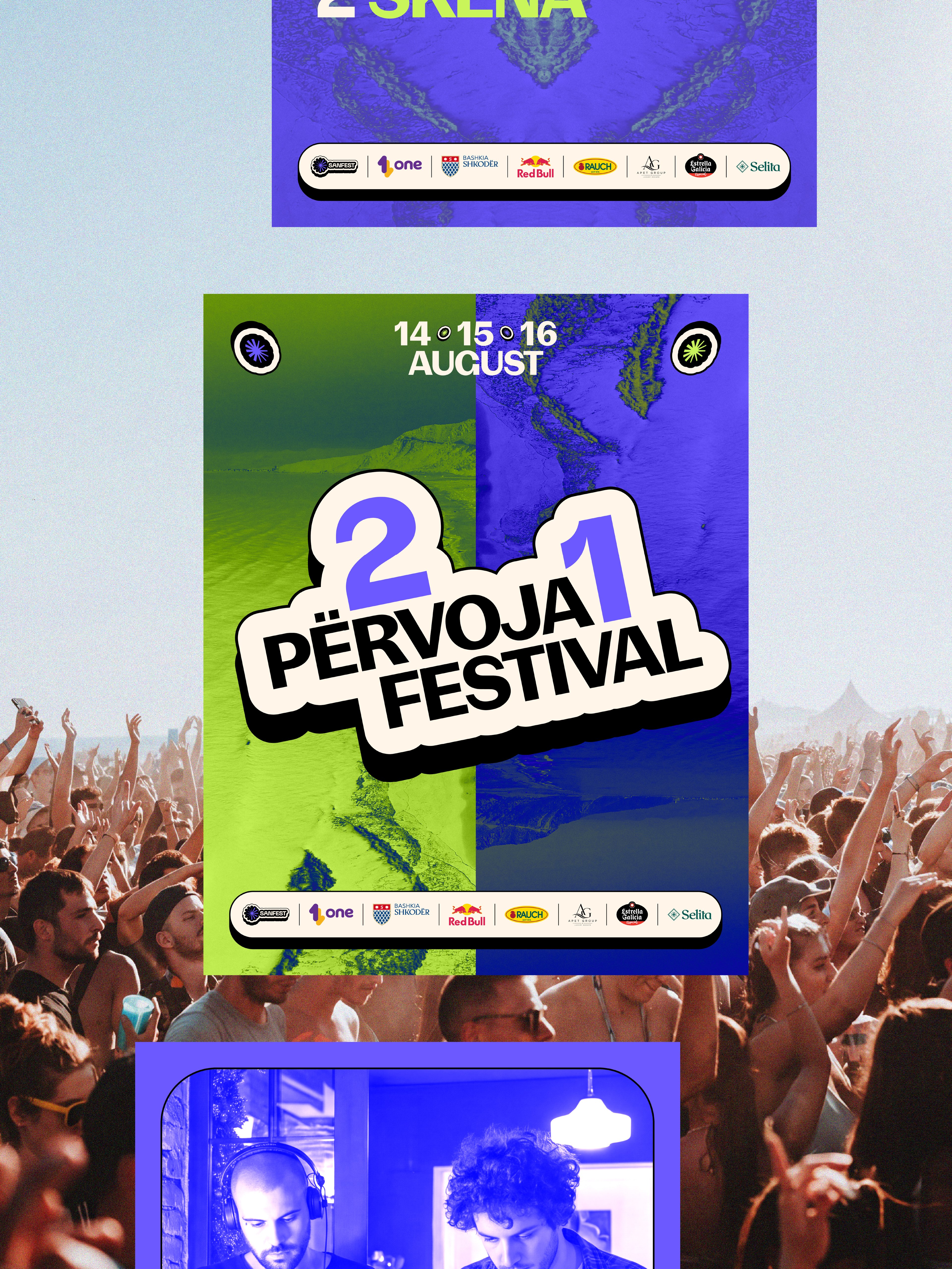
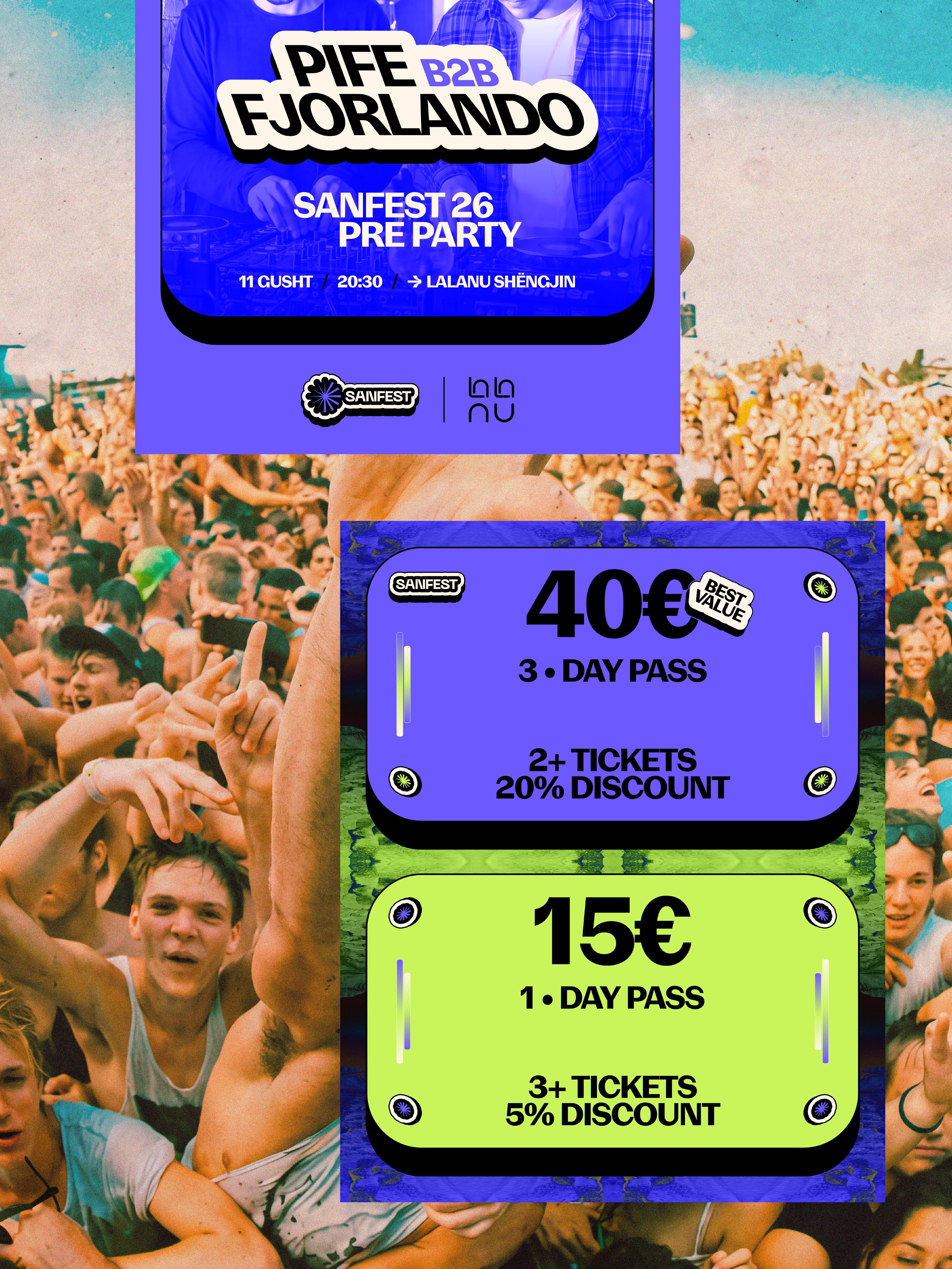
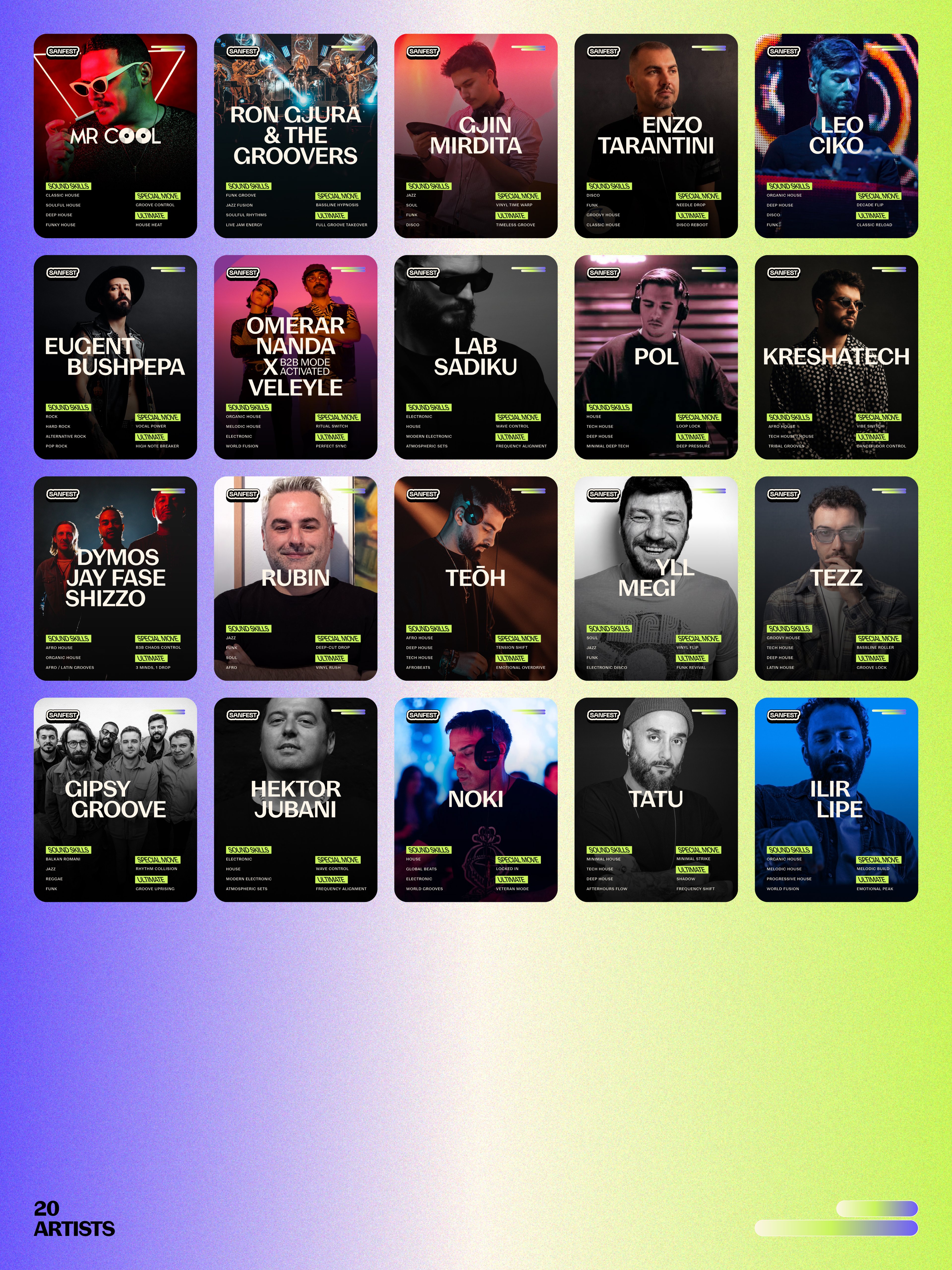
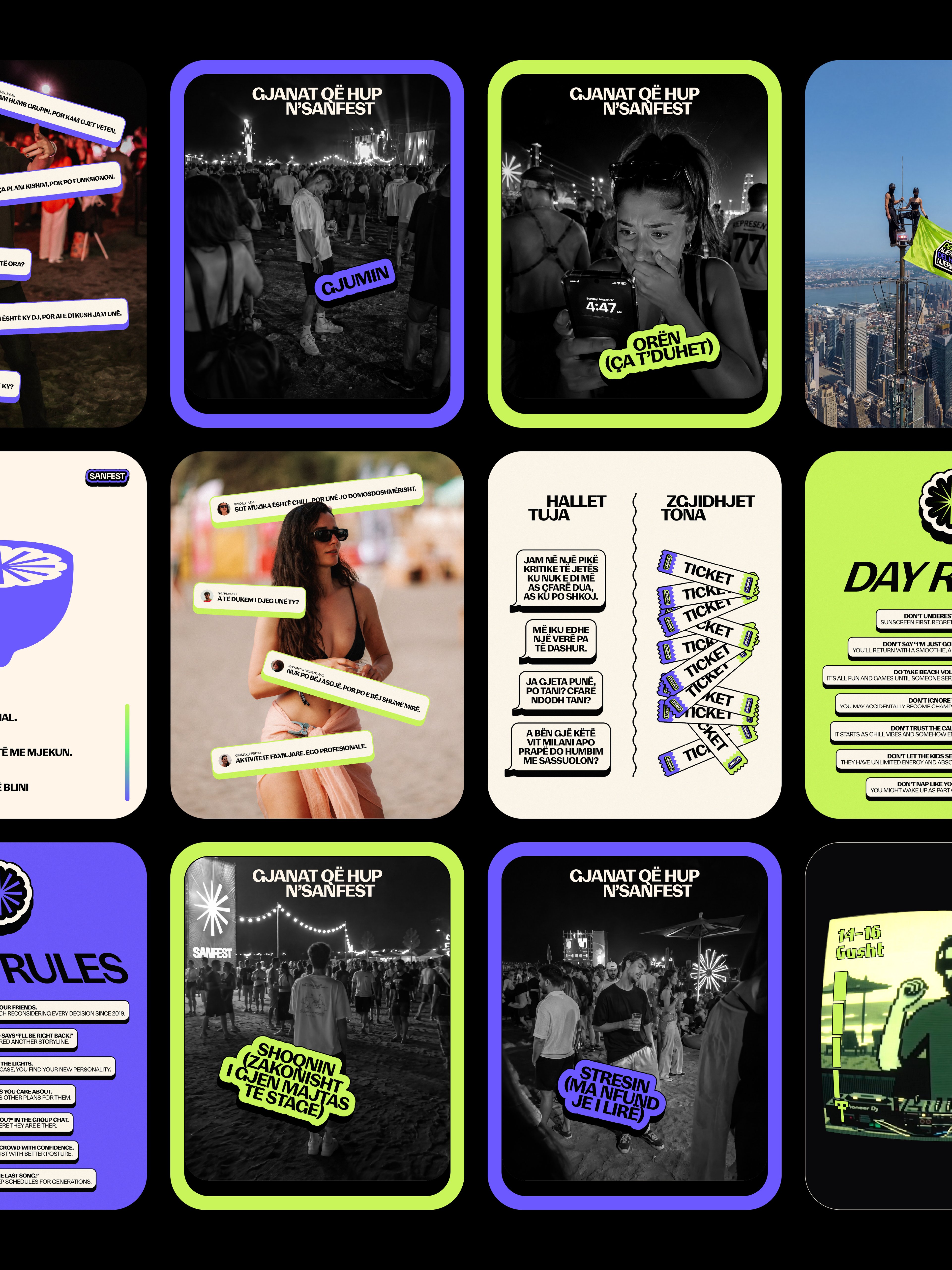
SANFEST® 2026 was shaped around the contrast between two versions of the same festival experience: the one lived under the sun and the one that takes over after dark. The identity translates that shift into a broader visual language built on rhythm, transformation and atmosphere, giving the edition a distinct character that feels expressive, immersive and recognizable across every touchpoint.
Challenge
The challenge was to capture the changing energy of SANFEST® without reducing the identity to a single visual mood. Daytime needed to feel structured, bright and controlled, while nighttime had to become more instinctive, intense and expressive. At the same time, the system had to remain flexible enough to support different formats, messages and moments throughout the festival while still feeling unmistakably SANFEST®.
Solution
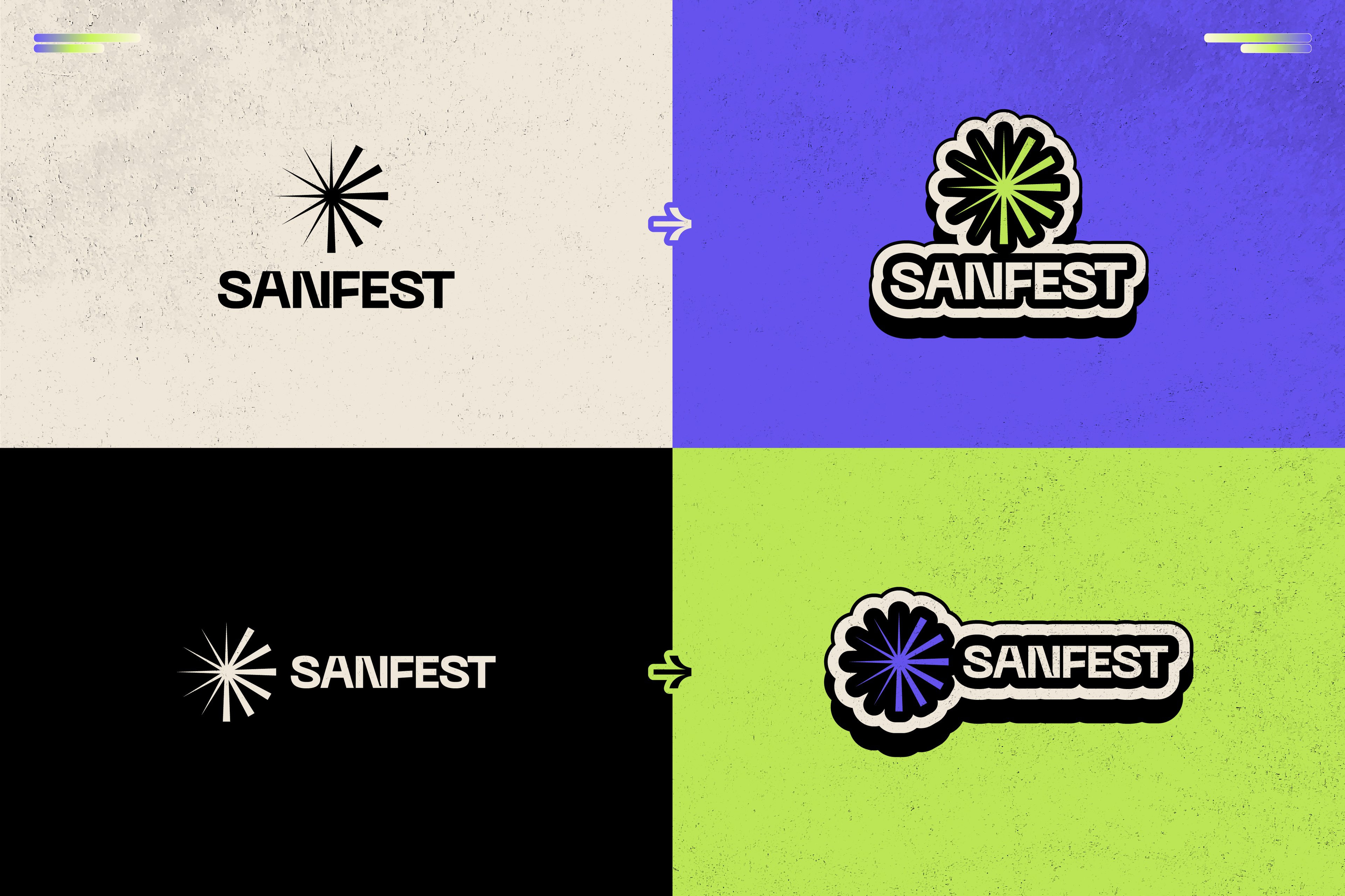
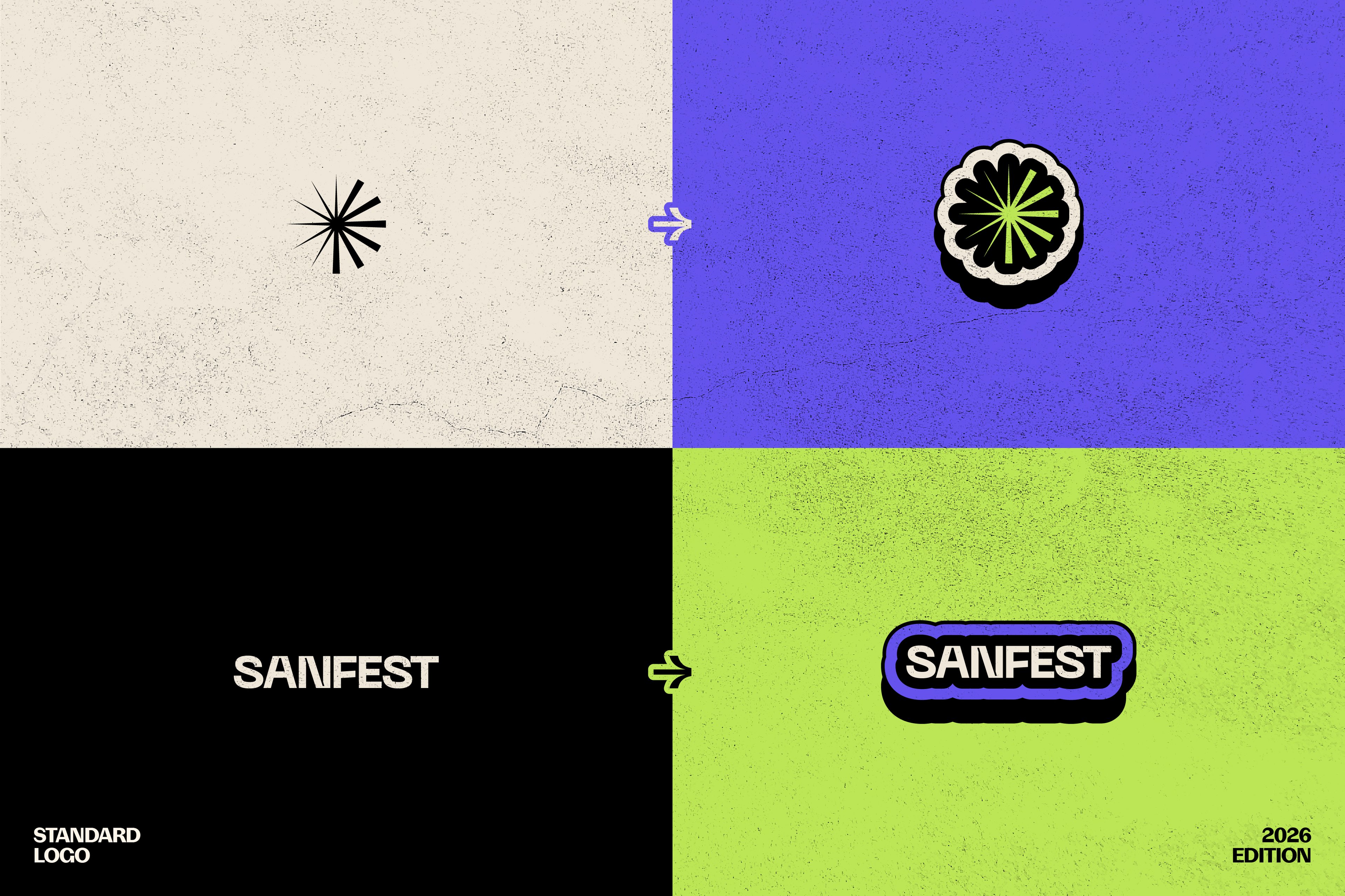
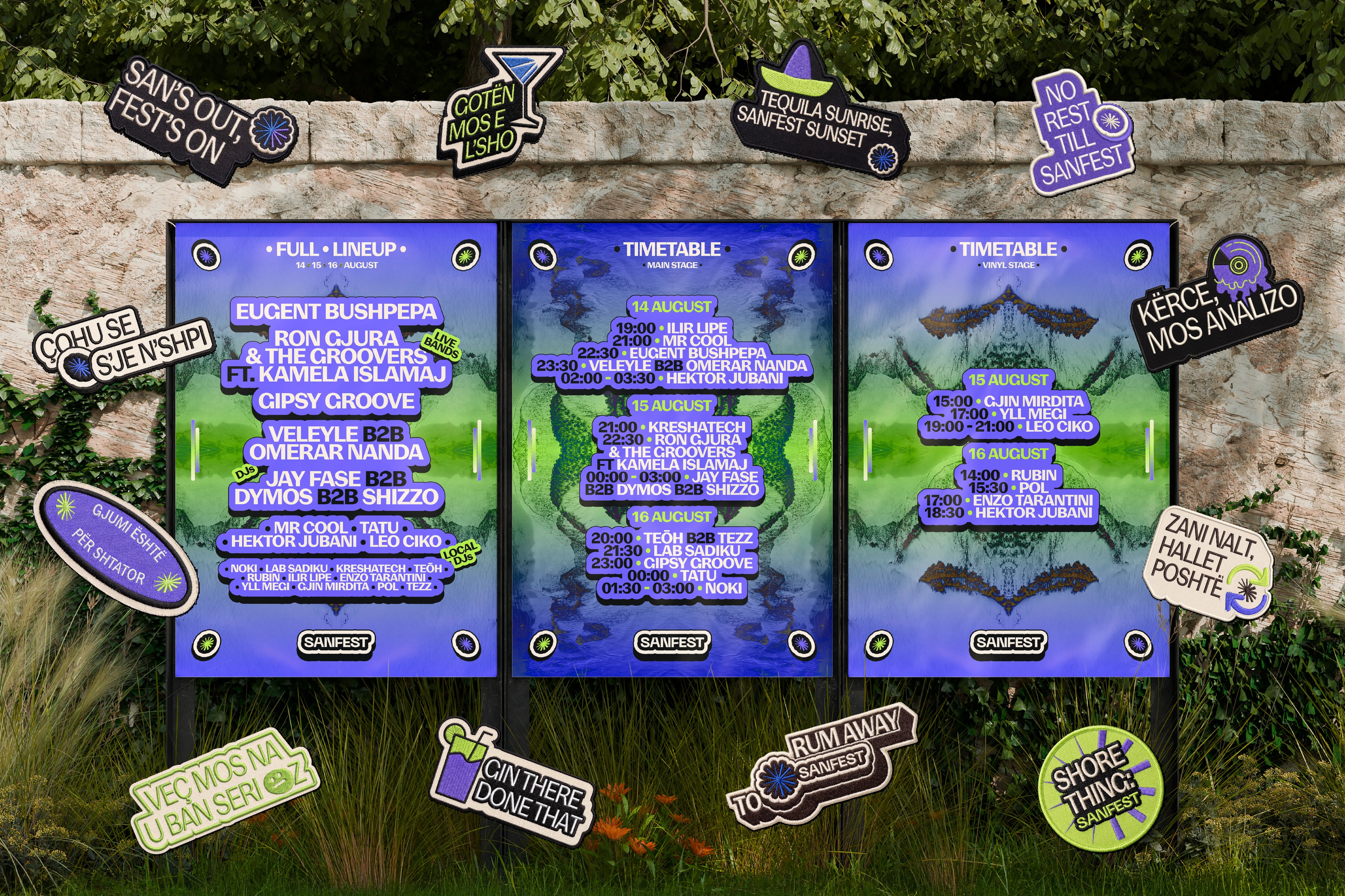
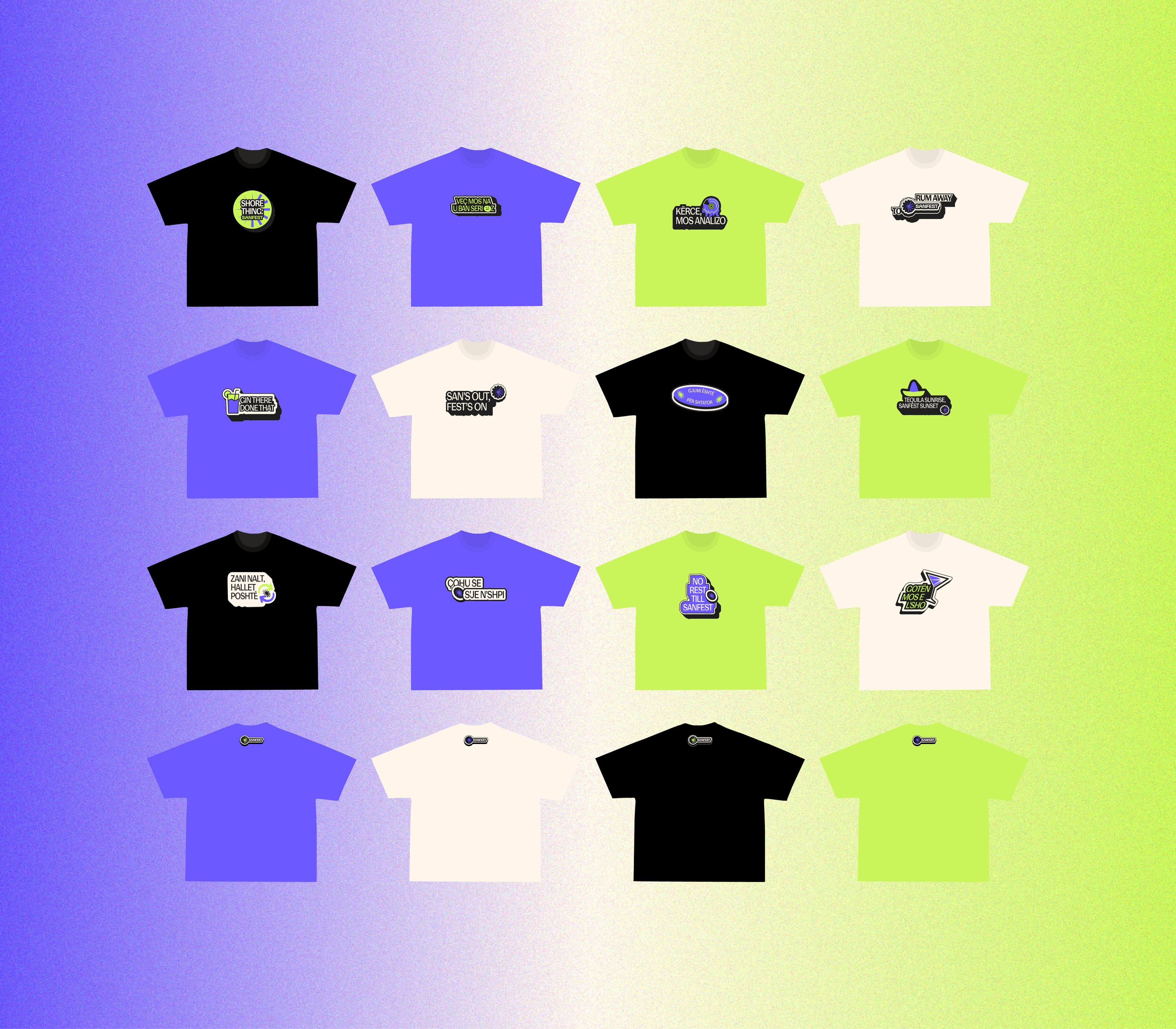
We built the identity around the sun and moon as recurring visual anchors, using light as the connecting element between both states. More ordered daytime compositions transition into freer nighttime expressions, while typography, graphic rhythm and image treatment help expand the system beyond the core duality. The result is a flexible visual language that can adapt across communication, digital content, environmental applications and festival touchpoints, shifting in mood and energy without losing consistency or recognition.
Overview
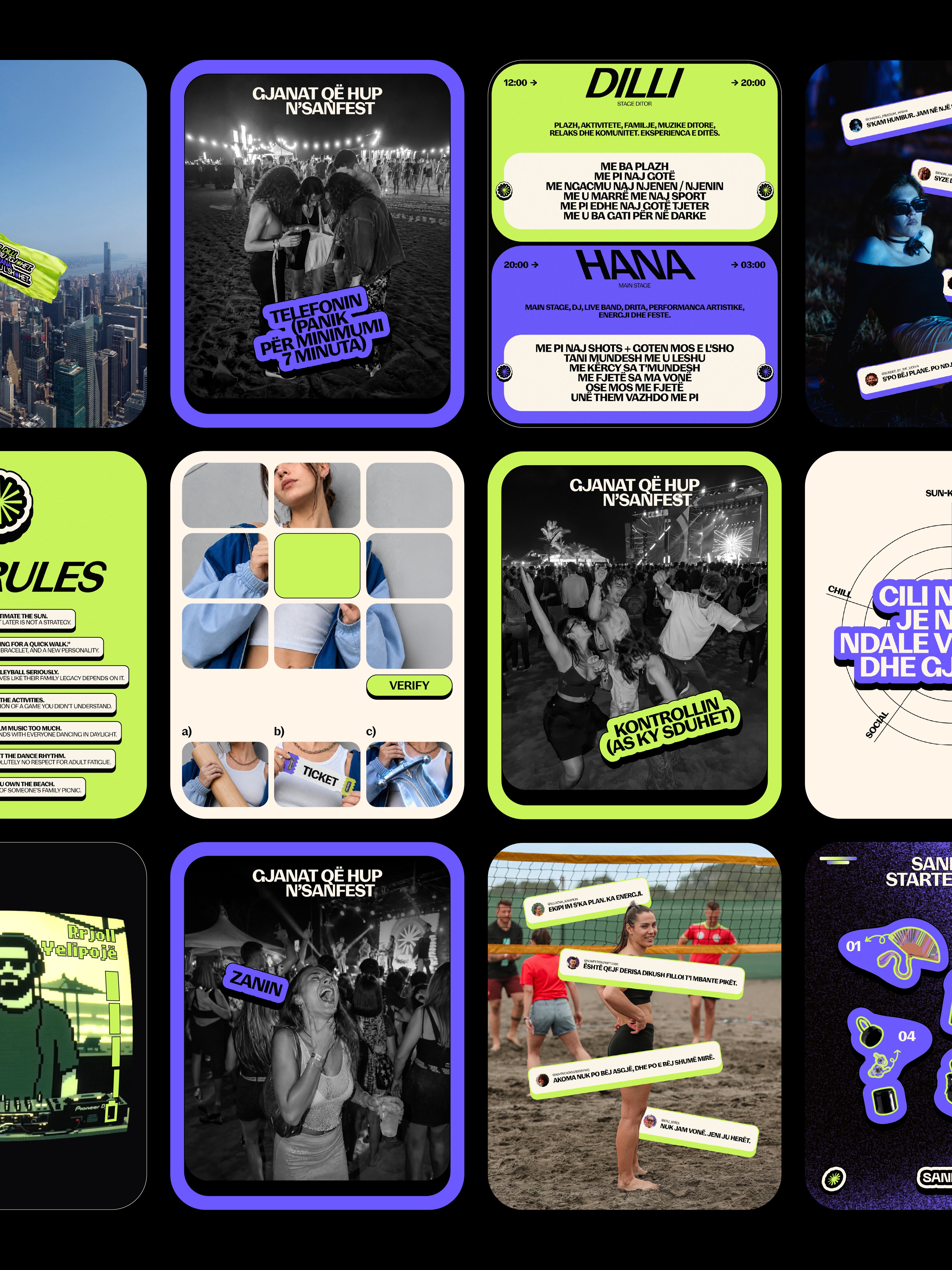
SANFEST® 2026 was shaped around the contrast between two versions of the same festival experience: the one lived under the sun and the one that takes over after dark. The identity translates that shift into a broader visual language built on rhythm, transformation and atmosphere, giving the edition a distinct character that feels expressive, immersive and recognizable across every touchpoint.
Challenge
The challenge was to capture the changing energy of SANFEST® without reducing the identity to a single visual mood. Daytime needed to feel structured, bright and controlled, while nighttime had to become more instinctive, intense and expressive. At the same time, the system had to remain flexible enough to support different formats, messages and moments throughout the festival while still feeling unmistakably SANFEST®.
Solution
We built the identity around the sun and moon as recurring visual anchors, using light as the connecting element between both states. More ordered daytime compositions transition into freer nighttime expressions, while typography, graphic rhythm and image treatment help expand the system beyond the core duality. The result is a flexible visual language that can adapt across communication, digital content, environmental applications and festival touchpoints, shifting in mood and energy without losing consistency or recognition.