Overview
Syncron, inspired by the essence of synchronicity, stands as a property management agency that seamlessly aligns with the needs of its clients and guests. Their ethos revolves around harmony, ensuring every property feels like a tranquil retreat.
Challenge
The challenge was to encapsulate Syncron's philosophy of simultaneous harmony in a visual identity. The design needed to convey the agency's commitment to providing a relaxed and synchronized property management experience, ensuring clients and guests feel at home, no matter where they are.
Solution
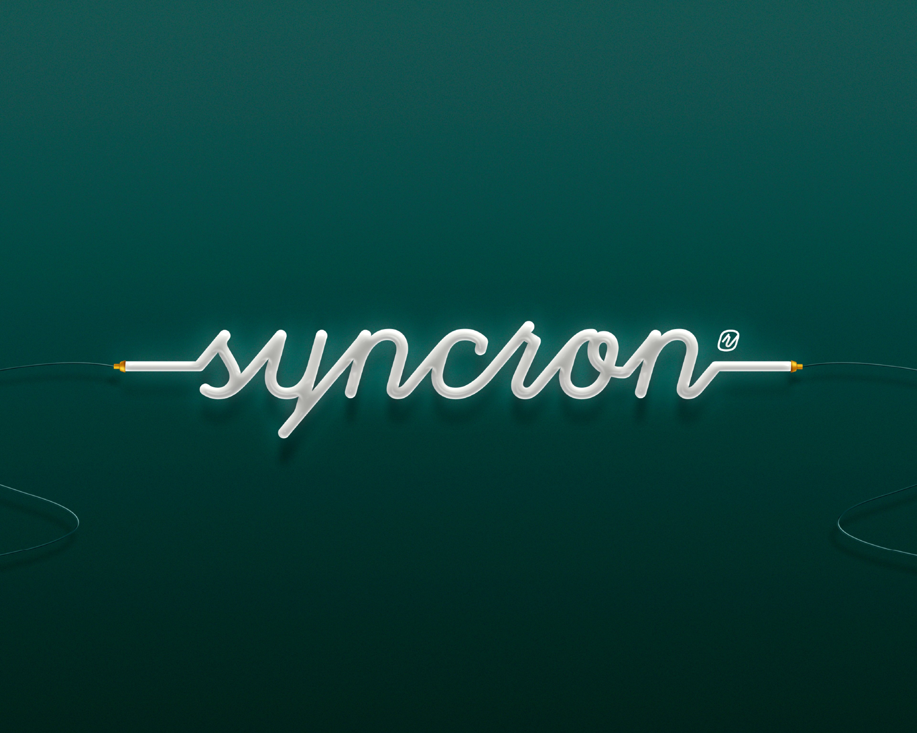
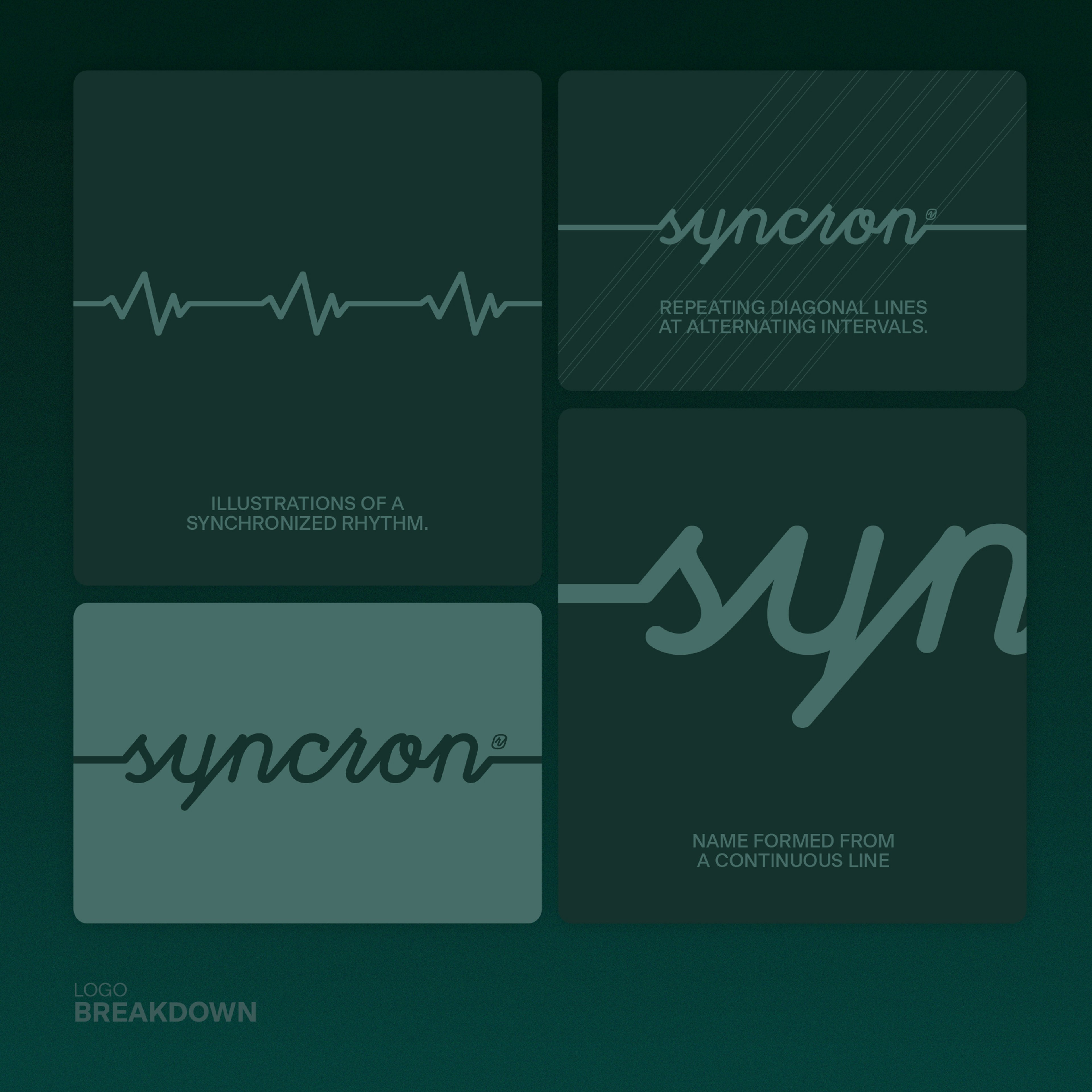
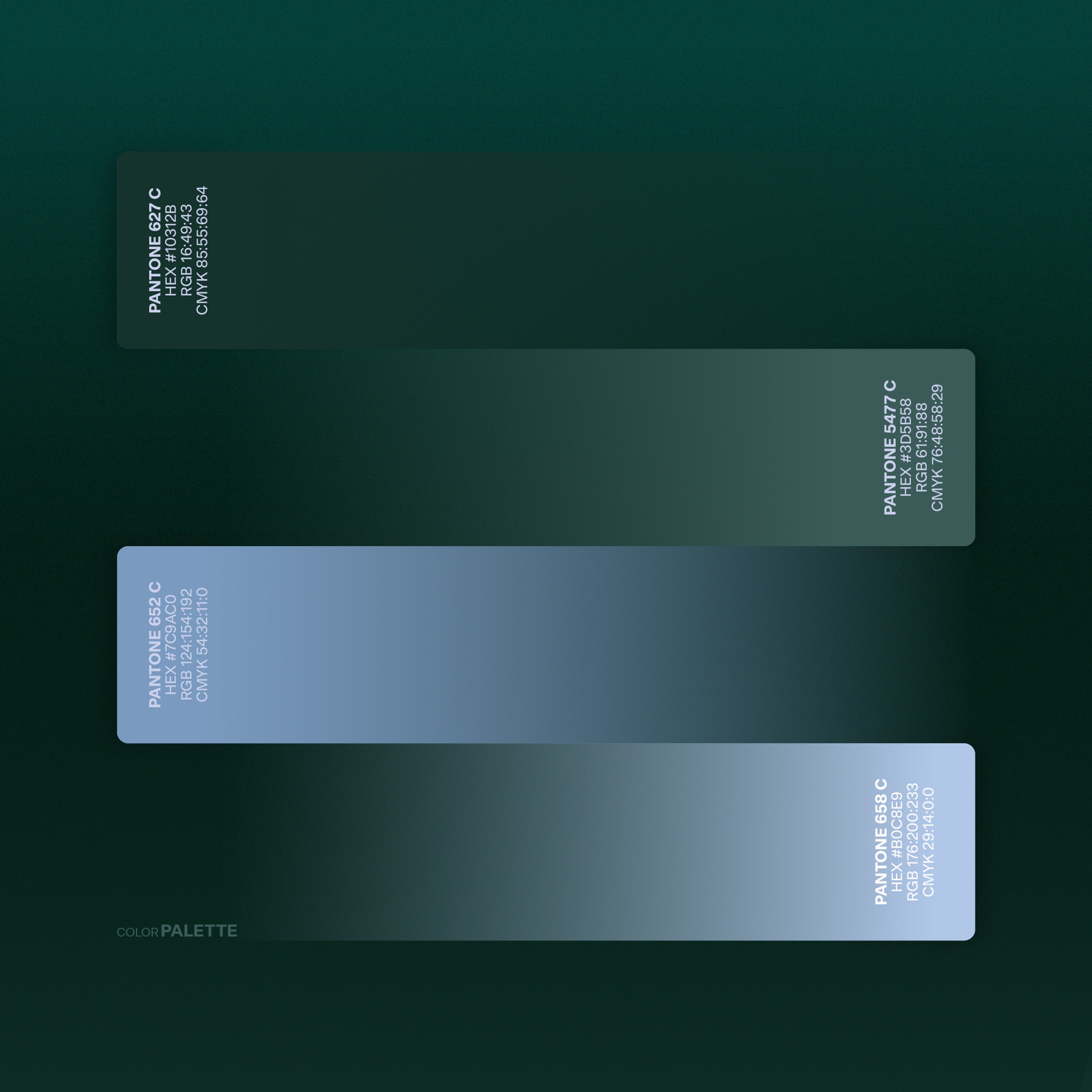
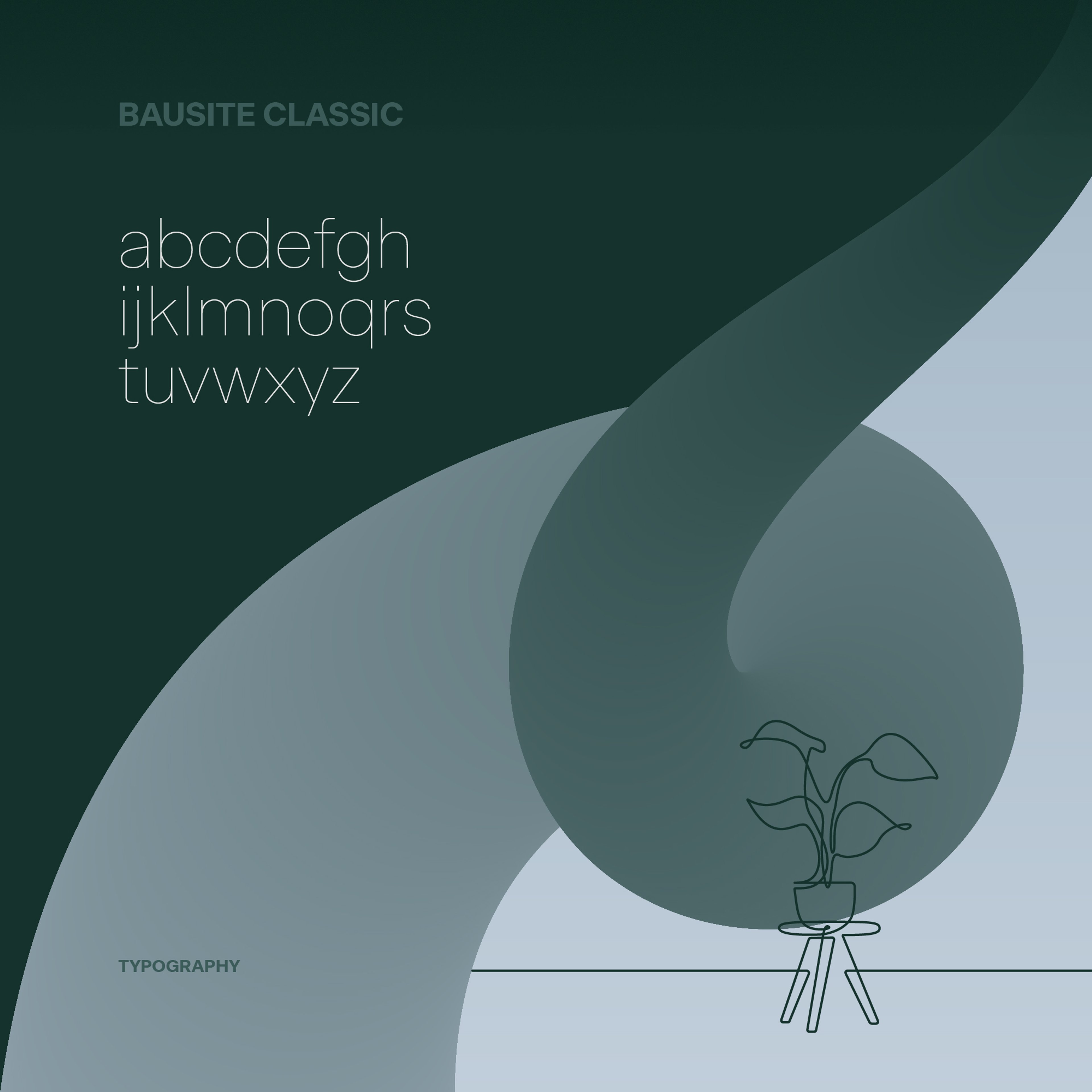
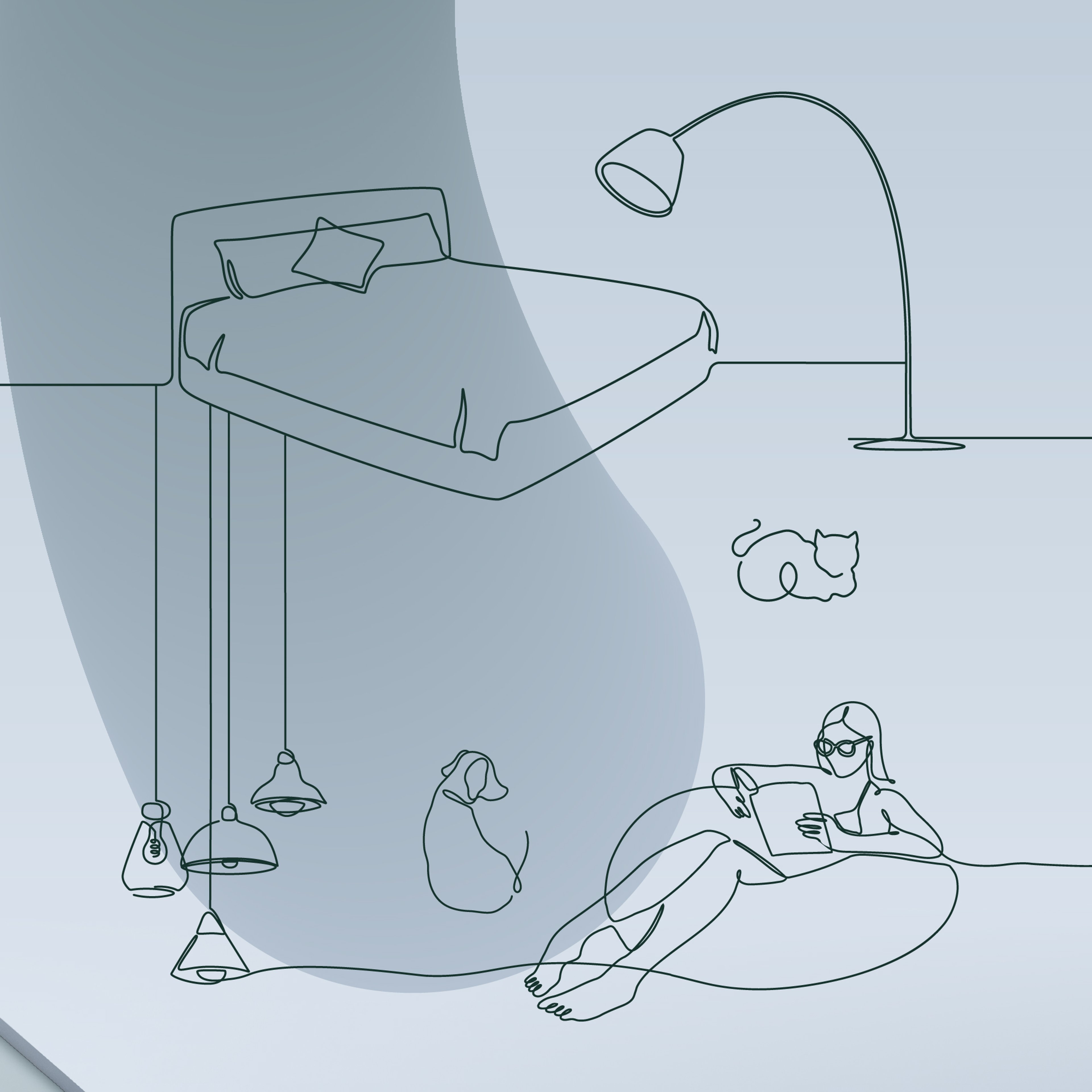
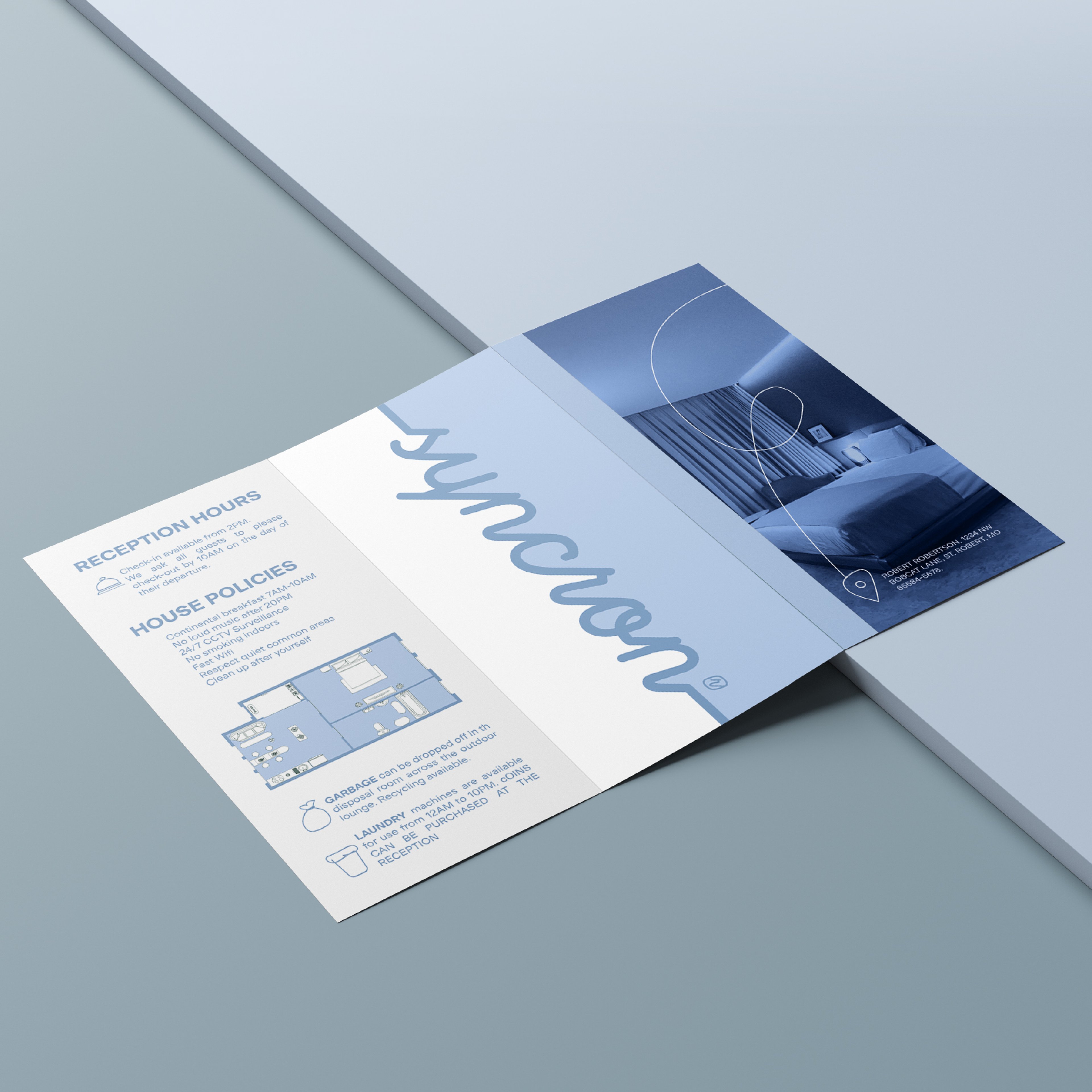
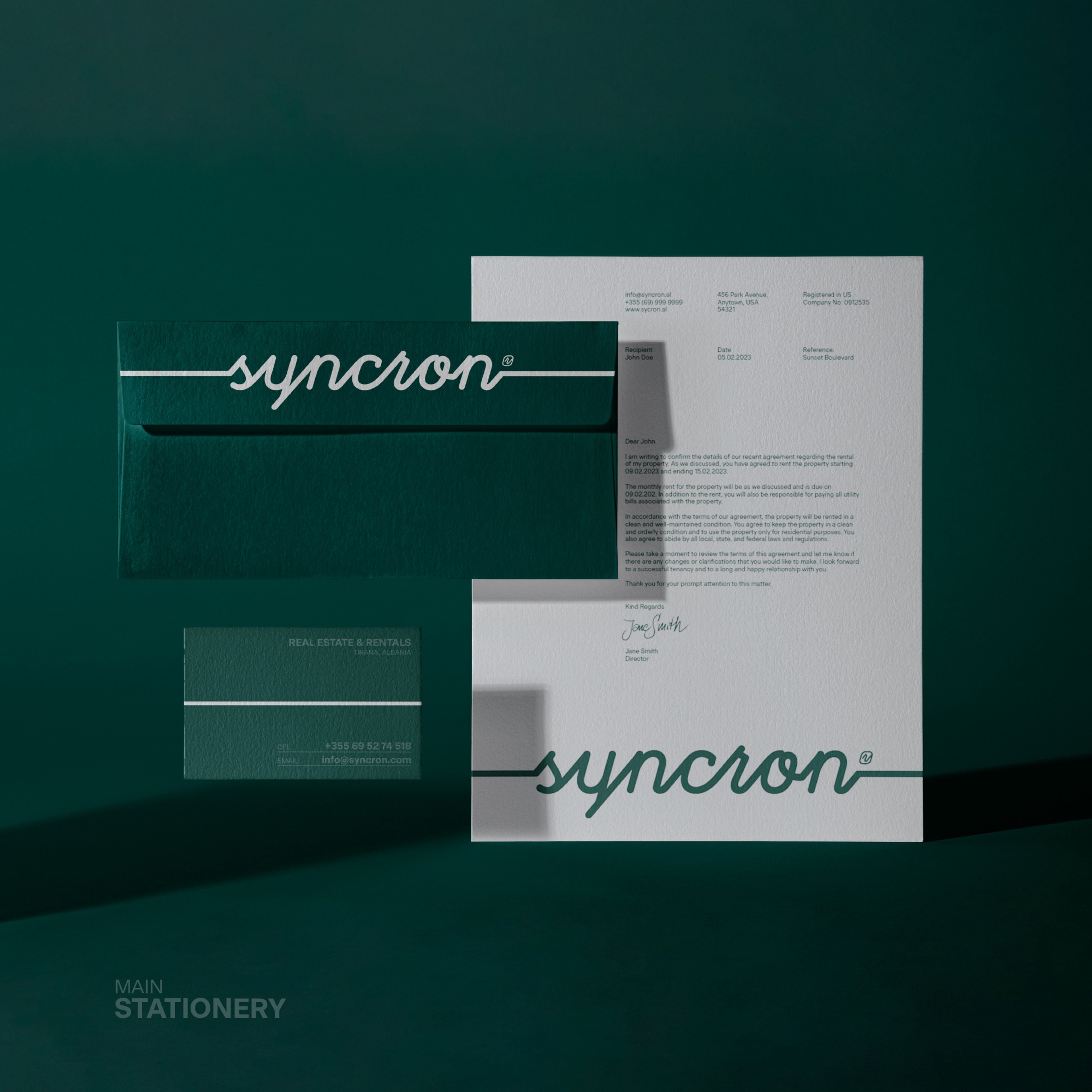
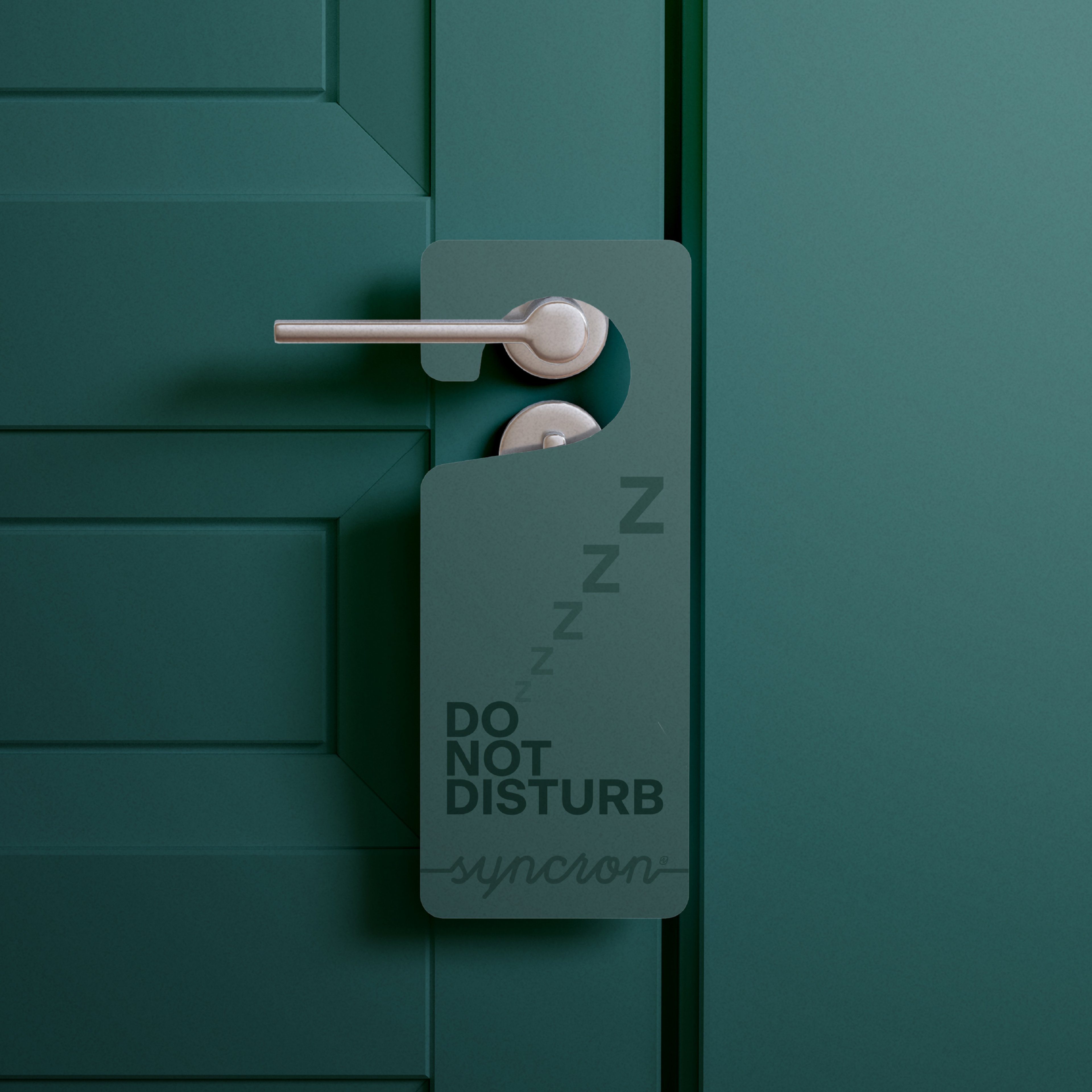
We developed a visual identity inspired by Syncron’s name and its focus on harmony. The logo uses continuous script, repeating diagonal lines, and fluid movement to reflect a synchronized approach to property management. A palette of grass green and sky blue brings a calm, welcoming feel, while organic illustrations reinforce the idea of relaxed spaces. Together, these elements communicate both Syncron’s expertise and its commitment to creating smooth, comfortable experiences for clients and guests.
Overview
Syncron, inspired by the essence of synchronicity, stands as a property management agency that seamlessly aligns with the needs of its clients and guests. Their ethos revolves around harmony, ensuring every property feels like a tranquil retreat.
Challenge
The challenge was to encapsulate Syncron's philosophy of simultaneous harmony in a visual identity. The design needed to convey the agency's commitment to providing a relaxed and synchronized property management experience, ensuring clients and guests feel at home, no matter where they are.
Solution
We developed a visual identity inspired by Syncron’s name and its focus on harmony. The logo uses continuous script, repeating diagonal lines, and fluid movement to reflect a synchronized approach to property management. A palette of grass green and sky blue brings a calm, welcoming feel, while organic illustrations reinforce the idea of relaxed spaces. Together, these elements communicate both Syncron’s expertise and its commitment to creating smooth, comfortable experiences for clients and guests.
Your turn
What are we shaping next?
Tell us what you have in mind. It can be a clear brief or just the start of an idea. We’ll help shape the next steps and keep everything simple from there.