Fills®Branded to Fulfill.
Overview
For Fills, we developed the naming and visual identity around the product’s defining feature: the filling at its center. Conceived as a playful and expressive brand within Wienna’s portfolio, the project was designed to feel bold, youthful, and instantly recognizable across both family packs and individual formats.
Challenge
The challenge was to create a name and identity that could capture the filled-cookie concept in a direct and memorable way, while also building a flexible system with room for extension in packaging, social content, and campaign communication. The range needed to feel vibrant and distinctive without losing cohesion.
Solution
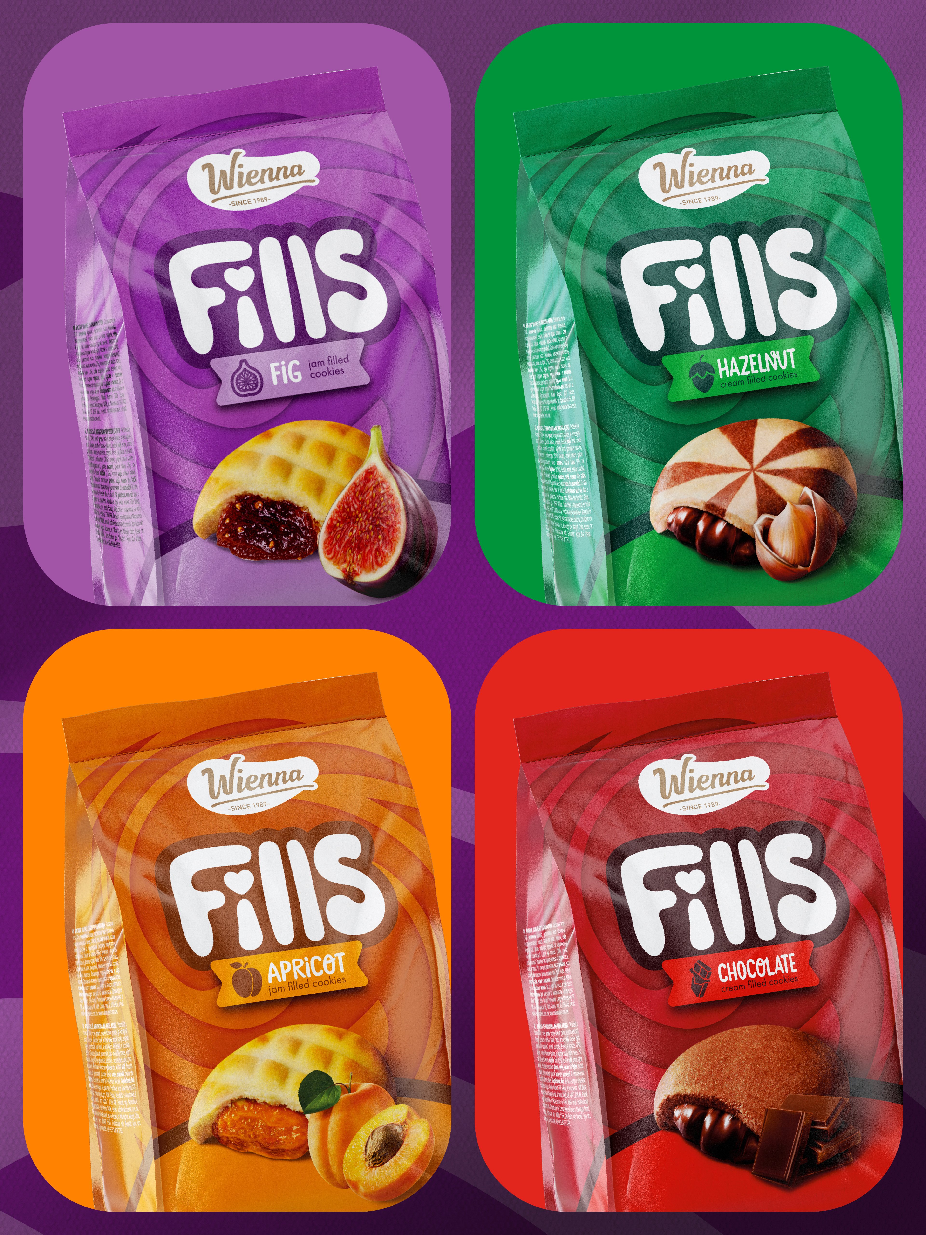
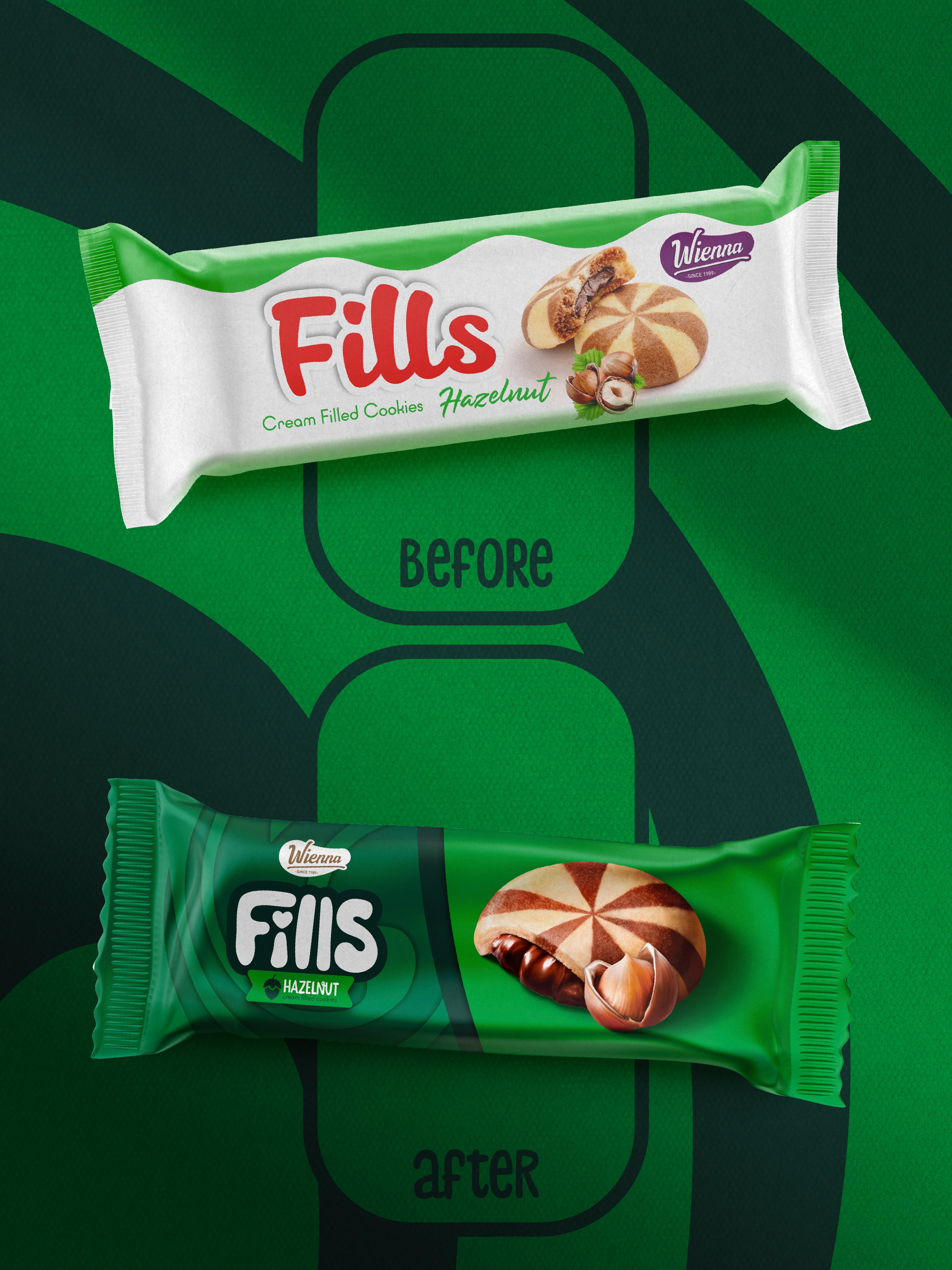
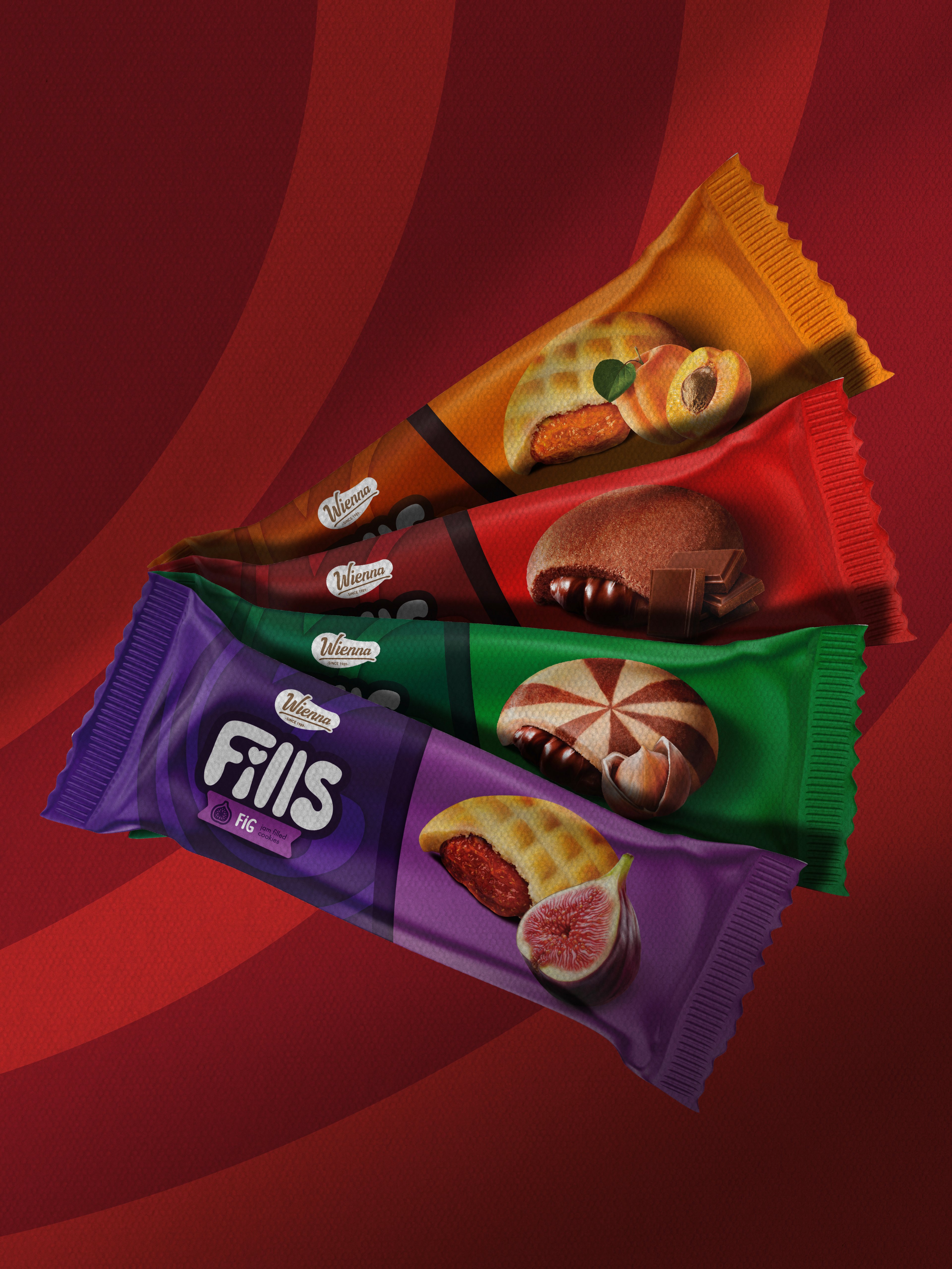
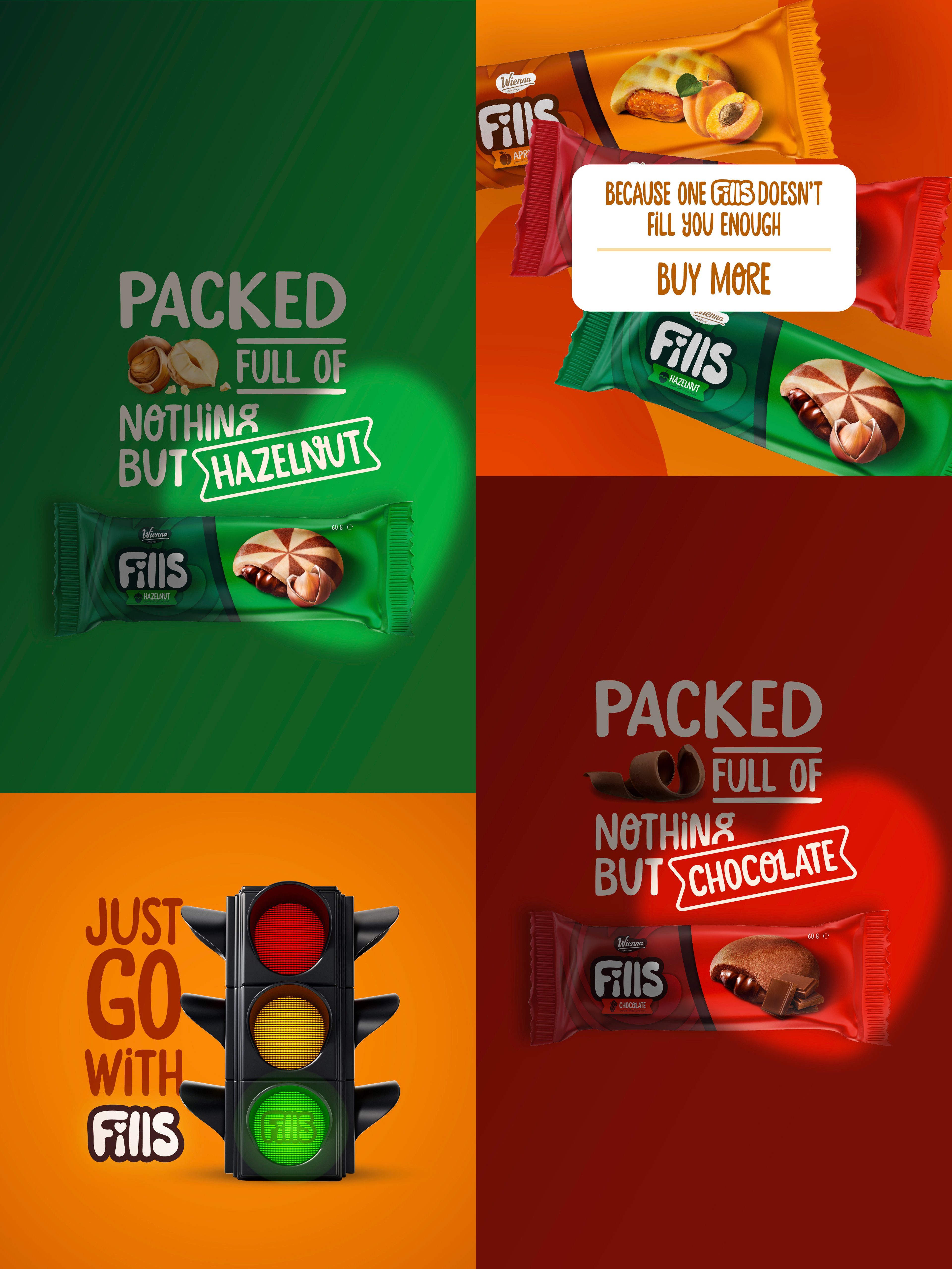
We created the name Fills and developed a graphic identity that brings its personality to life through rounded typography, flavor-led colors, and dynamic forms that emphasize the product experience. Each variant was given its own strong visual world, while the shared structure keeps the range connected. The result is a brand with clear shelf presence and a name that naturally opens up possibilities for taglines, social language, and future campaigns.
Overview
For Fills, we developed the naming and visual identity around the product’s defining feature: the filling at its center. Conceived as a playful and expressive brand within Wienna’s portfolio, the project was designed to feel bold, youthful, and instantly recognizable across both family packs and individual formats.
Challenge
The challenge was to create a name and identity that could capture the filled-cookie concept in a direct and memorable way, while also building a flexible system with room for extension in packaging, social content, and campaign communication. The range needed to feel vibrant and distinctive without losing cohesion.
Solution
We created the name Fills and developed a graphic identity that brings its personality to life through rounded typography, flavor-led colors, and dynamic forms that emphasize the product experience. Each variant was given its own strong visual world, while the shared structure keeps the range connected. The result is a brand with clear shelf presence and a name that naturally opens up possibilities for taglines, social language, and future campaigns.
Your turn
What are we shaping next?
Tell us what you have in mind. It can be a clear brief or just the start of an idea. We’ll help shape the next steps and keep everything simple from there.