Ina’s Farm®Dairy That Dares the Shelf.
Overview
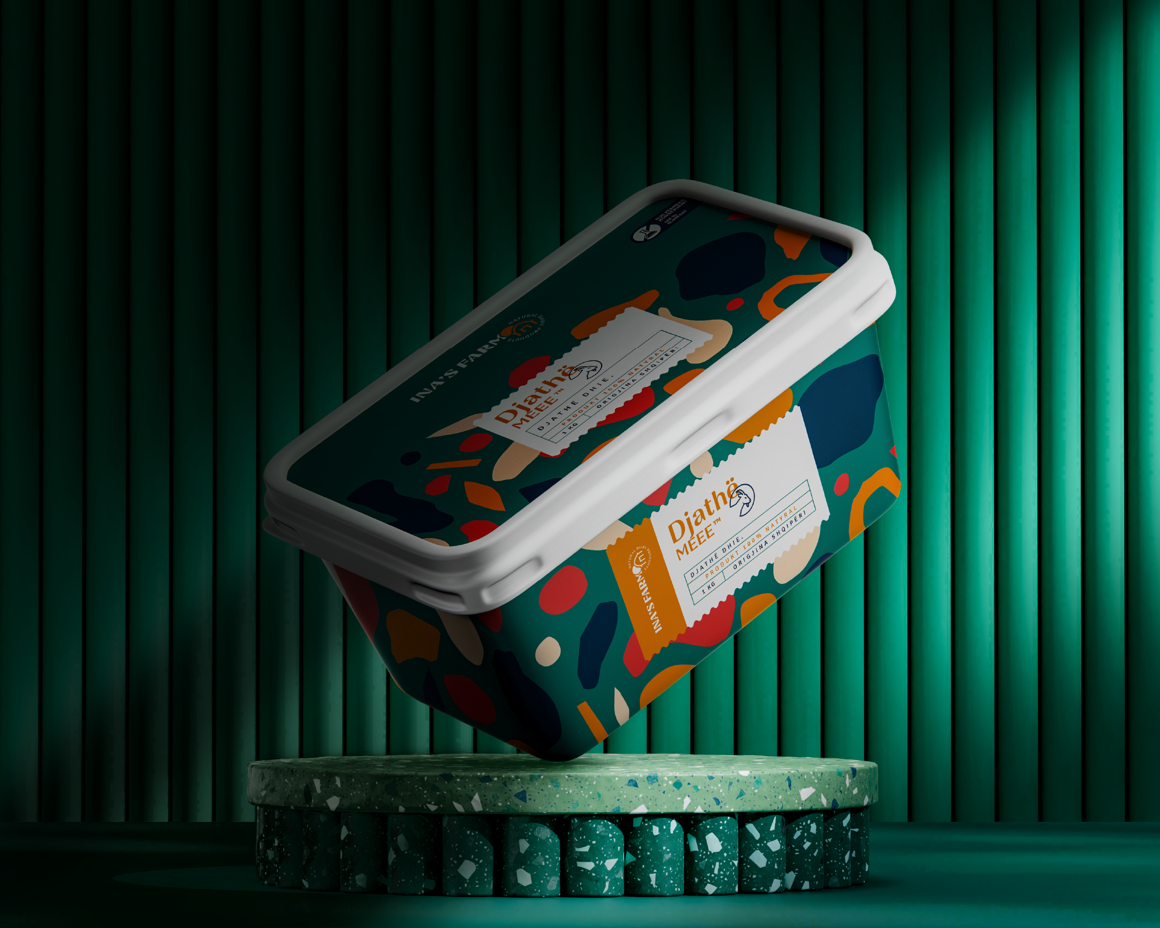
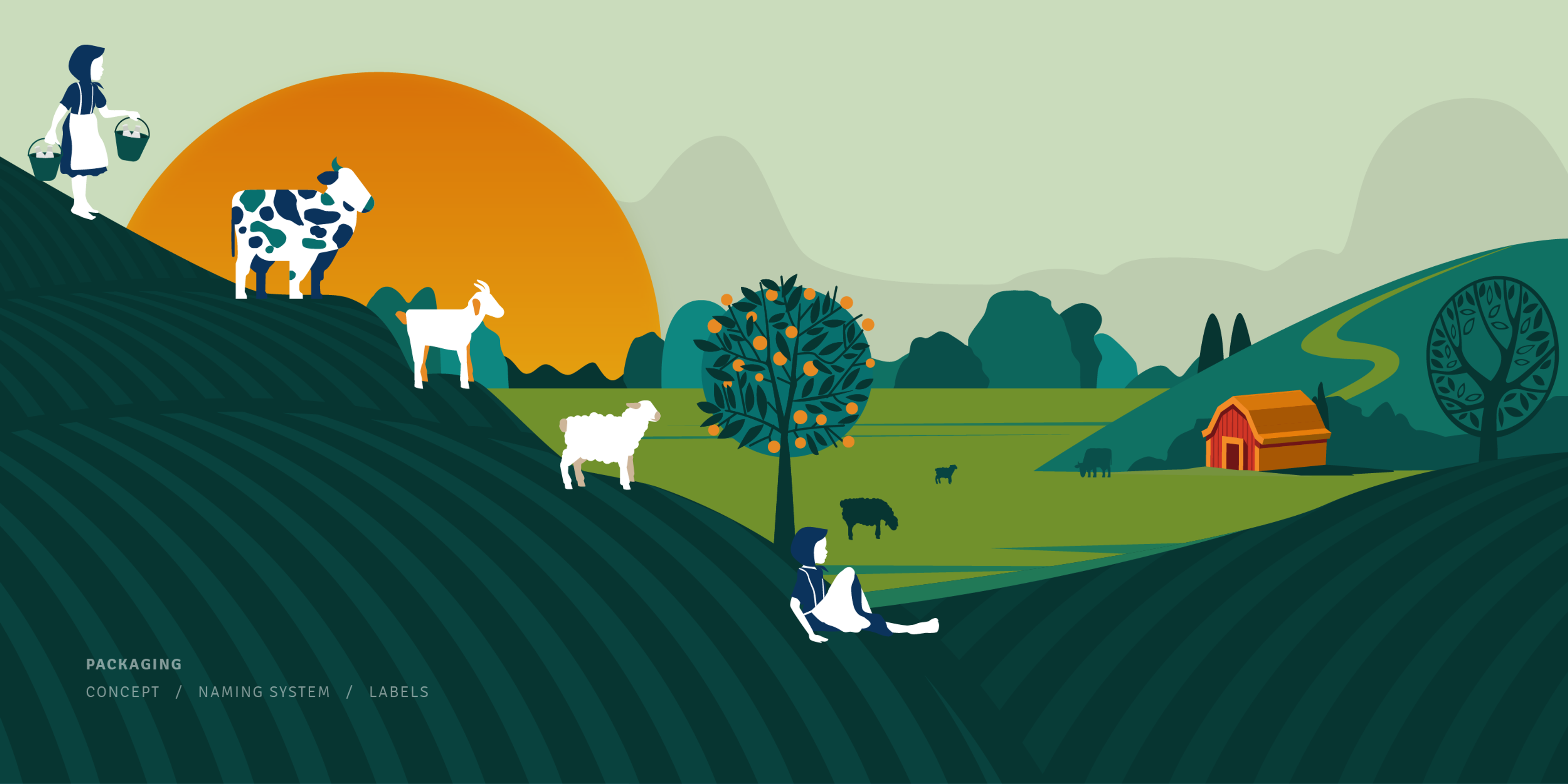
Ina’s Farm is a dairy brand rooted in freshness, nature, and the character of farm life. The packaging system was created to bring this world to life through a visual language that feels warm, playful, and instantly recognizable.
Challenge
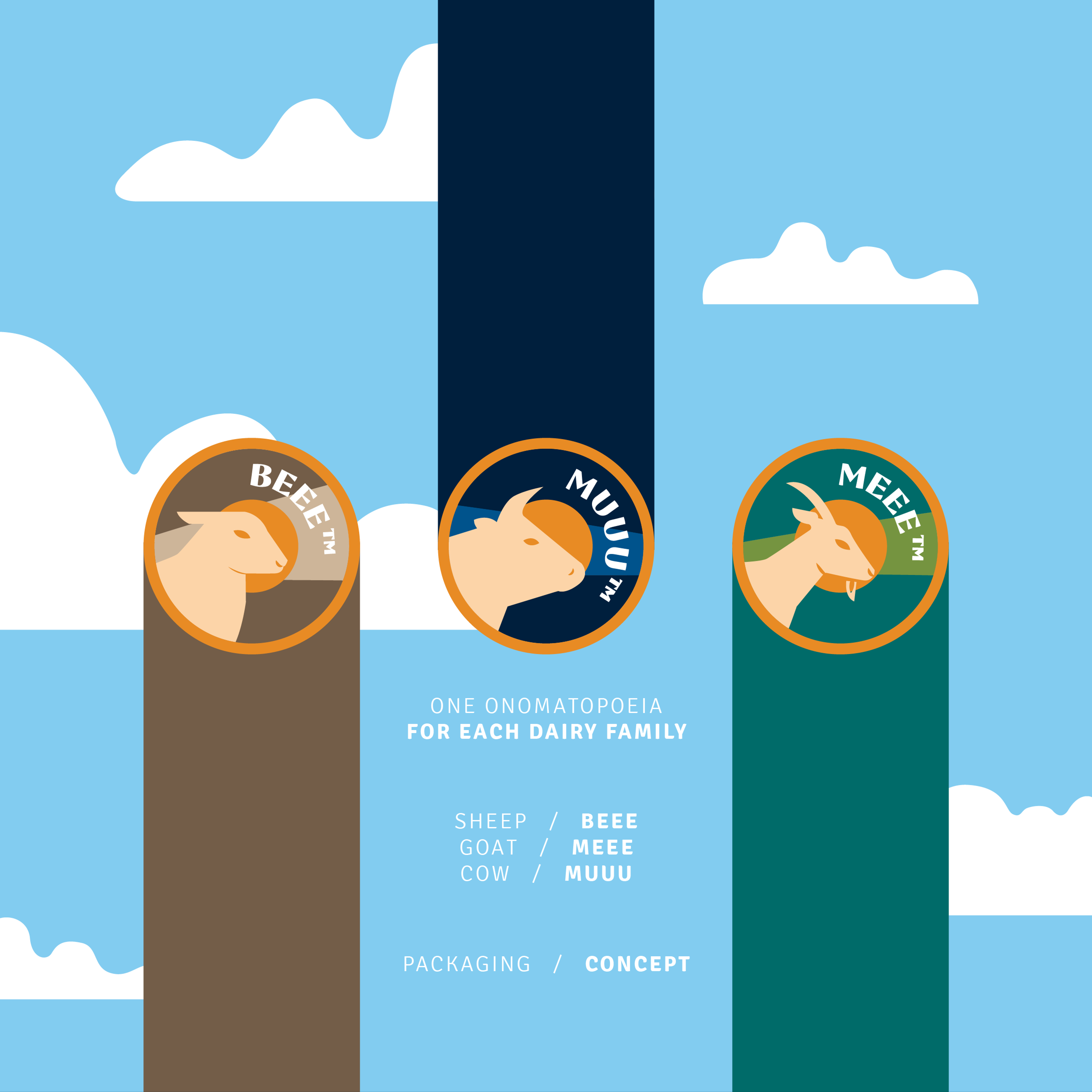
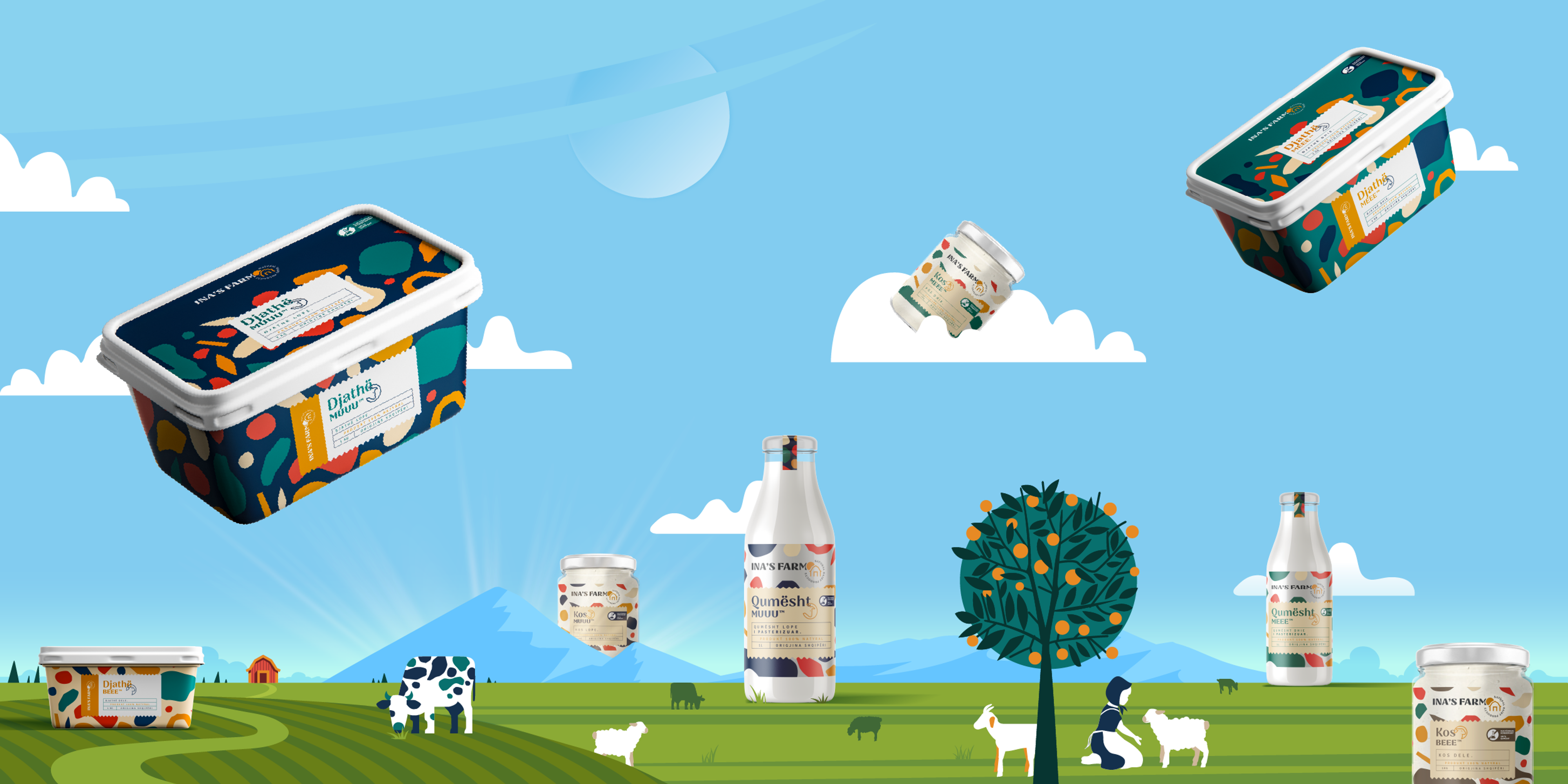
The main challenge was to create consistency across the product family while allowing each product to have its own personality. The design needed to feel cohesive on shelf, but still give cow, sheep, and goat products a clear and memorable distinction.
Solution
We developed a colorful packaging system inspired by farm animals, natural patterns, and playful sound cues. “MUUU”, “BEEE”, and “MEEE” became central identity elements, turning each product into a recognizable character within the same brand family. The result is a lively, cheerful, and structured packaging line that feels both natural and distinctive.
Overview
Ina’s Farm is a dairy brand rooted in freshness, nature, and the character of farm life. The packaging system was created to bring this world to life through a visual language that feels warm, playful, and instantly recognizable.
Challenge
The main challenge was to create consistency across the product family while allowing each product to have its own personality. The design needed to feel cohesive on shelf, but still give cow, sheep, and goat products a clear and memorable distinction.
Solution
We developed a colorful packaging system inspired by farm animals, natural patterns, and playful sound cues. “MUUU”, “BEEE”, and “MEEE” became central identity elements, turning each product into a recognizable character within the same brand family. The result is a lively, cheerful, and structured packaging line that feels both natural and distinctive.
Your turn
What are we shaping next?
Tell us what you have in mind. It can be a clear brief or just the start of an idea. We’ll help shape the next steps and keep everything simple from there.