Tepelene®Bottled Energy.
Overview
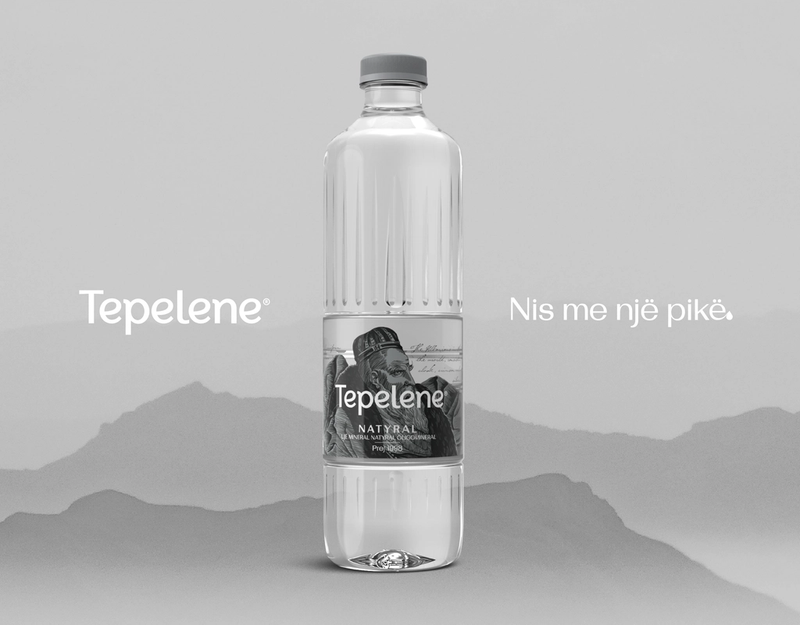
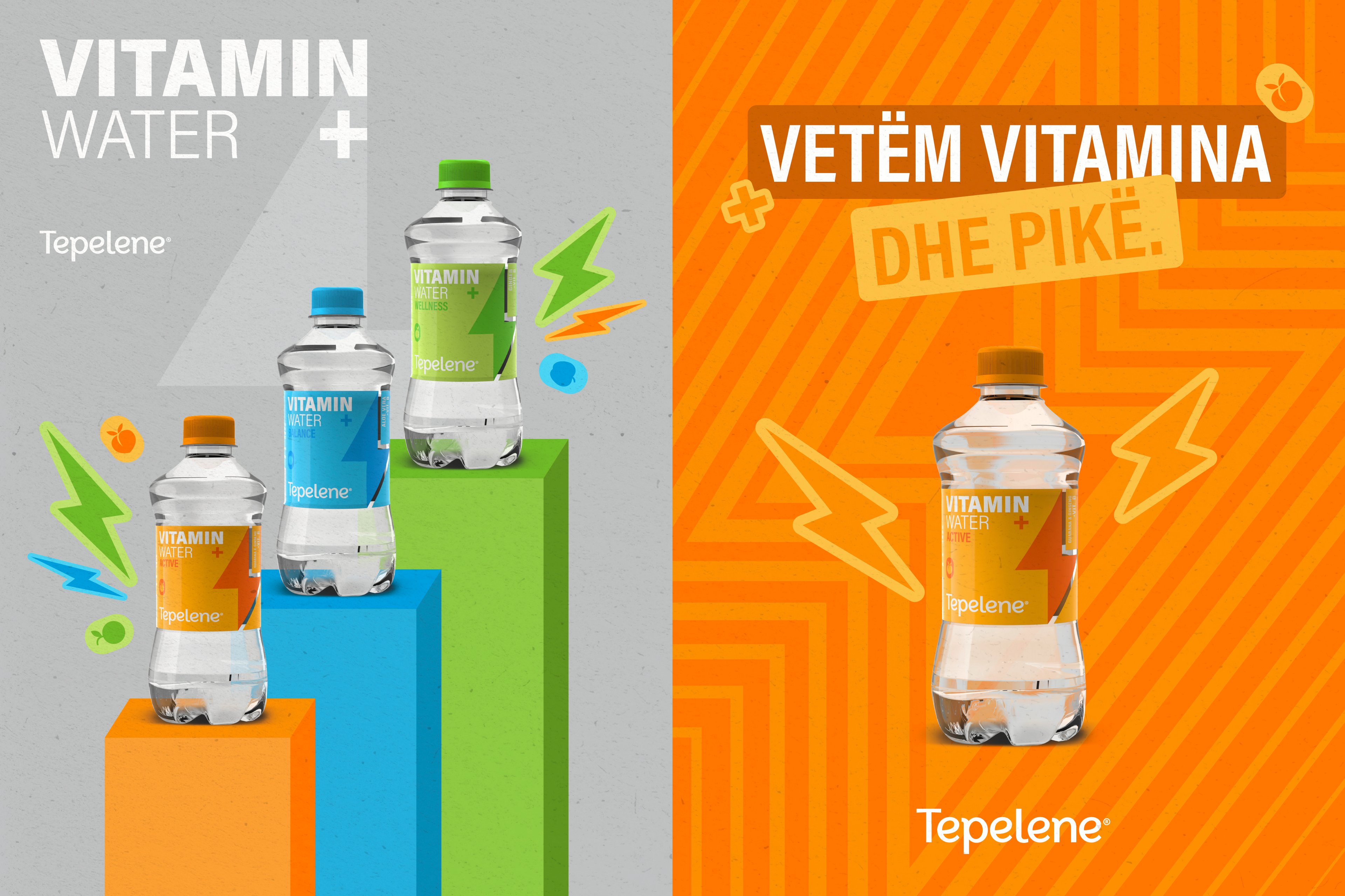
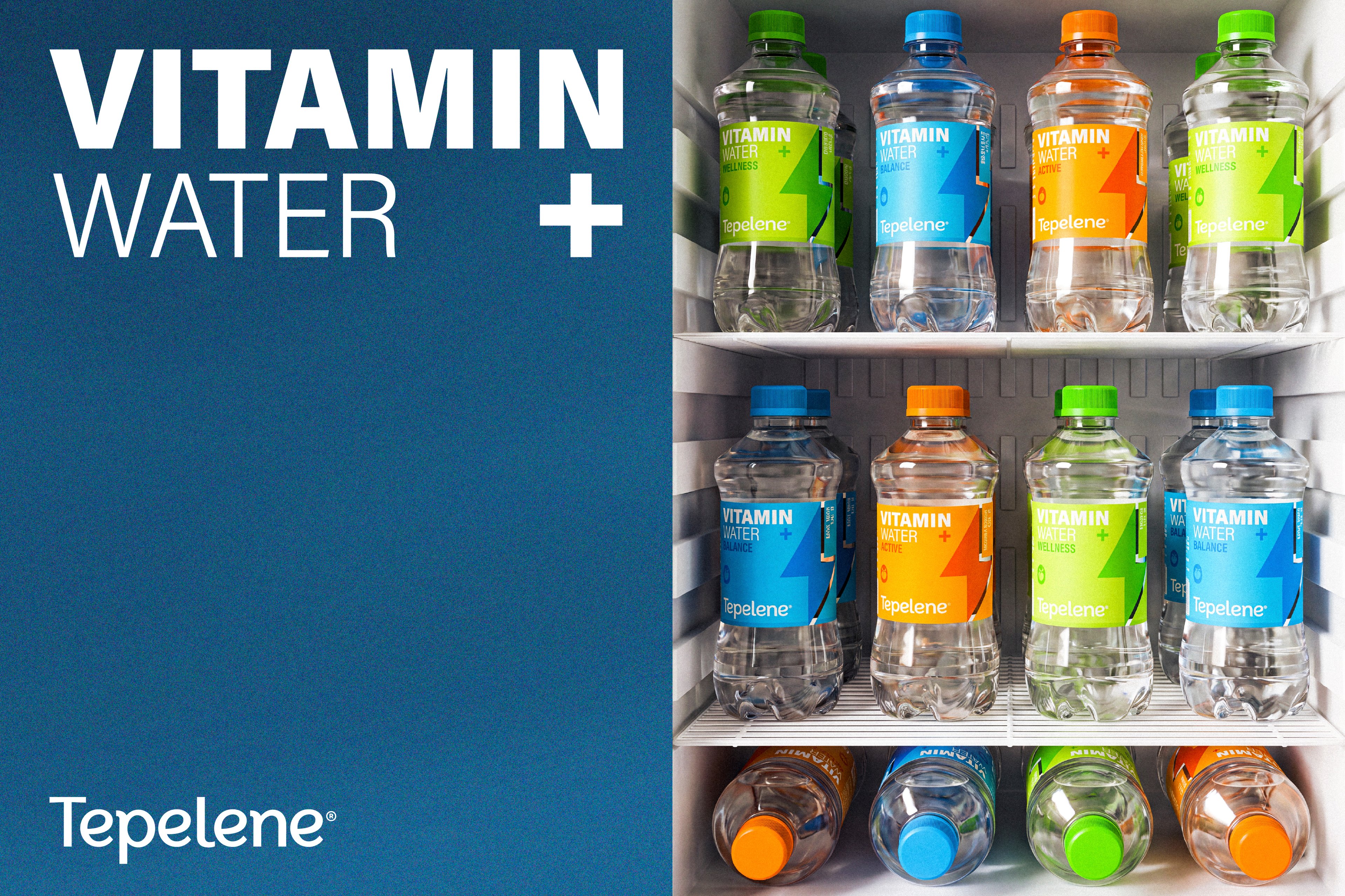
Tepelene Vitamin Water was developed as a dedicated product line within the Tepelene portfolio, created to introduce a more energetic and contemporary offer to the category. Our role was to build a clear branding system that could define the range visually, while also shaping a product identity with enough character and flexibility to work consistently across packaging and broader brand communication.
Challenge
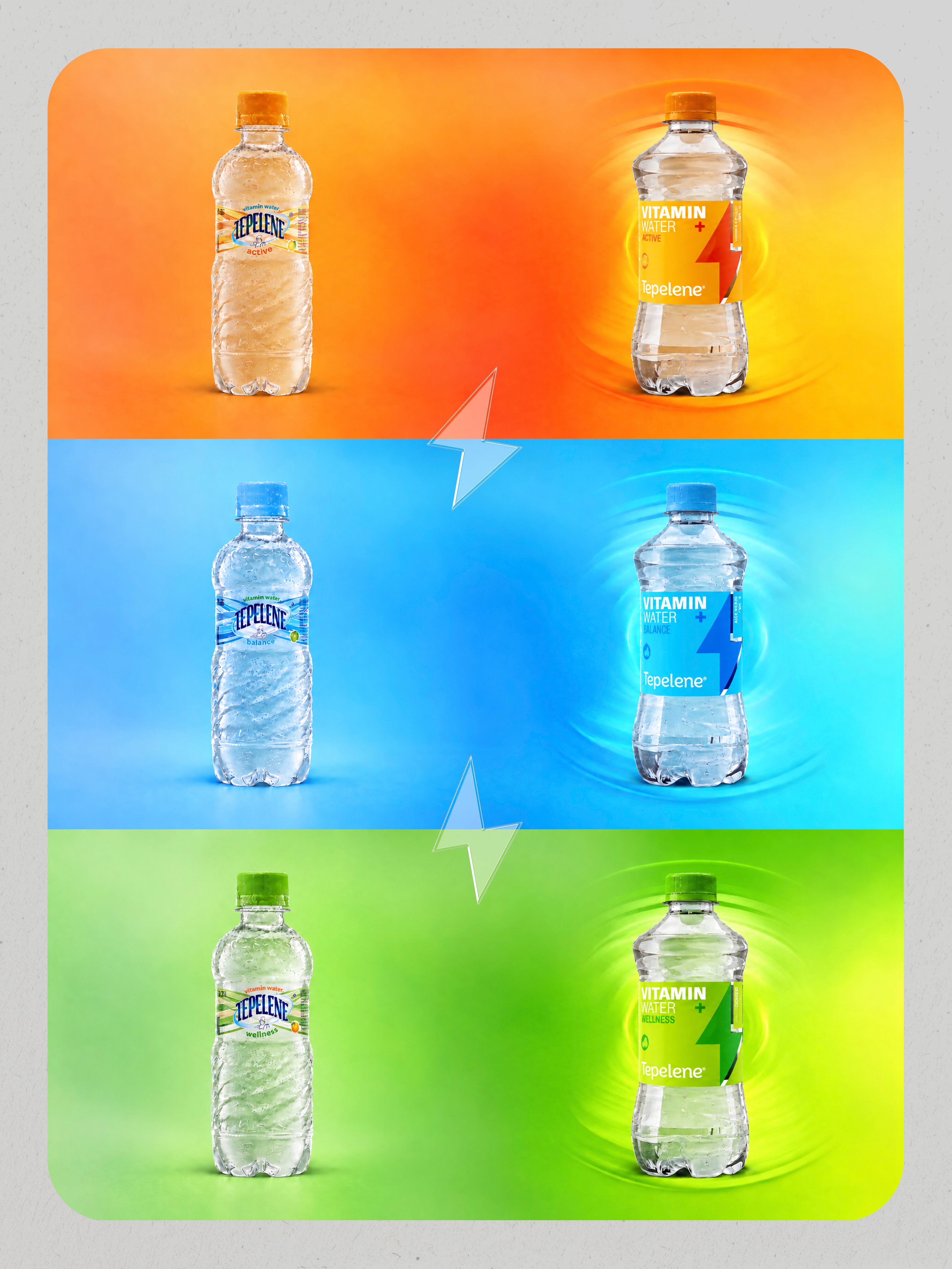
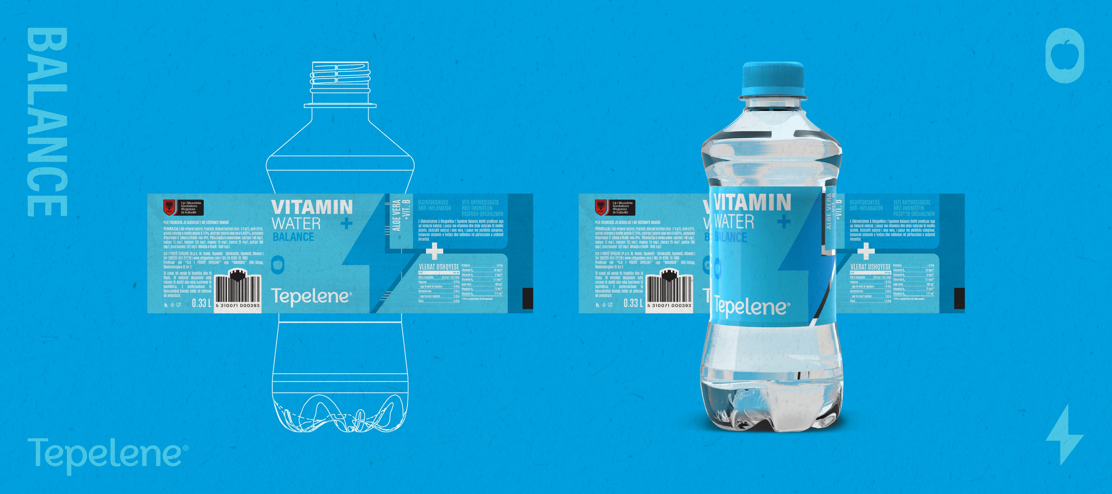
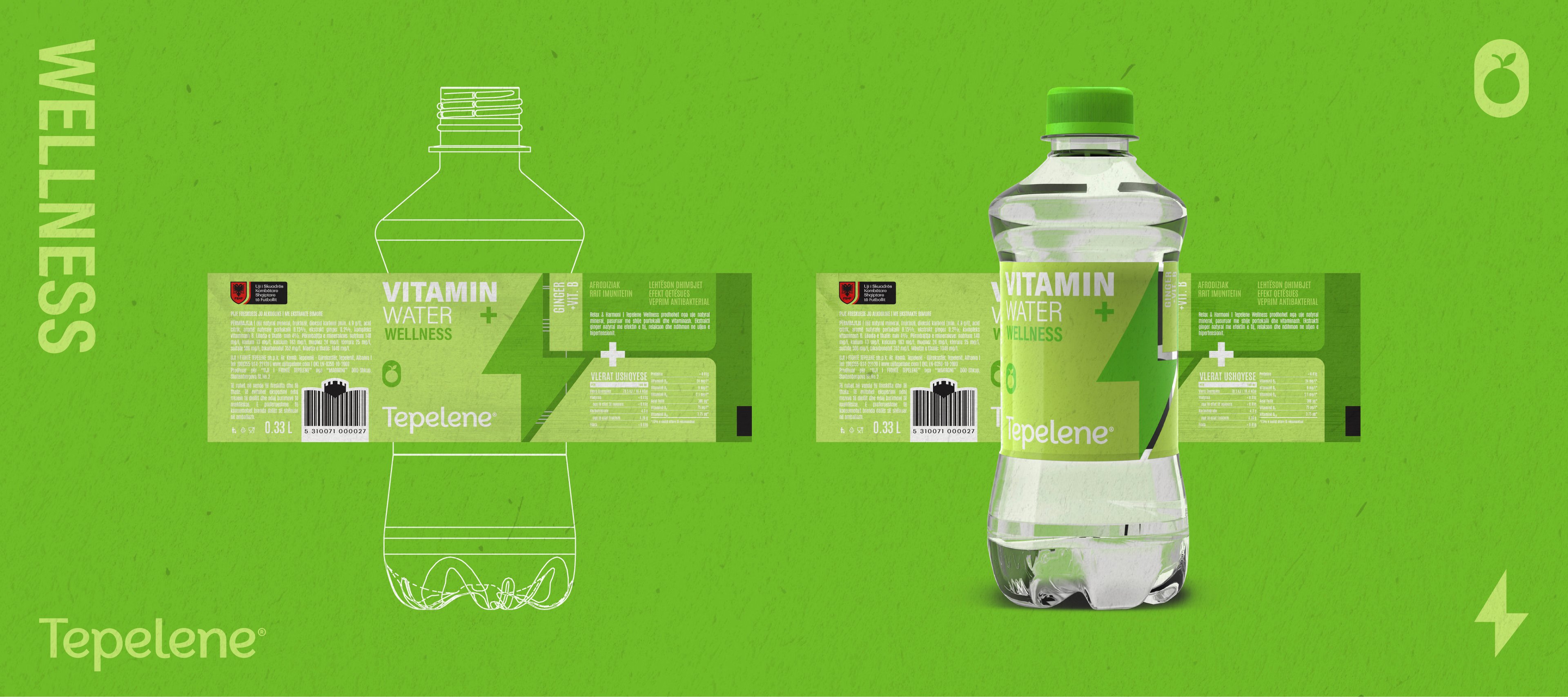
The challenge was to create a system that felt fresh, recognizable and easy to navigate, while giving each variant a distinct presence within one cohesive family. Beyond the graphic identity, the project also required the bottle itself to be conceived from scratch, making sure the structural packaging could support the overall concept and contribute to a stronger, more ownable product presence on shelf.
Solution
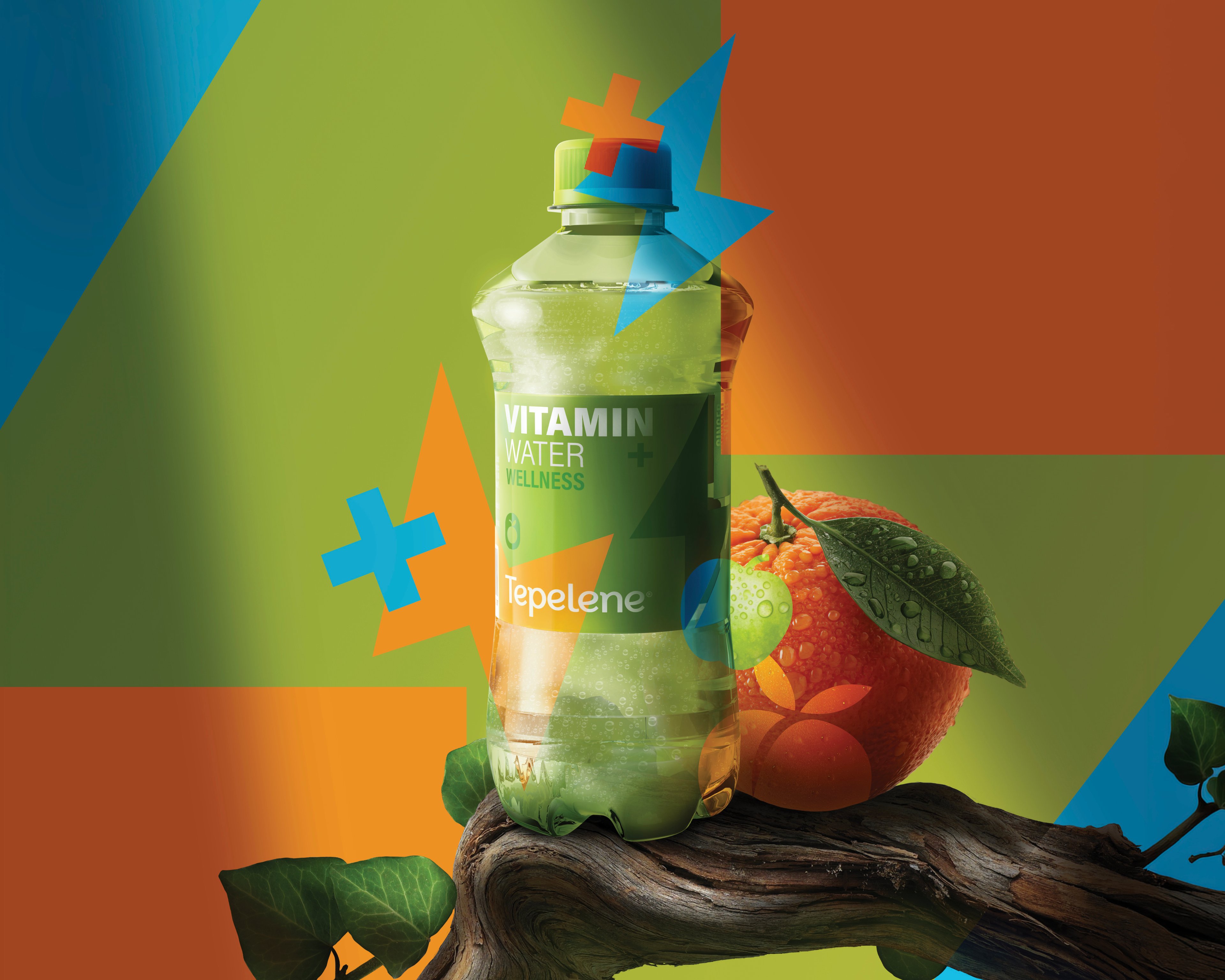
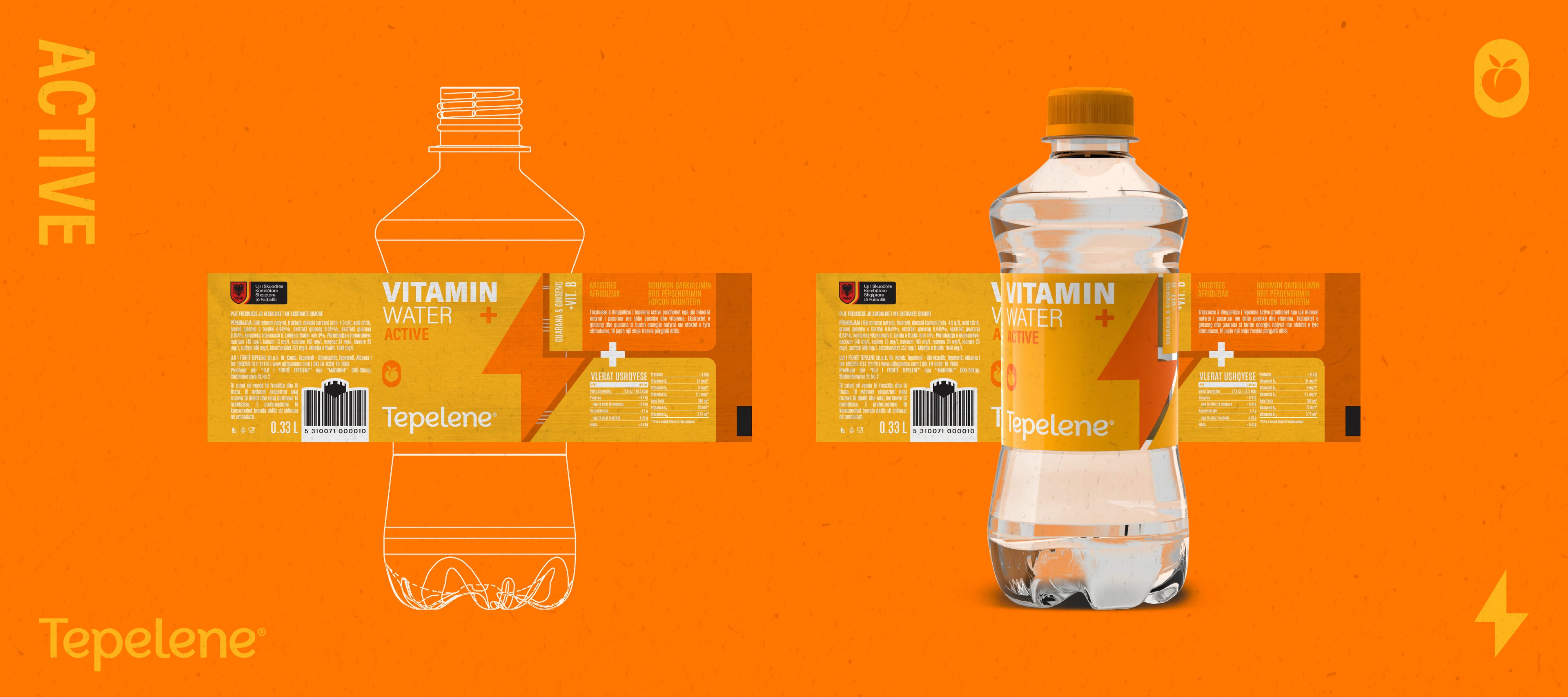
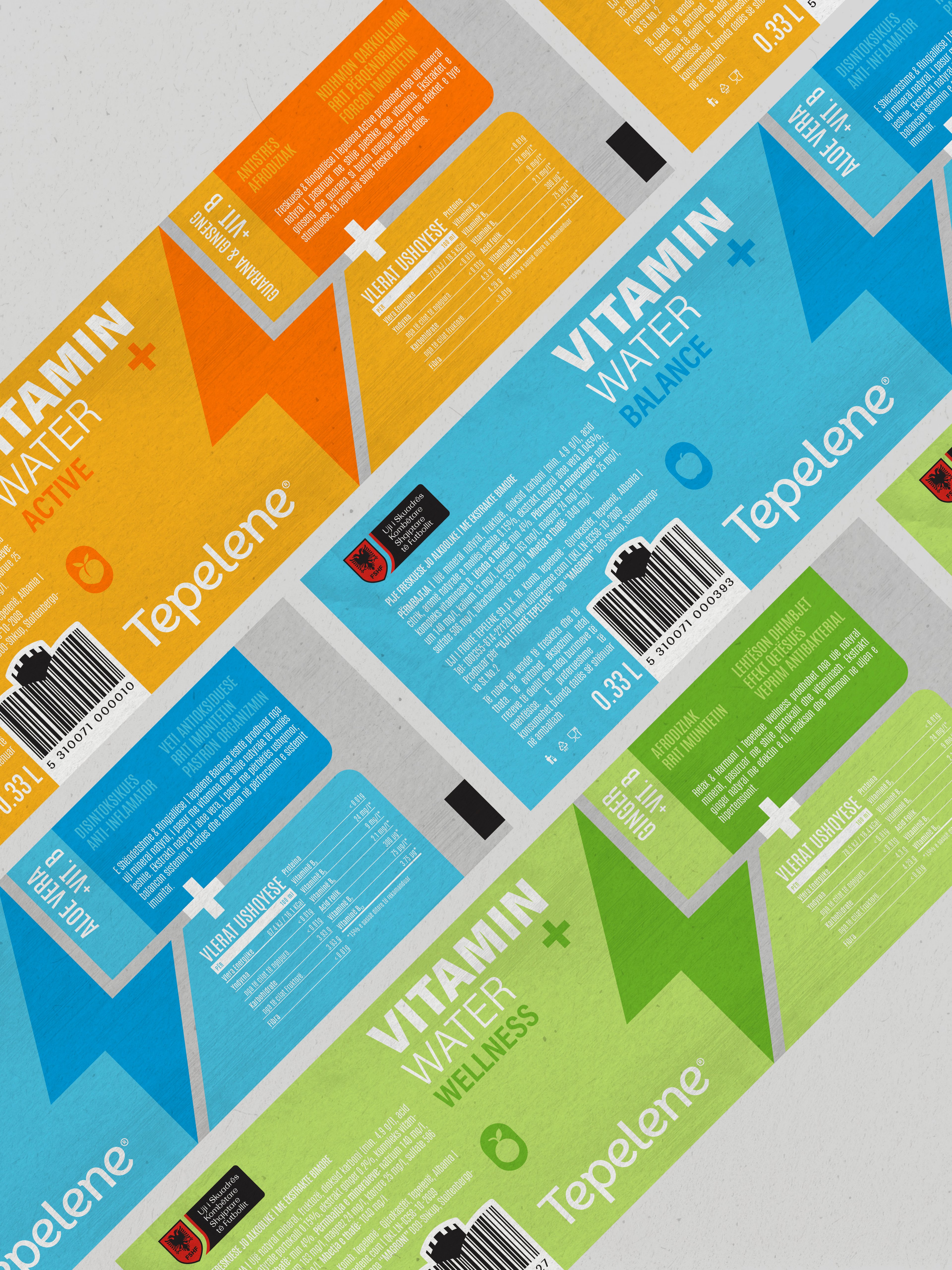
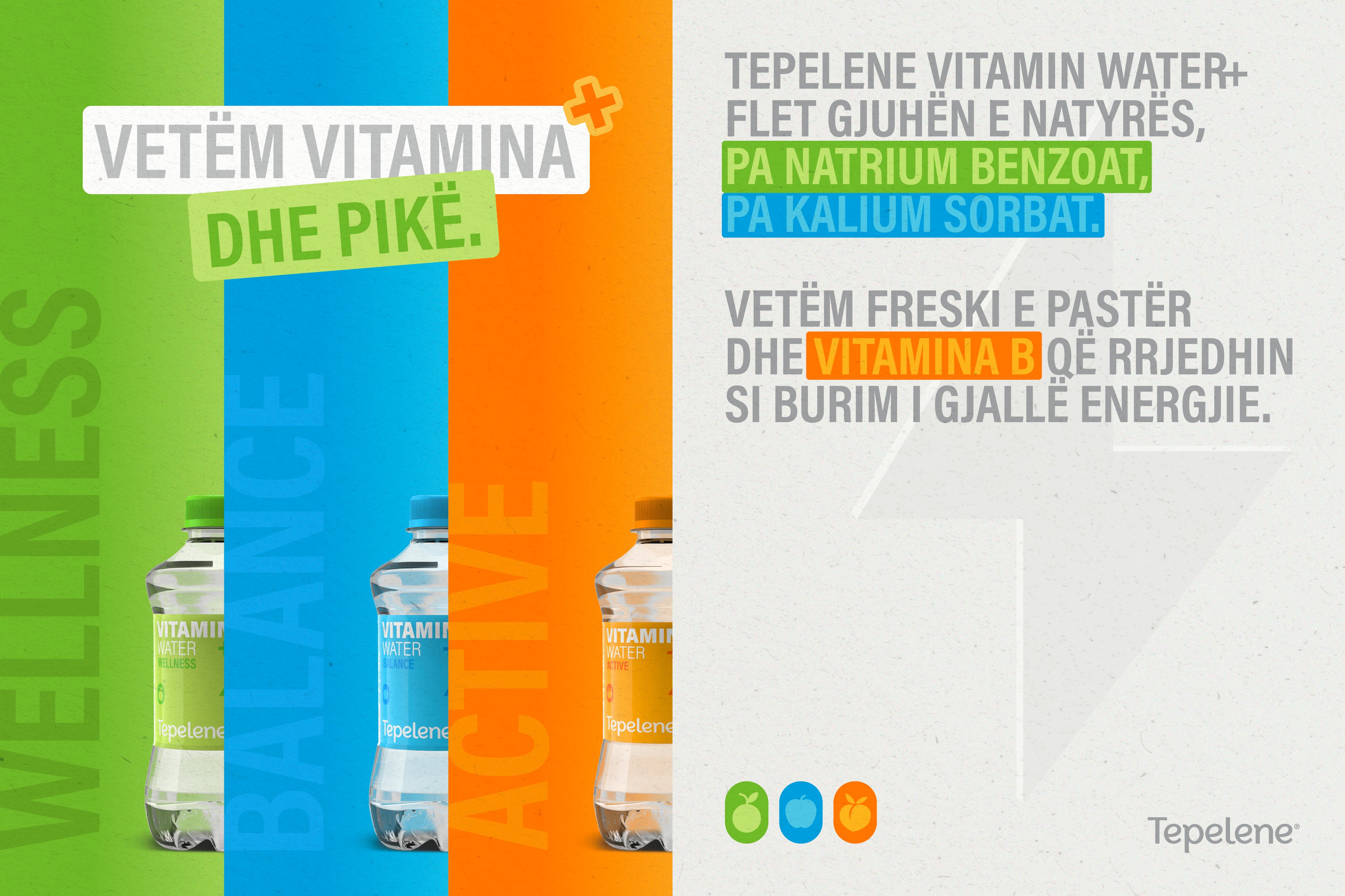
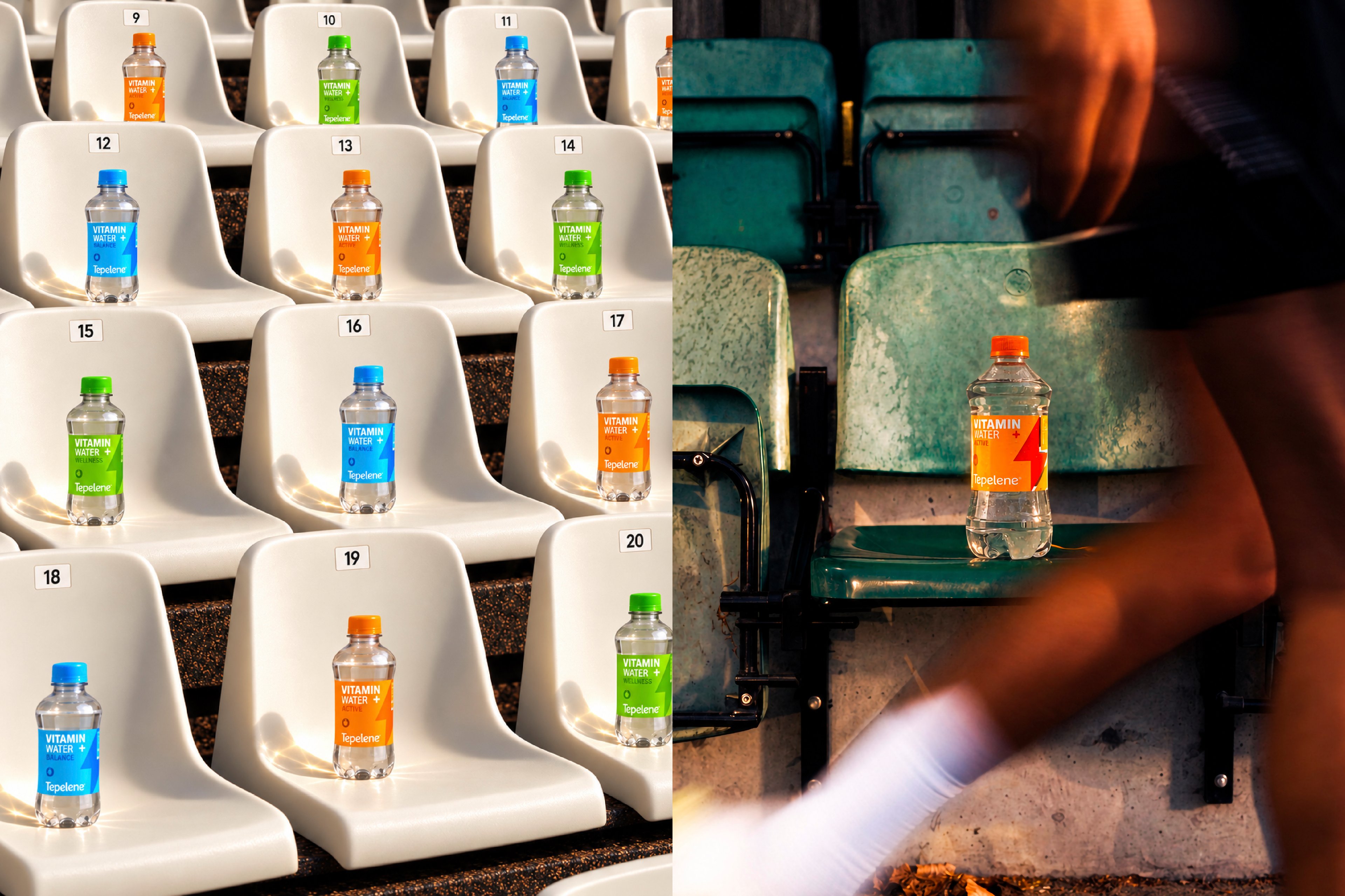
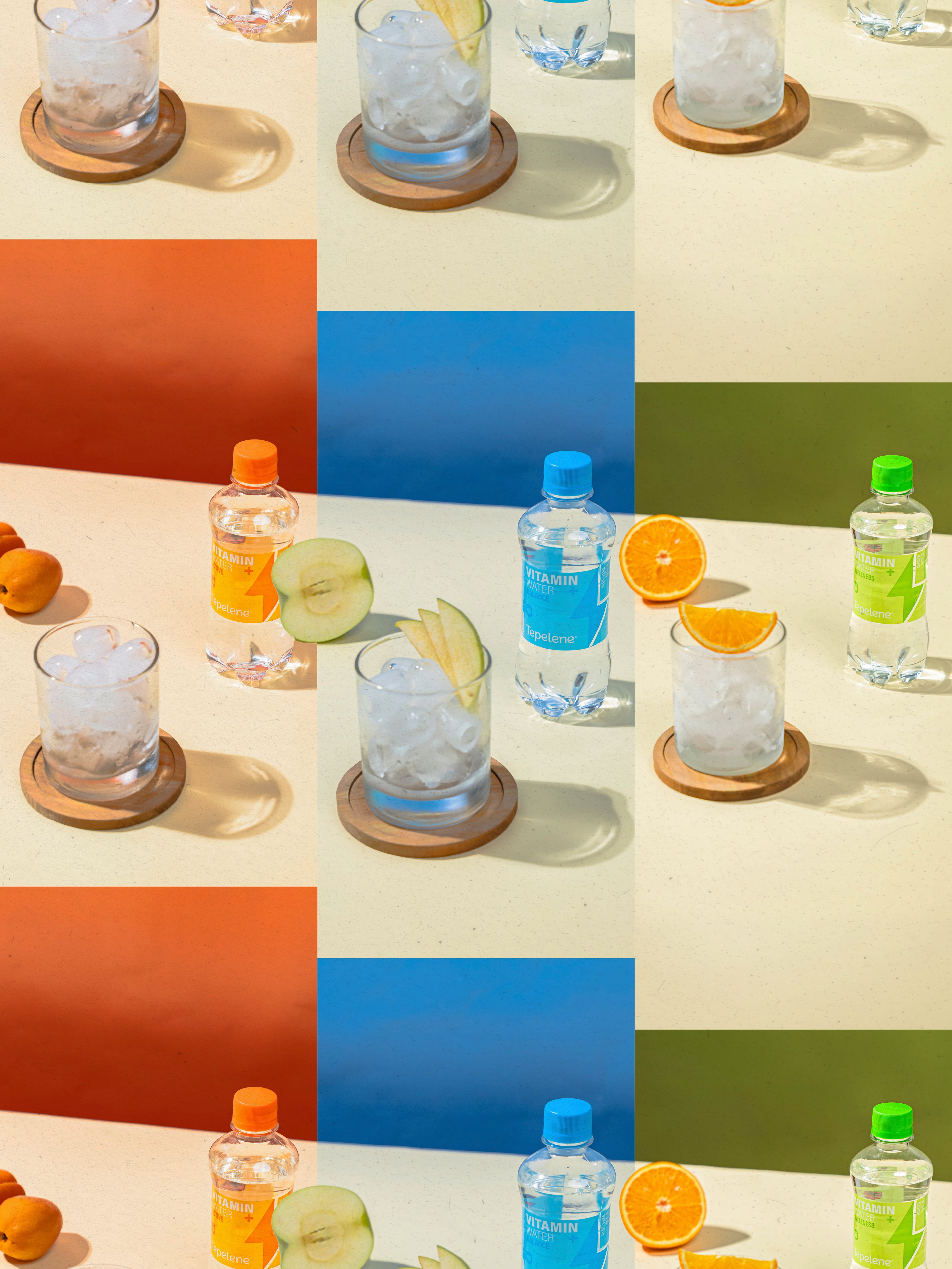
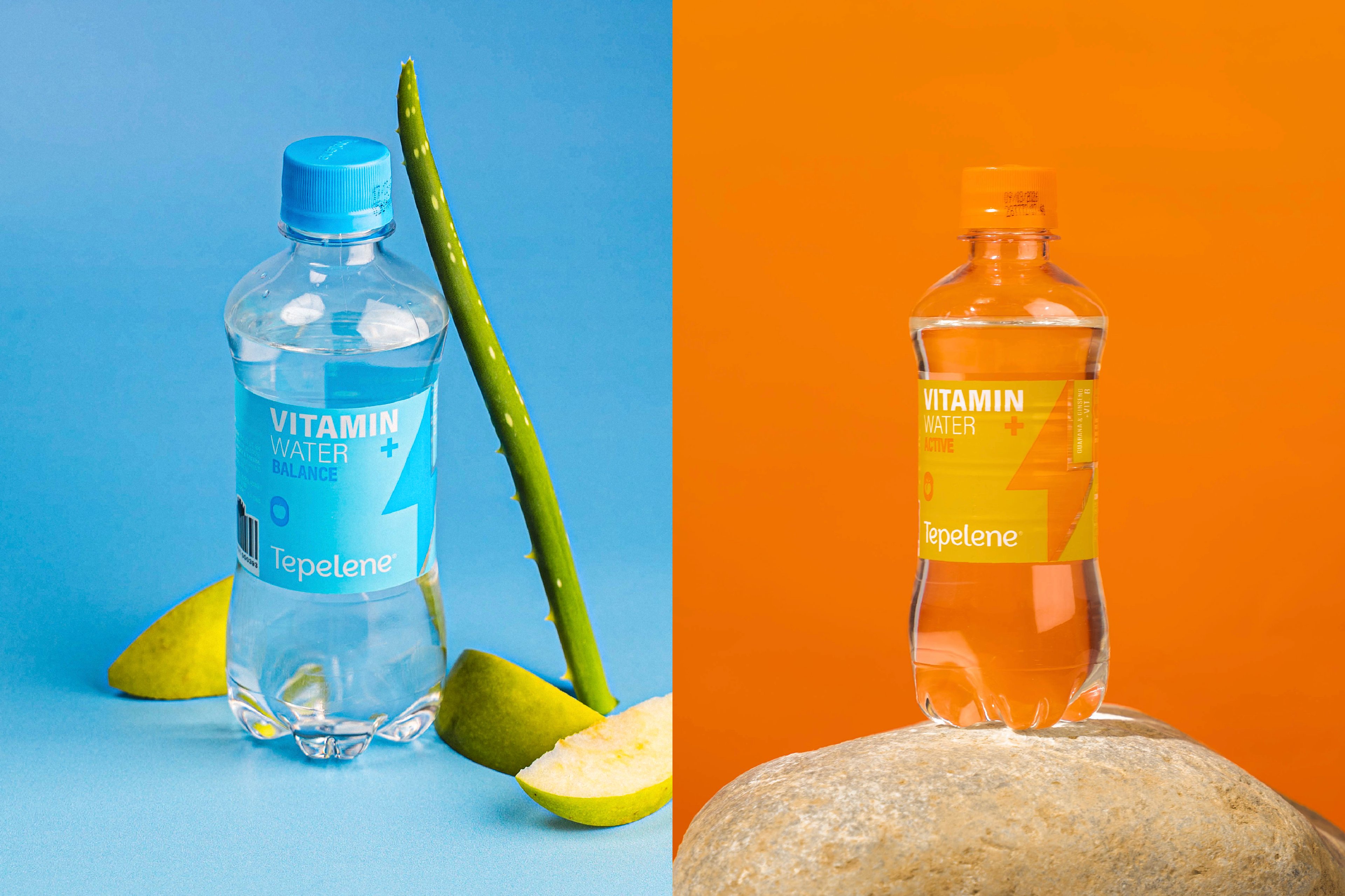
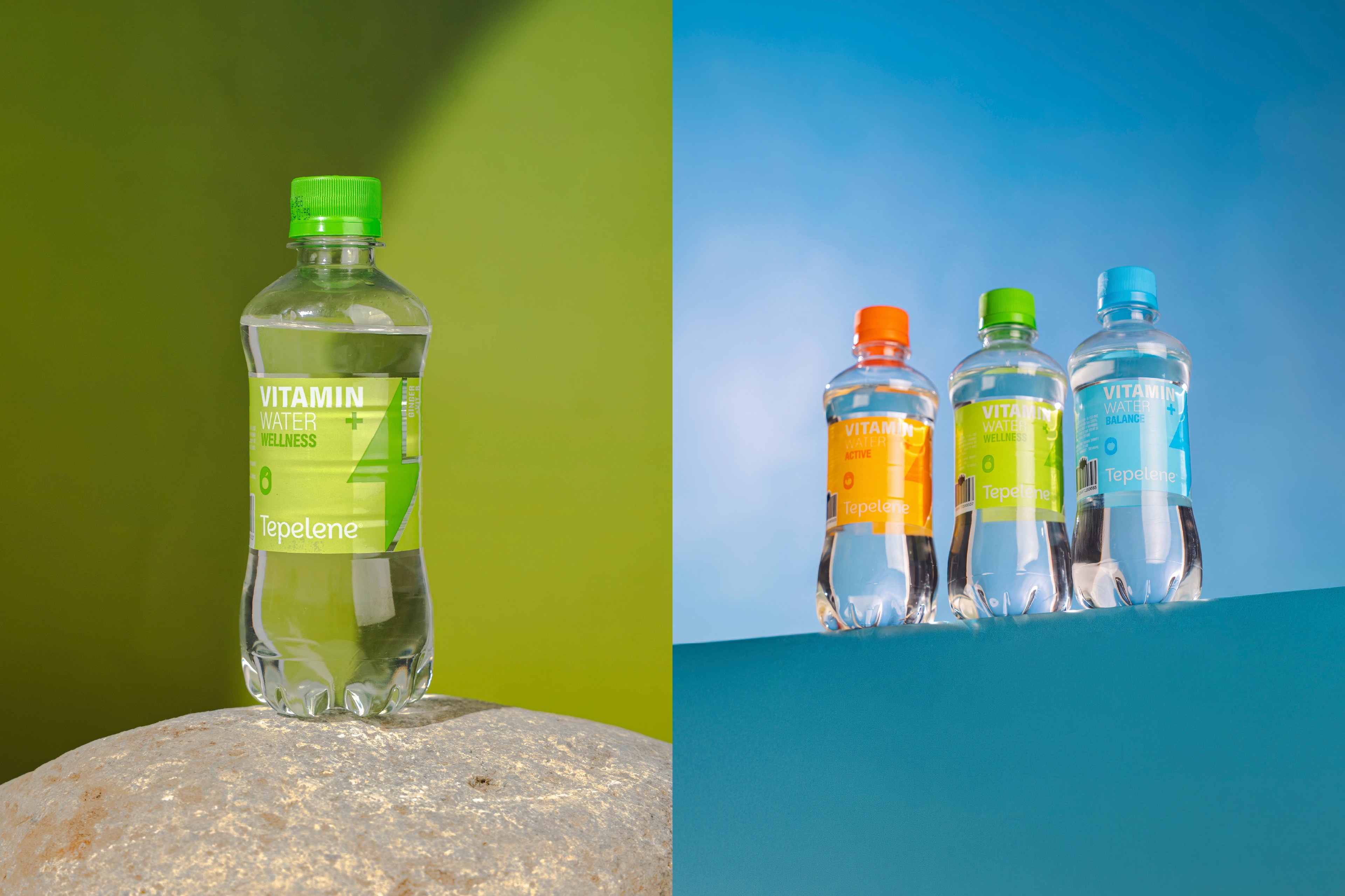
We developed a visual identity built around bold color differentiation, fruit cues and a distinctive energy icon, creating a language that feels dynamic, modern and memorable. In parallel, we designed the bottle from the ground up, developing a form and silhouette tailored specifically to the range. The result is a cohesive system with clearer product distinction, stronger shelf impact and a solid foundation for future brand applications.

Overview
Tepelene Vitamin Water was developed as a dedicated product line within the Tepelene portfolio, created to introduce a more energetic and contemporary offer to the category. Our role was to build a clear branding system that could define the range visually, while also shaping a product identity with enough character and flexibility to work consistently across packaging and broader brand communication.
Challenge
The challenge was to create a system that felt fresh, recognizable and easy to navigate, while giving each variant a distinct presence within one cohesive family. Beyond the graphic identity, the project also required the bottle itself to be conceived from scratch, making sure the structural packaging could support the overall concept and contribute to a stronger, more ownable product presence on shelf.
Solution
We developed a visual identity built around bold color differentiation, fruit cues and a distinctive energy icon, creating a language that feels dynamic, modern and memorable. In parallel, we designed the bottle from the ground up, developing a form and silhouette tailored specifically to the range. The result is a cohesive system with clearer product distinction, stronger shelf impact and a solid foundation for future brand applications.
Your turn
What are we shaping next?
Tell us what you have in mind. It can be a clear brief or just the start of an idea. We’ll help shape the next steps and keep everything simple from there.